Hi Footy Graphics Board,
Long term admirer of your work here! I'm not just grovelling, but genuinely I am constantly impressed by the designs that you guys all put up on this board. It's great stuff.
I'm wondering if anyone would like a new little challenge?
I run a Winter Twenty20 cricket competition in QLD each year. This year I want to give the comp a bit more flare and "colour" by giving all sides a logo of some description and maybe create a bit more connection to each side.
Would anyone like to create some logos for the 6 sides in our competition? These would be genuinely used by real teams. If anyone has any interest in creating some concepts I would be truly grateful!
The teams in our competition are as follows:
Any ideas are welcomed. Thanks for your time guys...
Long term admirer of your work here! I'm not just grovelling, but genuinely I am constantly impressed by the designs that you guys all put up on this board. It's great stuff.
I'm wondering if anyone would like a new little challenge?
I run a Winter Twenty20 cricket competition in QLD each year. This year I want to give the comp a bit more flare and "colour" by giving all sides a logo of some description and maybe create a bit more connection to each side.
Would anyone like to create some logos for the 6 sides in our competition? These would be genuinely used by real teams. If anyone has any interest in creating some concepts I would be truly grateful!
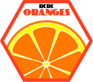
The teams in our competition are as follows:
- RCRC Oranges (colour - Fluro Orange)
- Gateway Gnu's (colour - Fluro Pink)
- Victoria Point (colour - Green)
- Bulli's XI (colour - Yellow)
- Cleveland Saints - (colours - Green and Blue)
- Salvos XI -
Any ideas are welcomed. Thanks for your time guys...