- Aug 18, 2009
- 4,229
- 17,495
- AFL Club
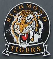
- Richmond
The logo from when we were the Esso Tigers was the best by a mile...

Follow along with the video below to see how to install our site as a web app on your home screen.
Note: This feature may not be available in some browsers.
The logo from when we were the Esso Tigers was the best by a mile...
")
This was my favourite it is the most realistic representation of a Tigers head, but I'm reasonably happy with the new logo, maybe they could have made it a bit less cartoony, I used to love our 80's logo and still have a Tetleys training top bought on the Thursday before the big one with that tiger on itYes
The new one is schit and looks like a pansy cartoon

I still have an enormous plastic version of that I got at the Royal Melbourne Show in I think 1982.I liked this one as a kid but I'm glad it's not our current logo
I still have an enormous plastic version of that I got at the Royal Melbourne Show in I think 1982.
Been saying that for ages, even in a thread directly suggesting it to RFC official... When we got the New Era range I was hopeful, but no instead we got a big yellow R insteadi just wish we could get that '46 monogram on a hat...
Was that ever an official logo, I have that on a few old badges from the 80's era?I liked this one as a kid but I'm glad it's not our current logo

View attachment 88775
5 min job on paint, but is a more modern version of the 80's logo. more realistic tiger, and includes the sash.
links the past and the future of the club.
i'd like to see something more like this