MKMatty
Busy Vibin’
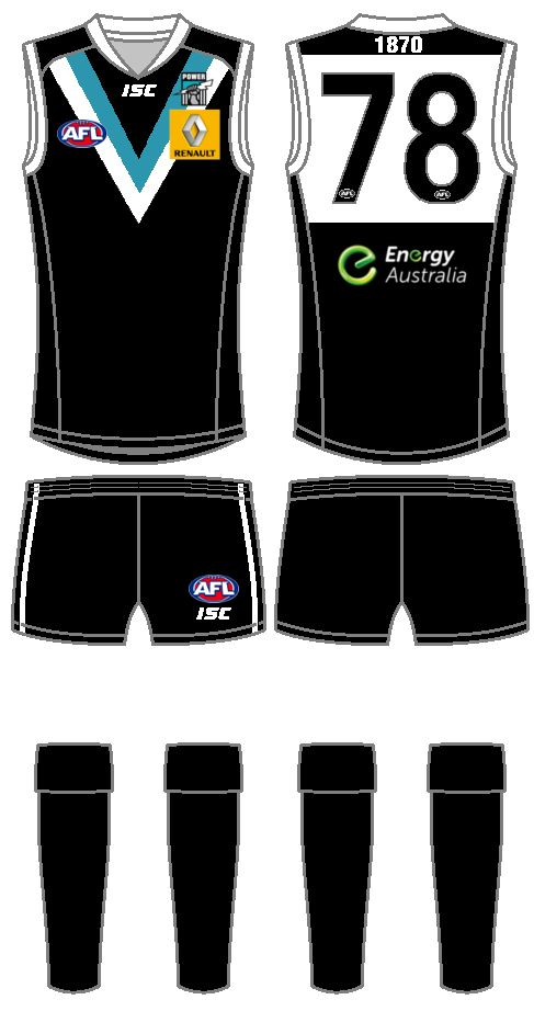
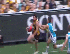
I must be in the minority but I genuinely like every jumper Port have had, especially the white clash with the teal back. Reminds me so much of that hanger Logan took against the Hawks (I think). So good.
EDIT:
I love how Treads just claps him. Haha.
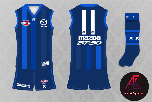
Great mark. Disgusting jumper.
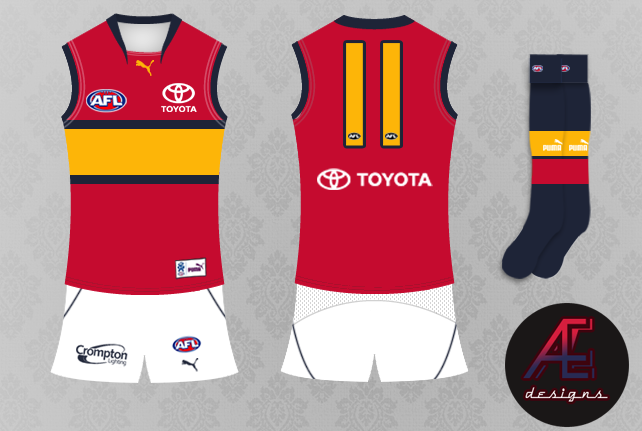
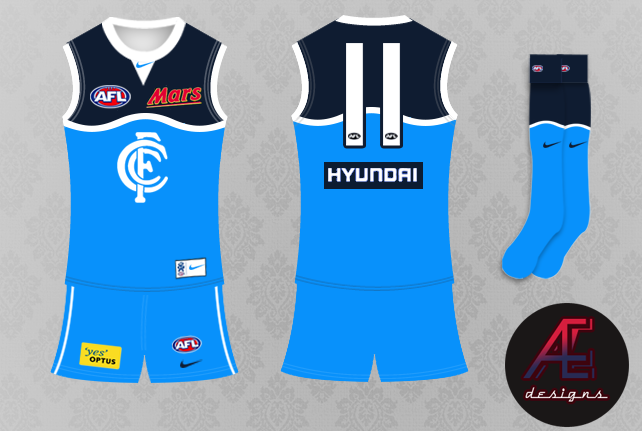


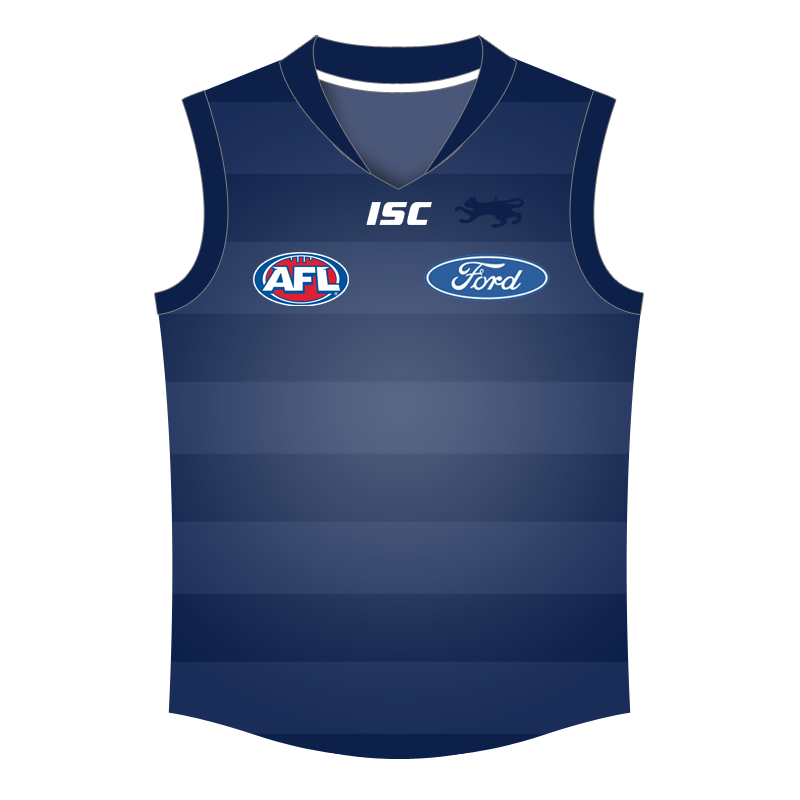
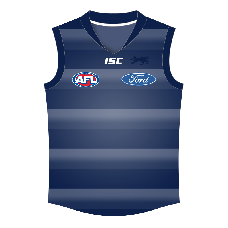
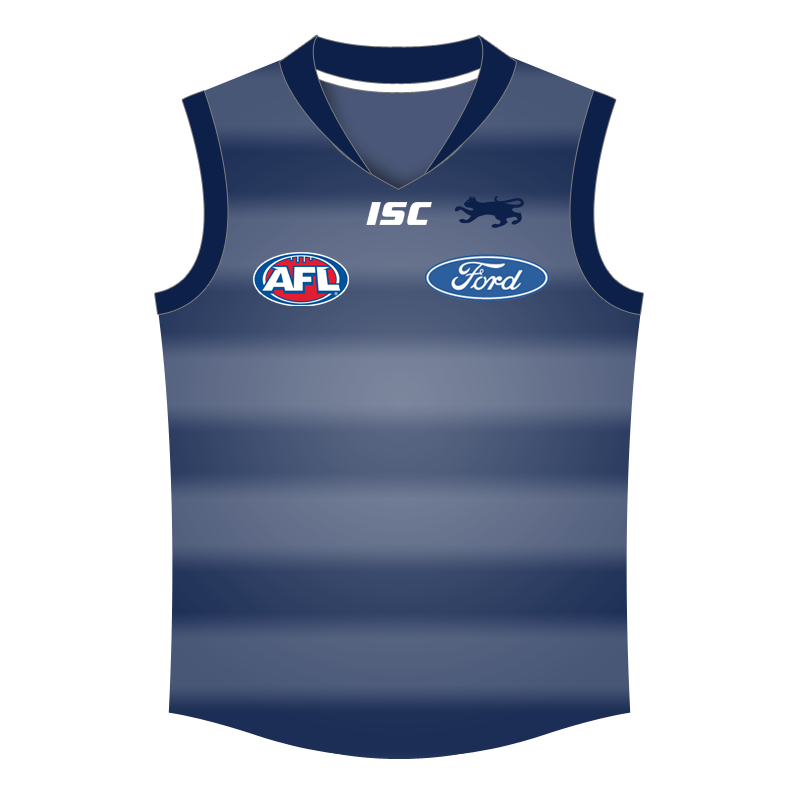
 stripes.