

I wasn't really a fan of the clash in that match up. It may have been the shade of sky blue used, it just looked washed out to me. Last seasons Jaguars clash had a similar idea with the Perth silhouette outline on the front and I have a feeling akkaps tried to mimic it here. Problem was, with just the one landmark, it doesn't really work that well (to me that is)If that guernsey was done in higher end software, I have no doubt it would have been a bolter. The only reason you'll lose votes is because of the jagged edges etc. but the design is great. Hence why you got the nod from me.
Navigation
Install the app
How to install the app on iOS
Follow along with the video below to see how to install our site as a web app on your home screen.
Note: This feature may not be available in some browsers.
More options
-


LIVE: Richmond v Melbourne - 7:25PM Wed
Squiggle tips Demons at 77% chance -- What's your tip? -- Team line-ups »
You are using an out of date browser. It may not display this or other websites correctly.
You should upgrade or use an alternative browser.
You should upgrade or use an alternative browser.
Competition NAFL 2014-15 Season Hub
- Thread starter E92_
- Start date
- Tagged users None
- Aug 21, 2007
- 31,666
- 99,002
- AFL Club
- Port Adelaide
- Other Teams
- Aston Villa, San Antonio Spurs
Havent you been working on the logo for ages as well? So a team to finally match the logo?
Yeah it started a few years back as a Melbourne Tigers concept and has developed to it's current finished state over several iterations since then.
It's my baby. It also really reflects my design development quite well because I upgraded it every time I felt I had the skills to.
Very happy to have it attached to my NAFL team long term.
Jack Stevens
#2 Ticket Holder
I wanted to go with a country Victoria location with a decent population and a bit of history. So I went with Ballarat, and have the blue and white representing all of Victoria.
The Diggers name was supposed to be a tie in of Ballarat's mining history, and wider Australian war history. And that's what the gold represents.
The Diggers name was supposed to be a tie in of Ballarat's mining history, and wider Australian war history. And that's what the gold represents.
- Moderator
- #29
Im curious. How and why did everyone choose their colours and nickname for their teams. I see a lot of alliteration/assonance in nicknames, and a few (like Adelaide River and Mt Isa) who have significance to the location.
Personally, I chose the colours of Green, Blue and silver because I wanted to take on the challenge of the adage "Blue and Green should never be seen, without a colour in between". Silver was chosen as the colour of a swordfish's scales.
I originally had light blue with a red and white striped panel down the middle; the blue representing the sky and the red/white representing the main tower of Mt Isa as shown below:
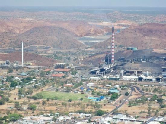
But this year I thought the colours clashed a bit too much, so with a little bit of a creative backstory the newer dark blue/teal colour is based around the sky on a stormy night in Mt Isa. And as the rain buckets down on the tower, the paint runs and creates a surprising but wonderful two-toned pink effect!
Damo Crows Fan
Club Legend
I designed mine just after Gernany won the world cup. I was obsessed with Germanies jersey design with the multiple tones of red, and messed about with other colours. Blue worked really well and the idea for a sash evolved pretty. Naturally.
The logo is obviously an adaptation of the german eagle, but with a WedgeTail and a southern cross design.
The logo is obviously an adaptation of the german eagle, but with a WedgeTail and a southern cross design.
That last paragraph sounds like the start of a Bryce Courtney storyI originally had light blue with a red and white striped panel down the middle; the blue representing the sky and the red/white representing the main tower of Mt Isa as shown below:

But this year I thought the colours clashed a bit too much, so with a little bit of a creative backstory the newer dark blue/teal colour is based around the sky on a stormy night in Mt Isa. And as the rain buckets down on the tower, the paint runs and creates a surprising but wonderful two-toned pink effect!
Are you originally from Mt Isa? I wouldn't think that someone who wasn't local or hadn't been there numerous times would reflect on a stormy night or the paint colours.
- Moderator
- #32
That last paragraph sounds like the start of a Bryce Courtney story
Are you originally from Mt Isa? I wouldn't think that someone who wasn't local or hadn't been there numerous times would reflect on a stormy night or the paint colours.
Haha! No I've never been, I've lived in Victoria all my life. My dad's been there though and he has a Mt Isa t-shirt, for whatever reason it inspired me to look up the place and research it more for my NAFL entry
The Wellington Makos colours are an evolution of the original Wellington Whales colours of black, blue teal, and white. These colours are commonly used in New Zealand national sport (also being the only NZ team seemed fitting to represent the whole nation) and also represented the ocean (teal), the whale (black) and the foam from a whale breaching (white). In their later versions the teal became more like the one used by New Zealand teams and began incorporating light grey. When they were re-branded, the black was lightened slightly, but the other colours remained.
The designs originally were based on the teams nickname, with early designs featuring a whale or part of a whale, followed by using a stylised silverfern to create a whales tail in the design. After the re-brand the designs became more NZ oriented while still having elements related to the new Makos name (sharp points/angles representing agression). While this years away (when revealed) has a returning though modified design element from the Whales guernseys but now representing a sharks fin.
This season will also see the Makos move away from representing the whole of New Zealand and the Maori culture in their heritage design to more representing their home city while still representing Maori culture.
E92_
Premium Platinum
- Thread starter
- #34
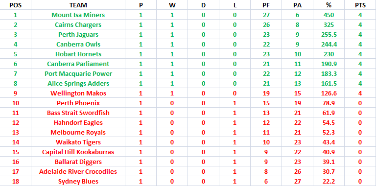
Round 1 ladder (tell me if you see anything wrong).
Round 2 is up:
http://www.bigfooty.com/forum/threads/nafl-round-2.1080827/#post-35892895
Round 2 is up:
http://www.bigfooty.com/forum/threads/nafl-round-2.1080827/#post-35892895
E92_
Premium Platinum
- Thread starter
- #36
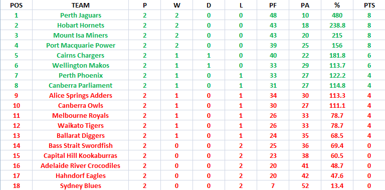
Round 2 ladder (tell me if you see anything wrong).
Round 3:
http://www.bigfooty.com/forum/threads/nafl-round-3.1081116/
Round 3:
http://www.bigfooty.com/forum/threads/nafl-round-3.1081116/
Damo Crows Fan
Club Legend
Sigh so much praise, so little improvement.
- Aug 21, 2007
- 31,666
- 99,002
- AFL Club
- Port Adelaide
- Other Teams
- Aston Villa, San Antonio Spurs
Sigh so much praise, so little improvement.
This is a particularly brutal competition.
9 very good designs are losing every week.
- Moderator
- #39
This is a particularly brutal competition.
9 very good designs are losing every week.
It is brutal but I still think it's the best representation of the talent this board has, there are so many 50/50 games (no disrespect to the NAFL Reserves but this is a much more even comp).
May the NAFL prosper long into the future – of the four seasons only two were completed, with the original proposal dying out after the bid announcements (likely due to the busy Xmas period, I refer to it as "season zero" in my soon to be released history piece) and what was technically season two being abandoned after four rounds.
Only seasons one and three got a full fixture completed and winner announced (Cory's Melbourne Flying Foxes and lmach's Perth Jaguars respectively)
Jack Stevens
#2 Ticket Holder
http://tinyurl.com/Diggers-Cats-blue-over-goldThe Ballarat Diggers are seeking legal advice, after it was revealed that the Geelong Cats of the AFL would be adding gold to their colour palette.
Geelong have traditionally worn blue and white, colours it shares with Ballarat. But the Diggers believe that by adding gold to the mix, the Cats are aggressing on their copyright.
"If the NAFL's going to continue in becoming the premier code of Australian Rules football, then we need to stand our ground and protect what's ours," a club spokesperson said.
"Gold is a unique and integral part of our brand, which Geelong have no right to use. This is a petty move from a club which is losing ever more support in country Victoria".
Geelong Football Club declined to comment when approached.
Jones2ByrneJones
Hour of Pessimism
- Jul 27, 2012
- 15,820
- 27,995
- AFL Club
- Port Adelaide
We've gone next level
- Aug 21, 2007
- 31,666
- 99,002
- AFL Club
- Port Adelaide
- Other Teams
- Aston Villa, San Antonio Spurs
I for one am proud that the diggers are never gonna give blue white and gold up.
This was just posted on the Parliament twitter page.@CanberraParliament 2h
@BallaratDiggers As a fellow Navy, Gold and White wearing team, we wish the Diggers all the best in this 'blue' of yours#DigTheirGrave #DontSueUsToo
Last edited:
E92_
Premium Platinum
- Thread starter
- #45
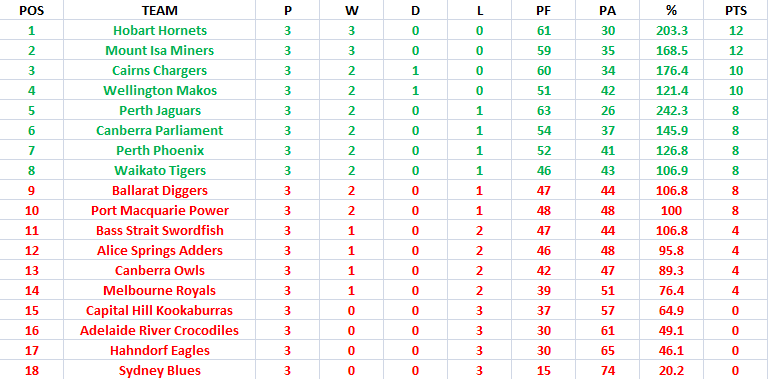
Round 3 ladder (tell me if you see anything wrong).
Round 4:
http://www.bigfooty.com/forum/threads/nafl-round-4.1081303/
Round 4:
http://www.bigfooty.com/forum/threads/nafl-round-4.1081303/
Greater Gattsby
♛ All Class ♛
- Oct 6, 2011
- 8,865
- 11,421
- AFL Club
- North Melbourne
- Other Teams
- Melbourne Victory | West Ham United
My perfect percentage <3Round 3 ladder (tell me if you see anything wrong).
Round 4:
http://www.bigfooty.com/forum/threads/nafl-round-4.1081303/
E92_
Premium Platinum
- Thread starter
- #47
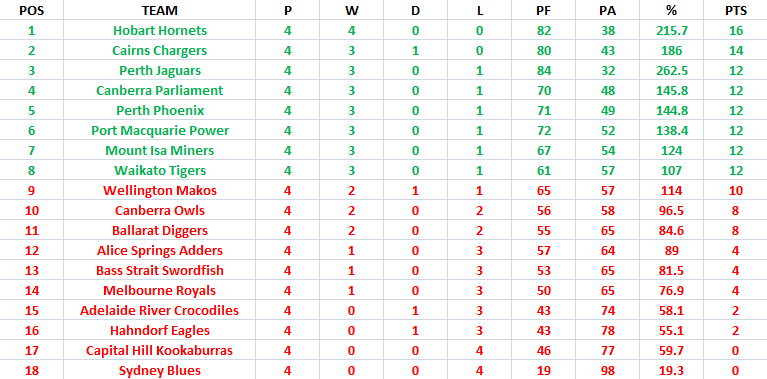
Round 4 ladder (tell me if you see anything wrong).
Round 5:
http://www.bigfooty.com/forum/threads/nafl-round-5-rivalry-round.1081526/#post-36030333
Round 5:
http://www.bigfooty.com/forum/threads/nafl-round-5-rivalry-round.1081526/#post-36030333
Yeah sorry to intrude but uh it looks like 'Alice Springs Adders' are missing a few wins there, if you could fix that up I'm sure the owner would be stoked.
See you round,
Dylan.
See you round,
Dylan.
Bacon Warrior
D10
Top of the table
* yeah
* yeah
Similar threads
- Replies
- 19
- Views
- 1K
