And in sponsor form


Follow along with the video below to see how to install our site as a web app on your home screen.
Note: This feature may not be available in some browsers.
nar, i just felt like posting some good decent looking logos, i thought thats what this thread was about?
Amongst other things, such as highlighting changes, discussion of logos in general is what this thread is about. So Klim, you're wrong. Cody, you didn't offer any discussion though. There was literally no context or accompanying text. We aren't mind readers, we had no idea what you were trying to do.NO. Its about posting changes to logos.
next time ill write a description instead of just dumping some logos hahaAmongst other things, such as highlighting changes, discussion of logos in general is what this thread is about. So Klim, you're wrong. Cody, you didn't offer any discussion though. There was literally no context or accompanying text. We aren't mind readers, we had no idea what you were trying to do.
EFAThe Cleveland Browns of the NFL are getting a logo finally on the 24th of Feburary.
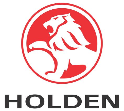
Does anyone else find the new squared-off Holden font really clumsy looking? I can't find it on google, but it's on all their new TV ads.
This one?

The old one for reference:
"Let's Go There" Probably shouldn't have. Anyway, I have it on good word this will be the next Holden logoNo, it's even worse than that one. Blocky and overly rounded and, well, crap.View attachment 110810
Nice that they gave their work experience kid something to do though.
love that logo...."Let's Go There" Probably shouldn't have. Anyway, I have it on good word this will be the next Holden logo
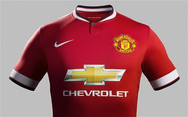
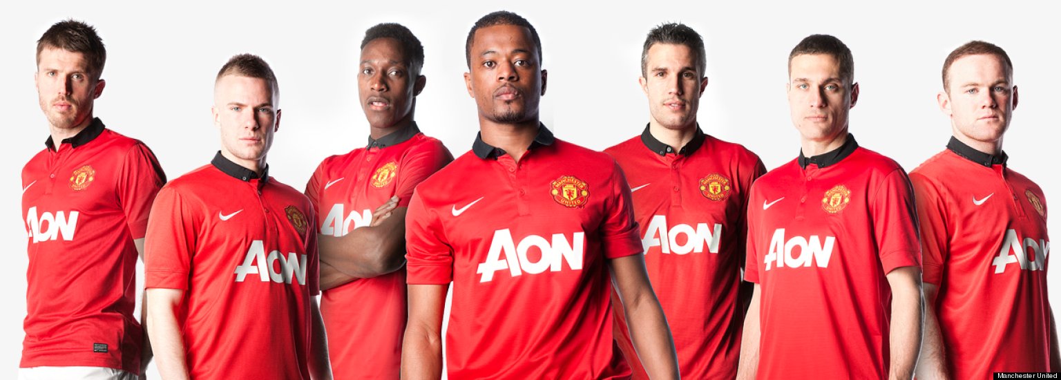
looks so good on a man u kit

Aon was good. Plain and simple, doesnt distract from much. Looked especially good on the blue tartan kitmate its better than Aon...


Then.
Before.
After.

You forgot this one, which comes third
And the latest one has the shading too, not flat like yours above
Agreed, the Chevrolet logo looks horrible on the Man U kit, if they used an outline of the logo it would work but as it is it does not compliment the kit what so ever.I like it when sponsors blend in with team colours
eg. Juventus with Jeep and Collingwoods CGU on the back before it had the blue then green backing