Navigation
Install the app
How to install the app on iOS
Follow along with the video below to see how to install our site as a web app on your home screen.
Note: This feature may not be available in some browsers.
More options
You are using an out of date browser. It may not display this or other websites correctly.
You should upgrade or use an alternative browser.
You should upgrade or use an alternative browser.
Post pictures of your club's 2015 Indigenous Guernsey
- Thread starter Cmarsh
- Start date
- Tagged users None
- Thread starter
- #27
Can barely see what the design is.
- Thread starter
- #28
Well then the sponsor is an entirely appropriate one.Geez unfortunate sponsor to have on an indigenous jumper...
EDIT: For those whose first assumption is wrongly a derogatory one, I was referring to the fact that these jumpers could be called "spot jobs"
- Aug 25, 2011
- 25,009
- 75,478
- AFL Club
- Fremantle
- Other Teams
- Coney Island Warriors, SFFC, Hajduk
That's kinda my point, it could be seen as belittling to refer to them as "spot jobs"
Therefore it is an unfortunate pairing IMO
Therefore it is an unfortunate pairing IMO
- Banned
- #30
99% of these tops looks terrible and almost as terrible as the 'story' behind each jumper. Also love the fact that aboriginal players get asked to do pics in this round and then never seen for the rest of the year. Will be waiting with bated breath as michael long gets interviewed 100 times this week, only good thing is seeing how much fatter he is this year than the last.
Geez unfortunate sponsor to have on an indigenous jumper...
Here's Freo's this year
View attachment 137638View attachment 137639
EDIT: For those whose first assumption is wrongly a derogatory one, I was referring to the fact that these jumpers could be called "spot jobs"
Dot
1.
a small round mark or spot.
Job
2.
a task or piece of work
Nothing beats the Hawthorn Indigenous jumper featuring the word Tasmania............................................
- May 3, 2006
- 11,979
- 7,033
- AFL Club
- West Coast
- Other Teams
- West Perth, Donnybrook FC, Steelers

Optical illusion

Ochre
Stop the Steal!
Riccardo11
Cancelled
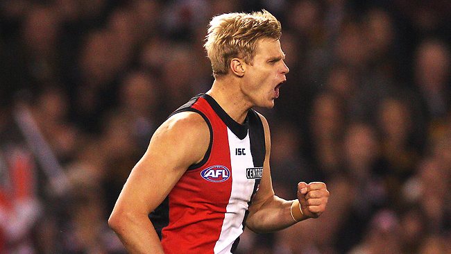
Why?That St kilda one takes the cake. Terrible.
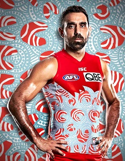
We obviously had to have a predominantly white strip as we are playing up in Brisbane, and it has avoided the obvious design elements everyone else is doing.
It's not the best design we've ever had, but it's far from the worst. It's probably one of the better ones from this years batch, most of the others are either too busy or too simple.
- Sep 25, 2013
- 14,447
- 22,047
- AFL Club
- Sydney
- Other Teams
- Norwich City, Detroit Pistons
Gee seems designed to draw even more attention to Nick Riewoldt's perpetually erect nipples lol

Mezz
Club Legend
- Aug 27, 2010
- 1,844
- 2,087
- AFL Club
- Fremantle
- Other Teams
- Perth Scorchers


Would be great if they didn't have to put the corporate logos on for one round.
Appreciate the symbolism that the Artist Luke Penrith has tried to represent.
Really love this one. Shame about the pink/blue/green of the corporate logo as the orange/black/white is excellent. The orange reminds me of the colour of the red dust up north too so very fitting.

why do they need that magpie? Looks like he's planning to swoop on those kids grabbing grub.
Pacman theme?
since when did the indigenous folk round the bay wear braces or worship spiders?
Optical illusion
Riccardo11
Cancelled
I don't dislike the jumper on it's own, but what moron put that background there?
since when did the indigenous folk round the bay wear braces or worship spiders?
Worship spiders is possible if you refer to the current indigenous inhabitants of St Kildas, they pretty cray cray.
I like all of them except the Eagles one. Would be nice if you could get them without the sponsor logos on them.
SydneyMalakellis
Senior List
FIAT!!!!! logo needs to be bigger in my opinion.
- Jul 25, 2008
- 3,915
- 2,537
- AFL Club
- Collingwood

- Other Teams
- Indiana Pacers

I like the Richmond one. Not doing too much, but pays tribute while maintaining their traditional strip.
Similar threads
- Replies
- 0
- Views
- 203
- Replies
- 14
- Views
- 1K
- Replies
- 65
- Views
- 3K
- Replies
- 14
- Views
- 921


