Navigation
Install the app
How to install the app on iOS
Follow along with the video below to see how to install our site as a web app on your home screen.
Note: This feature may not be available in some browsers.
More options


You are using an out of date browser. It may not display this or other websites correctly.
You should upgrade or use an alternative browser.
You should upgrade or use an alternative browser.
News 2015 Adelaide Crows BLK apparel
- Thread starter Hank93
- Start date
- Tagged users None
- Oct 31, 2014
- 1,726
- 4,014
- AFL Club
- Adelaide
- Other Teams
- Miami Heat
Looks awesome I reckon. Would love a to see a white background/clash guernsey, if they insist on one with a character on it.New Indigenous guernsey on pre-sale on CrowMania site, not too bad, beak's a bit long so it does make it look a bit like a Pelican...
http://shop.afc.com.au/adelaide-crows-2015-mens-replica-indigenous-guernsey-pre-sale-94016.phtml


Footypie32
especias secreto
Sorry I meant Instagram, they have only put up a couple of close ups of 3 items but I thought there might be more in store, apparently will be online soon.
View attachment 118990 View attachment 118989
Those beanies are sweet.
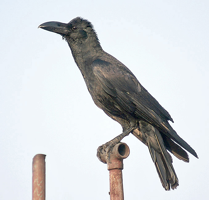
I know it's the particular Indigenous style with the long beak and it's a good design but here's what a 'shorter beak'/more traditional crow beak would've looked like

Red mist
Reynholm Industries
- Jun 30, 2014
- 29,143
- 34,097
- AFL Club
- Adelaide
- Other Teams
- Tottenham Hotspur, East Side Hawks
While I like it, I'm more inclined to think the bird is a kingfisher as there are fish inscribed in the wings on either side of the red birds head on the front. Would explain the longer beak.New Indigenous guernsey on pre-sale on CrowMania site, not too bad, beak's a bit long so it does make it look a bit like a Pelican...
http://shop.afc.com.au/adelaide-crows-2015-mens-replica-indigenous-guernsey-pre-sale-94016.phtml
Tex Support
Club Legend
- Oct 17, 2012
- 2,032
- 3,675
- AFL Club
- Adelaide
- Other Teams
- Norwood, Houston, UT Longhorns
That jumper kicks arse.
The club should get Bunji to organize a design for a permanent away guernsey.
Everything the great man does touches turns to gold.
The club should get Bunji to organize a design for a permanent away guernsey.
Everything the great man does touches turns to gold.
The original is obviously a very stylised design showing a swooping crow. Your stubby beak wrecks the proportions. I think they nailed it with the original, and is one of the best bird guernseys I've ever seen.I know it's the particular Indigenous style with the long beak and it's a good design but here's what a 'shorter beak'/more traditional crow beak would've looked like
Justinpa1
Club Legend
- Oct 21, 2013
- 1,245
- 1,643
- AFL Club
- Adelaide
- Other Teams
- Norwood Redlegs, Liverpool FC,49ers
Looks brilliant, definitely better than last year's. Welldone Bunj
Pdub
Norm Smith Medallist
I think it's meant to be a jungle crow, which I think is found on the Torres strait islands.
I think it looks great, third year in a row we have come up with a good design including that simple black red and yellow hoops one.
Here is a video, looks good on the players
http://www.afc.com.au/news/2015-03-28/new-indigeous-guernsey-revealed
Here is a video, looks good on the players
http://www.afc.com.au/news/2015-03-28/new-indigeous-guernsey-revealed
Last edited:
Really like it. Another excellent design.
Love it.
Maybe a less complicated design of that crow as our logo. Love the youtube clip that goes with it describing it.
Maybe a less complicated design of that crow as our logo. Love the youtube clip that goes with it describing it.
Red mist
Reynholm Industries
- Jun 30, 2014
- 29,143
- 34,097
- AFL Club
- Adelaide
- Other Teams
- Tottenham Hotspur, East Side Hawks
Thankyou, that probably clears up some reservations I had regarding the species of bird.I think it's meant to be a jungle crow, which I think is found on the Torres strait islands.
- Apr 12, 2012
- 4,266
- 7,036
- AFL Club
- Adelaide
- Other Teams
- Ricciardo, Red Sox
So good. Well done Macca. Put this man in charge of our away guernsey!
Reckon I'll have one with a 23 on it!
DD#23
Norm Smith Medallist
- Dec 31, 2013
- 9,127
- 12,400
- AFL Club
- Adelaide
just realised how strangely appropriate the "murder of crows" guernsey would have been right now...Design looks great; I don't understand why the video doesn't mention the 'we fly together' tag line though.
speaking of which, not sure I'm ready for the first time those claws come out either... haven't thought about it for a while, it was like it was just a bad dream.
- Mar 20, 2013
- 4,945
- 4,974
- AFL Club
- Adelaide
AgreeLove it.
Maybe a less complicated design of that crow as our logo. Love the youtube clip that goes with it describing it.
Love the design for the Guernsey but as a logo, shorter beak, wings and claws and obviously simplify the design elements within and its a great start point.
The explanation on the meaning/relevance of the pose is a great way to sell the design too- much easier to buy into than a clear copy of another logo aimed at a younger demographic!
It's that kind of thought and explanation that should go into a design of a logo
Also, wings are often the bit that can look awkward in bird logos but Macca has absolutely nailed that element IMO.
Would love to see someone with the necessary skills adapt this to logo style
- Moderator
- #925
It would be great to have a Ladies polo shirt of this design and also some childrens wear.
Similar threads
- Poll
- Replies
- 581
- Views
- 20K
- Replies
- 2K
- Views
- 28K
- Replies
- 430
- Views
- 22K
