


Jones2ByrneJones
Hour of Pessimism
- Jul 27, 2012
- 15,820
- 27,995
- AFL Club
- Port Adelaide
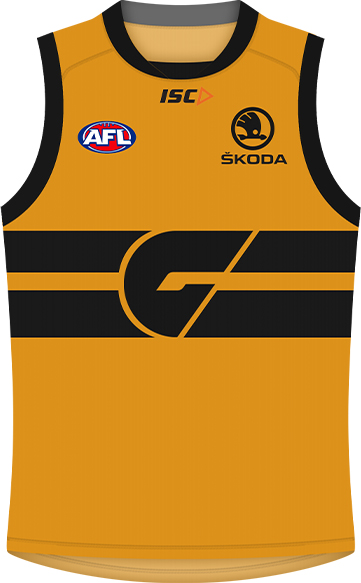
Just seeing this above the AFL's Draft Tracker. I reckon that grayscale GWS guernsey on the right looks pretty good!

Follow along with the video below to see how to install our site as a web app on your home screen.
Note: This feature may not be available in some browsers.
Make the G orange and it would make a good clash IMOJust seeing this above the AFL's Draft Tracker. I reckon that grayscale GWS guernsey on the right looks pretty good!
is it real or has it just been edited to fit in with the photo?Just seeing this above the AFL's Draft Tracker. I reckon that grayscale GWS guernsey on the right looks pretty good!
Edited. We don't have a greyscale jumper, even though it'd look awesomeis it real or has it just been edited to fit in with the photo?
I still wish the hyundai logo was in a white box like it used to be.

Now that looks classy
Are you being sarcastic? Because how the hell is a monotone logo that blends in well with the guernsey a bad thing?
because italic would never work.I was joking, chill!
This site seriously needs a sarcasm font.
The problem with italic is that it only works for one word, not a whole sarcastic sentence.because italic would never work.
I'm not quite sure what you're on about, works fine for meThe problem with italic is that it only works for one word, not a whole sarcastic sentence.
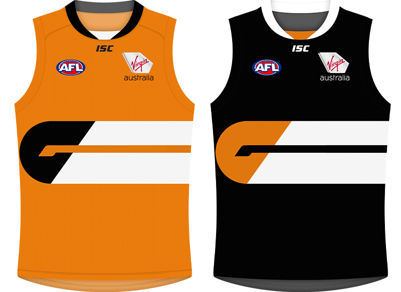
Honestly if the clash is anything other than this I'll be very surprised.
The perfect clash for Carlton. It's classy and it really suits the current CFC.Honestly if the clash is anything other than this I'll be very surprised.
I think I've seen that before on here. It's a great design. But I think I'd prefer it with a white G.GWS idea:
Tried to keep it simple.
I like the design, it feels retro (and maybe a little influenced from basketball?). However I couldn't see it being used as anything other than a training singlet.GWS idea:
Tried to keep it simple.
It looks terrible that way you idiot.I think I've seen that before on here. It's a great design. But I think I'd prefer it with a white
G.
change the black to charcoal and it'd be pretty goodGWS idea:
Tried to keep it simple.
I think I've seen that before on here. It's a great design. But I think I'd prefer it with a white G.
muahahahahaha...
No, Mr Rolleyes says more than a sarcasm font ever could.Is white text the 'sarcasm font'?

