- Aug 25, 2014
- 7,718
- 11,772
- AFL Club
- Richmond
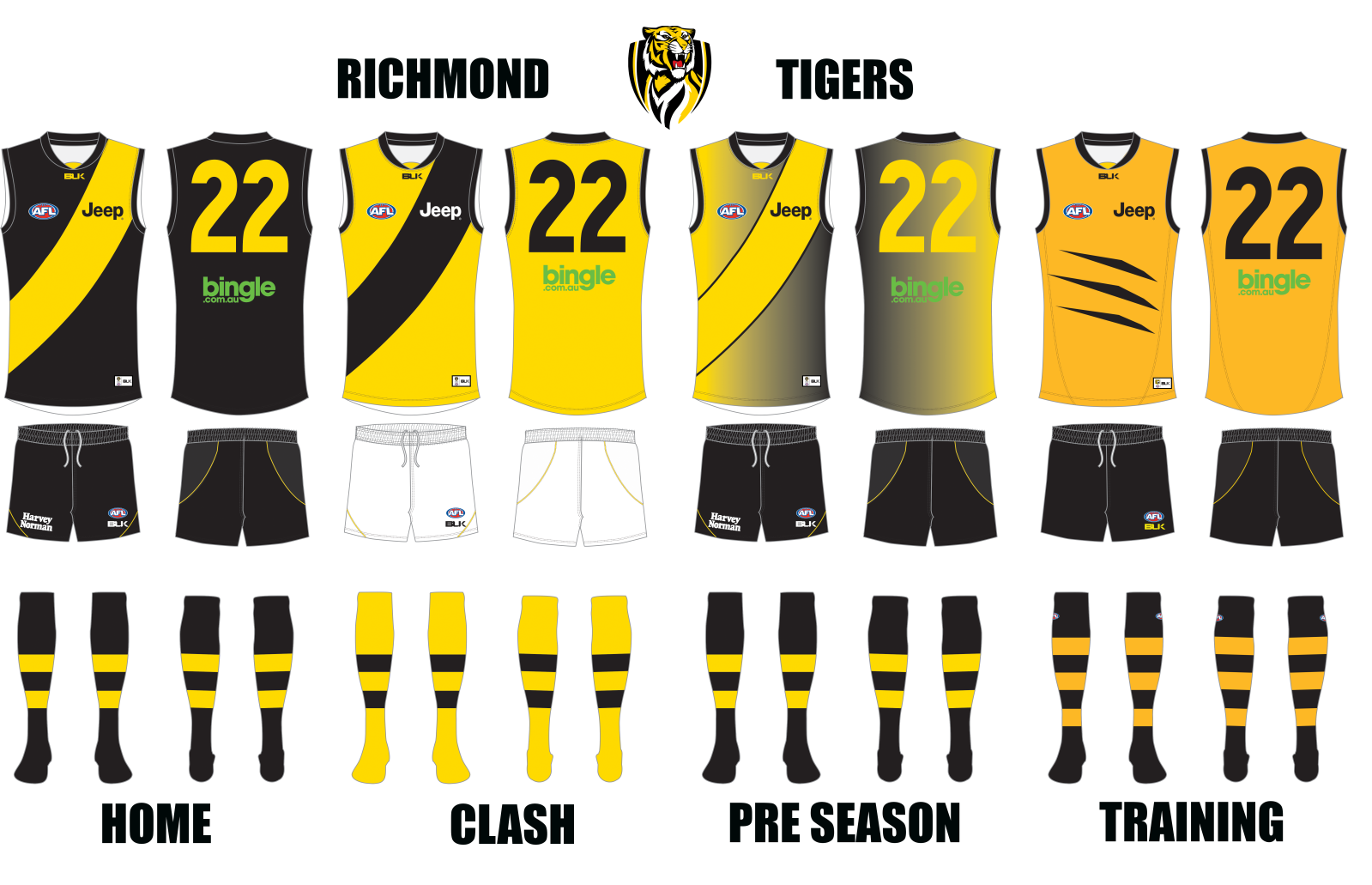
its alright,could be improved thoughThat is one putrid gradient, Cody.
Follow along with the video below to see how to install our site as a web app on your home screen.
Note: This feature may not be available in some browsers.
its alright,could be improved thoughThat is one putrid gradient, Cody.
With your sponsors, you'd be better off switching them for the clash, as the green looks horrible on the yellow and the Jeep one can be easily switched to black. The pre season is pretty horrible. Maybe you could work out how to have just the sash fade from black to yellow along the curve? As for the training, try and match the yellows used across all four kits so as to make it more uniformtesting my final design stuff and i put all my jumpers together to make this the way the tigers should be doing things...

yeh the training is a little tanned...With your sponsors, you'd be better off switching them for the clash, as the green looks horrible on the yellow and the Jeep one can be easily switched to black. The pre season is pretty horrible. Maybe you could work out how to have just the sash fade from black to yellow along the curve? As for the training, try and match the yellows used across all four kits so as to make it more uniform
never understood that one to be honest.favourite adelaide clash:
Yes. All gradient jumpers tend to be terrible.as for the pre season is it really that bad?
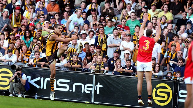
awesome. what about brown with yellow and white chevrons? or yellow with brown and whitehawks clash with port chevrons:
View attachment 109797
awesome. what about brown with yellow and white chevrons? or yellow with brown and white


I think he meant like Port has
T'was more like an away guernsey.favourite adelaide clash:
such a great matchup
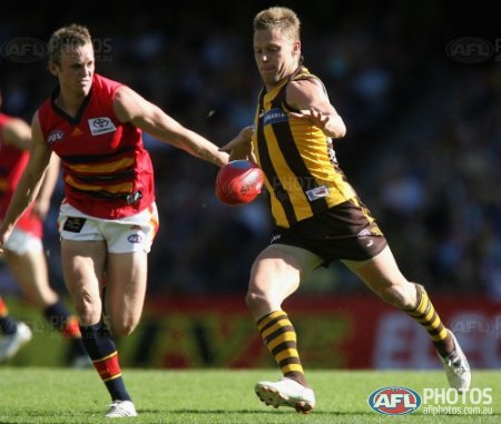
How's Buddy going for ya?
Looks extra impressive from this particular angle....
I'm glad he left when he did. We definitely got the best out of him.How's Buddy going for ya?


With that red Geelong, I'd make it orange. They have an affiliation with a drink driving avoidance organisation that appears on their socks once or twice, so having that appear on the guernseys would look good.Codym, I know one thing, the slash marks on that Richmond jumper are far more pleasing to the eye than Adelaide's effort.
My two cents given, I present a couple efforts...this Freo preseason guernsey that's actually been done for the better part of a year, but a rather annoying pc issue and me forgetting about it for a while conspired to delay its debut until now...
Port & starboard, together again!
This next one, I figure, will be a bit more controversial. I was poking around footyjumpers.com last week and decided to look at some Geelong jumpers. Apparently I hadn't noticed before that they'd worn red jumpers early in their history because everybody and their mama was in blue. Given I like to occasionally include something in a concept precisely because of how out of place it seems...well, you've been warned.
The preseason jumper is also based on a pre-VFL jumper, the main differences being the number panel and the subtle shadow hoops.
Thanks for looking, to those in WA, have a nice brunch, and to those in the rest of Aus, have a nice lunch.

Lovin the first cats one, could even be a clash jumper. Im assuming the freo one was first made when the red and green featured, looks good, what if the green and red were white. Then you could just have a bit more purple between the logo on the chest to make it stand out from the white.Codym, I know one thing, the slash marks on that Richmond jumper are far more pleasing to the eye than Adelaide's effort.
My two cents given, I present a couple efforts...this Freo preseason guernsey that's actually been done for the better part of a year, but a rather annoying pc issue and me forgetting about it for a while conspired to delay its debut until now...
Port & starboard, together again!
This next one, I figure, will be a bit more controversial. I was poking around footyjumpers.com last week and decided to look at some Geelong jumpers. Apparently I hadn't noticed before that they'd worn red jumpers early in their history because everybody and their mama was in blue. Given I like to occasionally include something in a concept precisely because of how out of place it seems...well, you've been warned.
The preseason jumper is also based on a pre-VFL jumper, the main differences being the number panel and the subtle shadow hoops.
Thanks for looking, to those in WA, have a nice brunch, and to those in the rest of Aus, have a nice lunch.
That Adelaide clash reminds me of when they played Richmond at Etihad who were massive outsiders and their tactic was just kick short and take no risks. I think it was the biggest upset of 2007 (?) and one of the most boring games of all time.
Why that colour?gws alternate:
View attachment 111930
That'd be better, and colder to their colours. One tip is make sure the White hoop is below the stitching layers I that said stitching can be seen as a continuous line
thanks for the helpThat'd be better, and colder to their colours. One tip is make sure the White hoop is below the stitching layers I that said stitching can be seen as a continuous line