Discussion 2015 Anzac Day Guernsey

Remove this Banner Ad

I'm yet to be convinced it has, though. Attendance and interest declined last year rather than improved, so there is much work to do to engage the Kiwis rather than just rely on fans from Australia to fly over to Wellington.

I'm also not convinced wearing our home jumper with a special NZ badge would engage the locals any less than specially designed one off strips.
I was speaking theoretically.

I'm not convinced either, however if those at the club think it may help then I have no problem ditching our traditional jumper for what is after all, one non-traditional game.

It is worth noting that the linked article did relate to the jumper and its design, so I suppose that's at least one article in the NZ media that wouldn't have appeared without taking this approach ;)
 
It's screams transformers, but there might be more than meets the eye there.
I don't mind it.
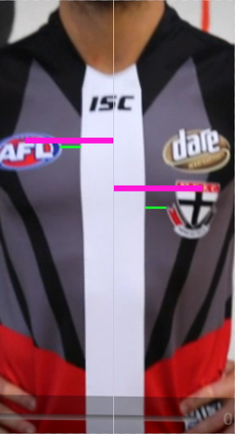
Has the Dare label pushed the Saints shield down a bit?.

I'm guessing that the logos have been digitally inserted, which is why they look slightly off. I am also guessing that the club is hoping that by removing the NZ tribal designs it generates some Australian based sales. Tribal designs would have been an imrpovement in my tribal opinion!

Kia kaha i piripono whanau St Kilda!
 
Last edited:

Log in to remove this ad.

It's been posted plenty of times, in plenty of places, but IMO this should be the bolted-on guernsey (minus the socks...).

View attachment 112137

The fern is great, but that pattern is atrocious. Way worse than anything they have come up with yet, particularly this one.

Worst one yet. And we were going so well with the home and clash strips, too.

The Shield appears to be halfway down the chest and actually off centre, but maybe thats to put the ANZAC badge and/or the poppy above the Dare logo.

Why we can't just wear the home jumper with a badge like every other team instead of slapping some swirls on jumper and calling it "Maori inspired" is beyond me.

Not sure what you mean by this? The logos are equidistant.

mN4P9dA.jpg
 
The fern is great, but that pattern is atrocious. Way worse than anything they have come up with yet, particularly this one.


Not sure what you mean by this? The logos are equidistant.

mN4P9dA.jpg
I meant it was off centre, it looks to be leaning to the right, but that may be the way the player is wearing it. I meant halfway down the chest because it appears to be below the tit, which is, if my anatomy is correct, half the distance between the neck and the waist.

Sorry if it wasn't clear.
 

Remove this Banner Ad

Back
Top