- Jul 9, 2010
- 24,163
- 26,536
- AFL Club
- Fremantle
Follow along with the video below to see how to install our site as a web app on your home screen.
Note: This feature may not be available in some browsers.
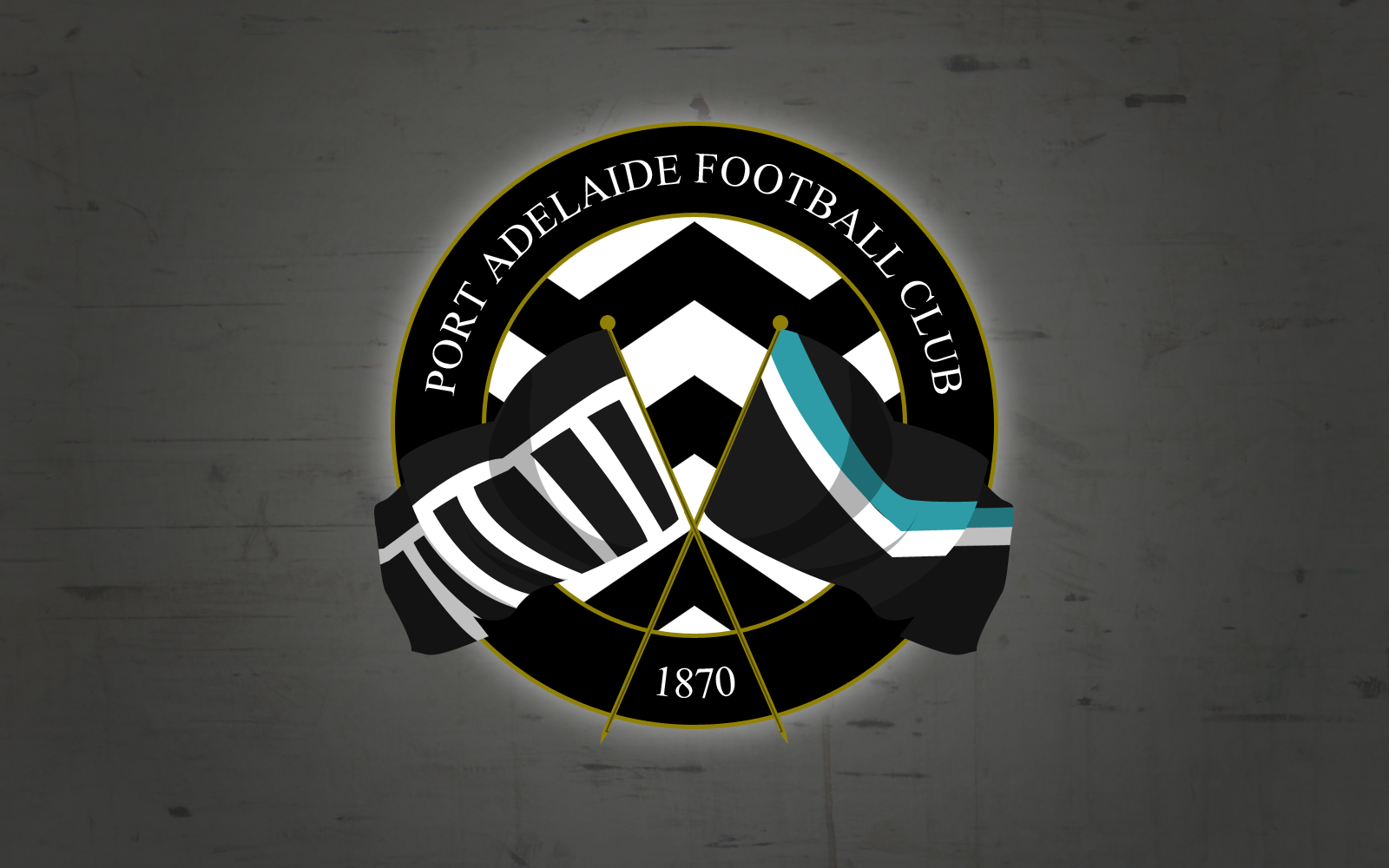
Good work! Perhaps make the numbers on the outside teal and 1870 underneath the monogram?
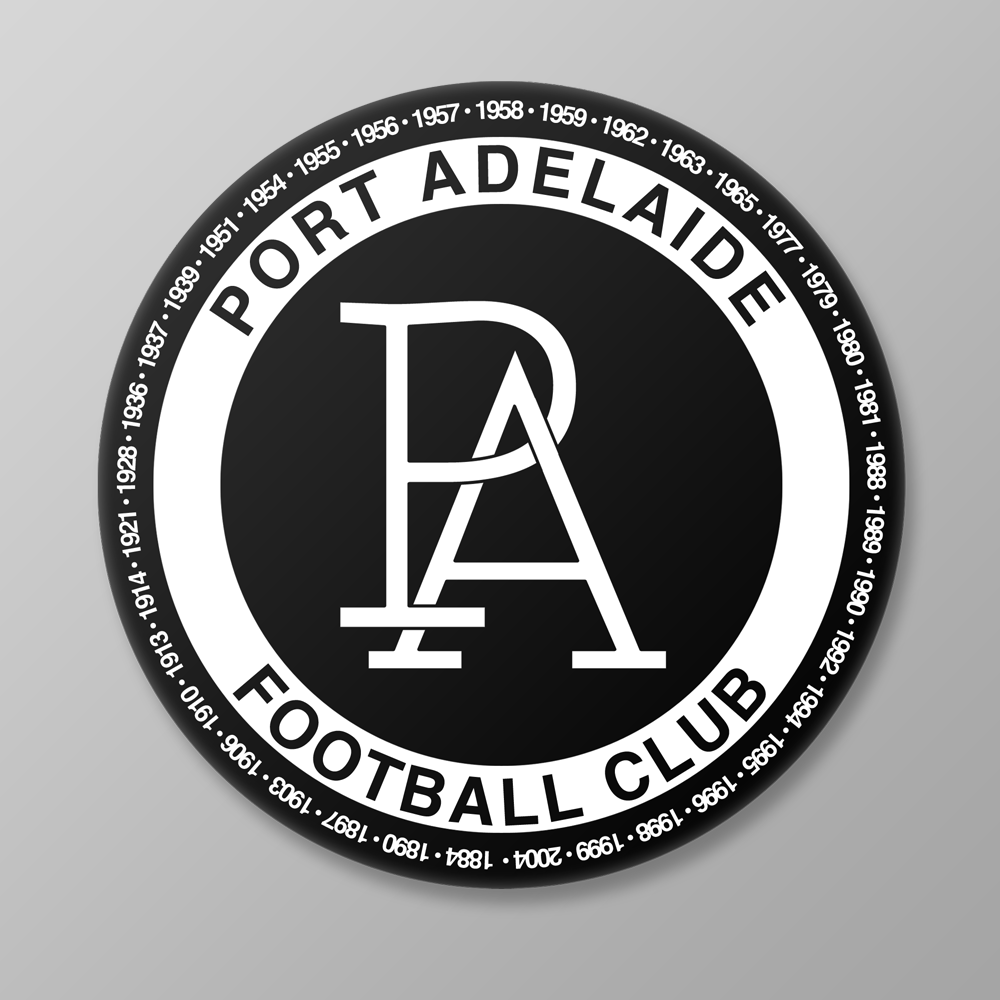
Incomplete Port Adelaide unification logo concept.
The monogram is taken from the New Era caps that Port released a while ago. It's surrounded by a ring of all of our premiership years. What's missing is "1870" and a little bit of teal. I wasn't sure where to put them, because it makes the logo look overly busy, so I've left it blank for the moment. I'm probably not going to put any power or magpies on there.
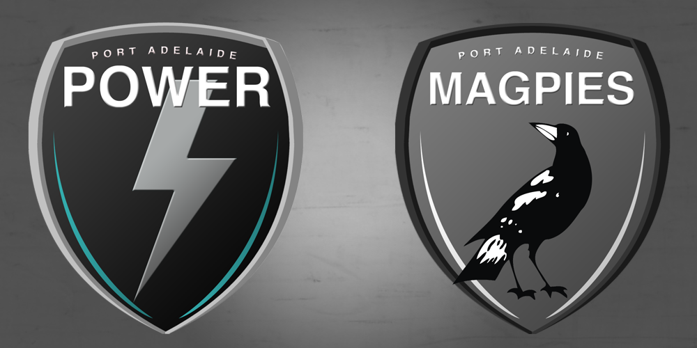
Once this is done, I'm looking to create two seperate (although similar) logos for the AFL and SANFL sides - with power (lightning bolt) and a magpie respectively. They'll be more cool, hip, etc, and are designed for media purposes and whatnot - like Geelong have done.
Incomplete Port Adelaide unification logo concept.
The monogram is taken from the New Era caps that Port released a while ago. It's surrounded by a ring of all of our premiership years. What's missing is "1870" and a little bit of teal. I wasn't sure where to put them, because it makes the logo look overly busy, so I've left it blank for the moment. I'm probably not going to put any power or magpies on there.
Once this is done, I'm looking to create two seperate (although similar) logos for the AFL and SANFL sides - with power (lightning bolt) and a magpie respectively. They'll be more cool, hip, etc, and are designed for media purposes and whatnot - like Geelong have done.
Yeah, maybe Essee Cross could do the same logo concept but for Fremantle?I'm not a fan of having all the premierships around the logo. Looks too busy for mine.
That was my major concern, but I think it's a nice sentimental touch.I'm not a fan of having all the premierships around the logo. Looks too busy for mine.
love it. good work mate
Incomplete Port Adelaide unification logo concept.
The monogram is taken from the New Era caps that Port released a while ago. It's surrounded by a ring of all of our premiership years. What's missing is "1870" and a little bit of teal. I wasn't sure where to put them, because it makes the logo look overly busy, so I've left it blank for the moment. I'm probably not going to put any power or magpies on there.
Once this is done, I'm looking to create two seperate (although similar) logos for the AFL and SANFL sides - with power (lightning bolt) and a magpie respectively. They'll be more cool, hip, etc, and are designed for media purposes and whatnot - like Geelong have done.

That looks really nice! great job
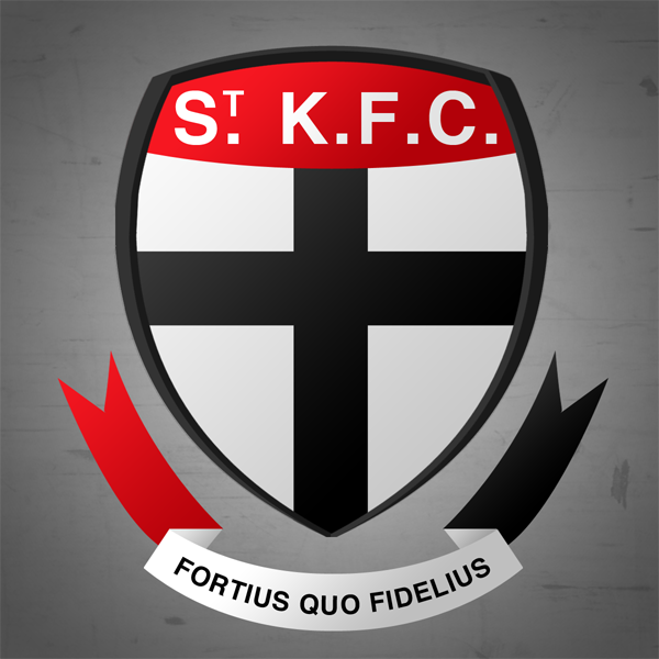
And using the same template as above, I present to you a slightly modernised/updated St Kilda logo.

The official supporters group has an interesting logo:
How would that look with the word Tigers where the word Official is and without Supporter Group?
I'd do it if my laptop wasn't rooted
I actually did this a while ago, I'll see if I can find it.Can someone please do a mock-up of a Port Adelaide logo using their The Port Club logo?