Navigation
Install the app
How to install the app on iOS
Follow along with the video below to see how to install our site as a web app on your home screen.
Note: This feature may not be available in some browsers.
More options


You are using an out of date browser. It may not display this or other websites correctly.
You should upgrade or use an alternative browser.
You should upgrade or use an alternative browser.
Competition AGOTW Week 9
- Thread starter Cory
- Start date
- Tagged users None
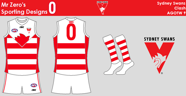
Mr Zero
All Australian
Marlowe
𝓤𝓷𝓽𝓸𝓾𝓬𝓱𝓪𝓫𝓵𝓮
- Mar 12, 2012
- 29,928
- 53,376
- AFL Club
- Melbourne
- Other Teams
- Gold City Royals
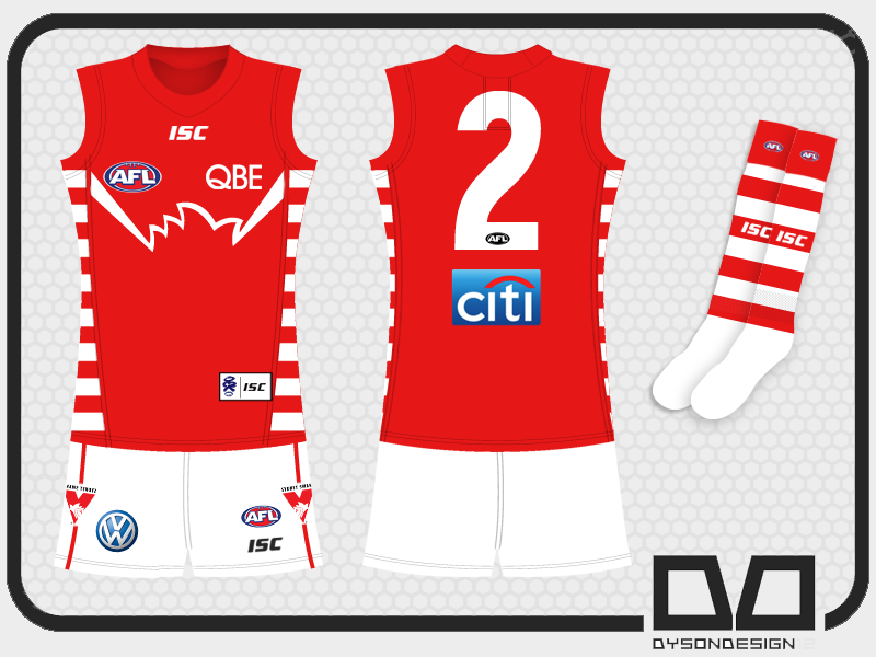
Entry #3:

Greater Gattsby
♛ All Class ♛
- Oct 6, 2011
- 8,865
- 11,421
- AFL Club
- North Melbourne
- Other Teams
- Melbourne Victory | West Ham United
Entry 1
Why the cream colouring.
Chamois Reinforcing?
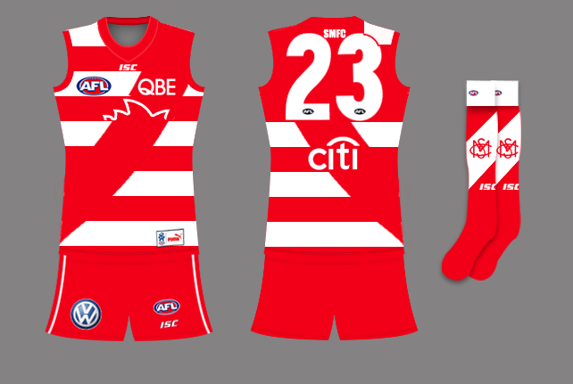
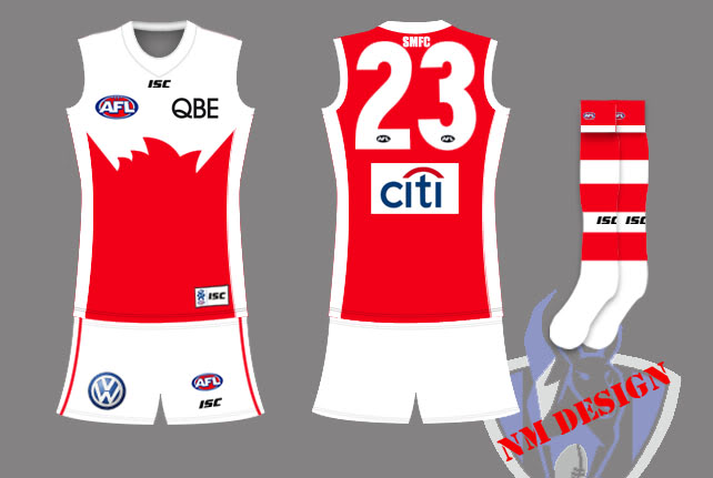
Hey dudes, here are my three.
#2
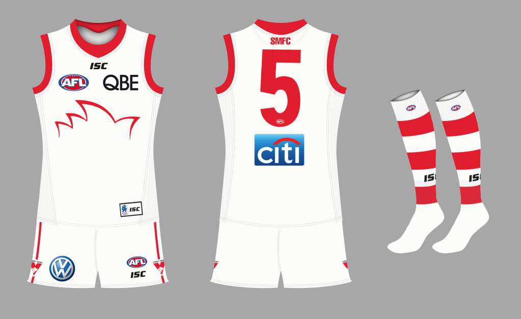
And Teen Wolf, that second entry is superb, Ive always thought the Harbour Bridge would look good on a Swans jumper but lack the skill to pull it off.
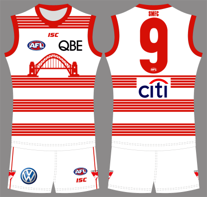
The Harbour Bridge looks squashed
The bridge is squashed into the front of the jumper. Increase the width of the bridge to give it the impressive look it has on Sydney Harbour. Look at the harbour bridge on the old Sydney Swans logo, it shows the bridge in the correct scale.
Mr Zero
All Australian
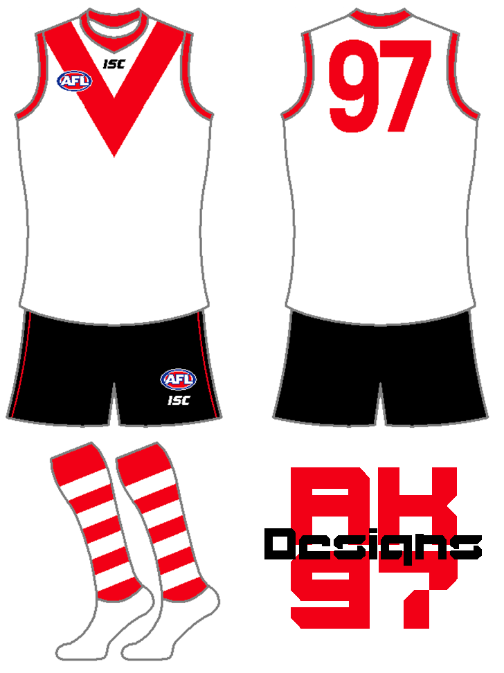
Chamois Reinforcing?
It wouldn't make sense because South never wore chamois reinforcement.
Kept it traditional and tried to make the fans of South Melbourne happy with my design.
It is the tradtional South Melbourne red V on white. The neck becomes red as the colour of the collar of the last South Melbourne jumper was red but the neck underneath was white. The Sydney Swans logo is placed in the red V.


Are there any rules in this competition stating how close to another persons design someone elses can be. Can you just put an extra logo on a design and call in your own.
Mr Zero
All Australian
Are there any rules in this competition stating how close to another persons design someone elses can be. Can you just put an extra logo on a design and call in your own.
You can hardly call your jumper "YOUR OWN" design there.
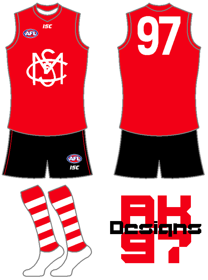
Sorry if my jumper looks like the old South Melbourne jumper because it is suppose to. The Brisbane Lions Melbourne jumper use to be so close to what the old Fitzroy jumper was that you would think they are the same team, which they are.
For old South Melbourne supporters to see the Swans to run out onto the ground in a jumper very similar to the one which South Melbourne wore would be good.
For old South Melbourne supporters to see the Swans to run out onto the ground in a jumper very similar to the one which South Melbourne wore would be good.
Mr Zero
All Australian
I don't have any problems with you using it but I'm just saying you can't get upset when someones design is similar.
Mullygrub
Team Captain
All the designs look really good. It is going to be really hard to get a winner.
This. Everyone has submitted very nice designs for this week
Now, these are very similar to the ones posted, so I apologise, but I've had these in my head for ages for Sydney to wear:
Entry 1
Entry 2
Entry 3
Entry 1
Entry 2

Entry 3
tassielions
Debutant
- Nov 12, 2009
- 122
- 35
- AFL Club
- North Melbourne
- Other Teams
- Fitzroy Football Club

Jumper number 3
Teen Wolf
Norm Smith Medallist
- Jul 5, 2011
- 8,115
- 8,923
- AFL Club
- North Melbourne
- Other Teams
- Afghanistan women's cricket team
The bridge is squashed into the front of the jumper. Increase the width of the bridge to give it the impressive look it has on Sydney Harbour. Look at the harbour bridge on the old Sydney Swans logo, it shows the bridge in the correct scale.
Thanks, but I am well aware of the bridge's correct scale.
Think of it more as a caricature rather than a true-to-life depiction. I've tried using a more realistic image, but it just didn't appear prominent enough on the jumper.
Thanks, but I am well aware of the bridge's correct scale.
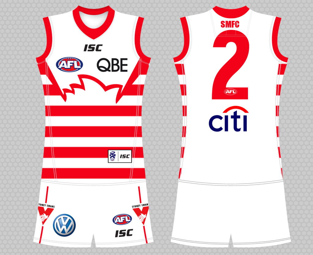
Teen Wolf, thank you for you comment as it provided inspiration for my third entry for this week. So with the Sydney Harbour Bridge in as far as I known as correct scale:

and my other two entries are:


Teen Wolf
Norm Smith Medallist
- Jul 5, 2011
- 8,115
- 8,923
- AFL Club
- North Melbourne
- Other Teams
- Afghanistan women's cricket team
Teen Wolf, thank you for you comment as it provided inspiration for my third entry for this week. So with the Sydney Harbour Bridge in as far as I known as correct scale:
I'm flattered ww, even though I'm not entirely sure how I managed to do that.
coolknot
Club Legend
- Nov 29, 2009
- 1,188
- 7
- AFL Club
- Western Bulldogs
- Other Teams
- Liverpool, Melbourne Heart, Boston
Unsure 'bout the black shorts, but nice designs especially the third.Now, these are very similar to the ones posted, so I apologise, but I've had these in my head for ages for Sydney to wear:
Entry 1
Entry 2
Entry 3

That's what they wore. And cheers.
Omegaville
Club Legend
Similar threads
- Poll
- Replies
- 6
- Views
- 602
- Replies
- 20
- Views
- 1K
- Replies
- 0
- Views
- 438
- Replies
- 5
- Views
- 655
