Workshop Alternative Guernsey Ideas

Remove this Banner Ad

Re: What should happen...

The Richmond jumpers look 100 times better without the bloody green Bingle logo.

I disagree - I like the green. But that's a personal preference. The blue of AFG probably wasn't as jarring.
 
Re: What should happen...

What a sexy looking jumper, love it :thumbsu:

Agreed. It's one of my two favourite Port designs - the current one is an instant classic but this is one is more iconic and distinctive for Port Power.

do we know if there's going to be any text on the new Tigers logo?

I'd assume there would be, but I have no idea how it'd look.
 
Re: What should happen...

St Kilda

stkildalogo.png


stkildahome.png


The Saints logo and home jumper are great. The black cuffs do make the jumper darker and more intimidating; however, it does make the jumper slightly less identifiable as St Kilda - more almost all of their history, St Kilda has worn either white or black and white cuffs.

stkildaclash.png


The clash jumper is based on St Kilda's 1933 jumper.

stkildapreseason.png


stkildapreseasonclash.png


The preseason jumpers are based on this year's preseason jumpers featuring a cross.
 

Log in to remove this ad.

Re: What should happen...

St Kilda

stkildaclash.png


The clash jumper is based on St Kilda's 1933 jumper.

stkildapreseason.png


stkildapreseasonclash.png


The preseason jumpers are based on this year's preseason jumpers featuring a cross.

These are brilliant.

I've said this before a couple of times but if St Kilda were to ever change their tri-panel design for whatever reason, I'd love to see something like those cross jumpers come in - black for home (maybe with red and white trim up the top of the socks) and a mostly white for away, i.e. modified versions of the 2009 training jumpers. I'd love for a mostly red clash - perhaps even yellow? For all the hate for the for more recent yellow clash, the club wore great red/yellow/black designs from 1915-1922 - but I doubt the AFL would allow it (might not create enough contrast against Melbourne or Essendon, but we've seen worse clashes this year).

Also I love the socks on that clash jumper and the nod to the club's history.
 
Re: What should happen...

Sydney Swans

sydneylogo.png


sydneyhome.png


sydneyclash.png


Sydney already have a great logo and home and clash jumpers. Ideally, I'd like to see the home jumper predominantly red but I can't think of a workable solution.

sydneyalt.png


This unnecessary alternate jumper is based on the original Swans' jumper (and also the QBE promotional jumper), but features the Opera House logo.

sydneypreseason.png


This preseason jumper is predominantly red, featuring a single horizontal stripe and the logo.

sydneypreseasonclash.png


This preseason clash jumper is in the style of the seemingly popular "bird's head" designs.
 
Re: What should happen...

Didn't the Swans have a training jumper like that recently? Probably one of the better Bird Heads I've seen though.
Love the hooped jumper too.
 

(Log in to remove this ad.)

Re: What should happen...

sydneyhome.png


Ideally, I'd like to see the home jumper predominantly red but I can't think of a workable solution.

sydneyalt.png


This unnecessary alternate jumper is based on the original Swans' jumper (and also the QBE promotional jumper), but features the Opera House logo.

How to make Sydney's home jumper predominantly red: invert the colours on the front, or use the 1990s preseason jumper with stripes in the white area. Inverting would be simplest though.

The alternate jumper is great because there aren't enough hooped jumpers in the league. Definitely wouldn't work against Geelong! But yeah, it's unnecessary because Sydney clash with relatively few teams.

The sash was an awesome jumper to revisit in heritage rounds - if I had to choose between hoops and sash, I'd go sash. But I'd go both ahead of their current jumper - that's just me.
 
Re: What should happen...

the swans with a mainly white strip looks amazing, the white back with red numbers looks amazing. and with the opera house design on the front
i think there jumper was like this in the late 80s early 90s for 1 or 2 years
 
Re: What should happen...

Swans preseason is the bomb pie machine. Great work as always. :thumbsu:
 
Re: What should happen...

Saints ones are great but where's the logo gone?

The logo on the jumper? It was just an oversight on my part. Overall, I'm indifferent to club logos on jumpers (near the chest sponsor). I like how it make the jumper more identifiable and in most cases it makes the players literally have the club on their heart. However, it does make the jumpers seem more cluttered, especially with additional logos - eg, Collingwood (v Adelaide) with the CFA logo in the Community Cup last year.
100819_dale_2.jpg


I actually think it looks better with team logos on the back above the number, eg Fremantle
JaydenPittJumper246B.jpg


But again, I've neglected to add this to almost all of the designs.


Love the Swan preseason jumper
icon14.gif

Swans preseason is the bomb pie machine. Great work as always.
icon14.gif

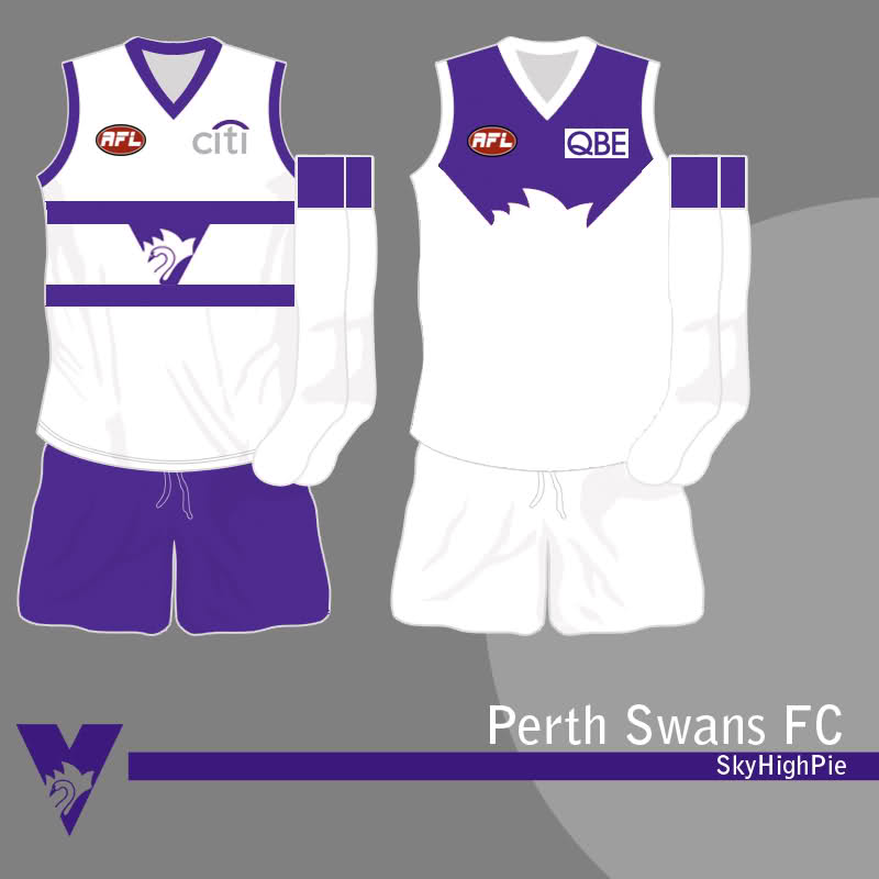
Thanks. I was inspired by SkyHighPie's design for the "Perth Swans", which was nonsensical as a Perth jumper but great as a Sydney design.
2804or5.jpg


Didn't the Swans have a training jumper like that recently? Probably one of the better Bird Heads I've seen though.
Love the hooped jumper too.


To the Swans Preseason, I'd add some of the Opera House Into it. A good idea??

Great design nonetheless

I was trying to base the design on that training jumper, but I couldn't find a picture so I was just doing it from memory.


How to make Sydney's home jumper predominantly red: invert the colours on the front, or use the 1990s preseason jumper with stripes in the white area. Inverting would be simplest though.

The alternate jumper is great because there aren't enough hooped jumpers in the league. Definitely wouldn't work against Geelong! But yeah, it's unnecessary because Sydney clash with relatively few teams.

The sash was an awesome jumper to revisit in heritage rounds - if I had to choose between hoops and sash, I'd go sash. But I'd go both ahead of their current jumper - that's just me.

Inverting the colours would look strange with a red opera house. One possibility would be to fill in most of the front of the jumper red, leaving a white vee with the opera house above:

sydneyhomealt.png


Alternatively, they could wear a predominantly red version of the hoops jumper; the main difference would just be a mostly red back with a white number.


the swans with a mainly white strip looks amazing, the white back with red numbers looks amazing. and with the opera house design on the front
i think there jumper was like this in the late 80s early 90s for 1 or 2 years

I agree. From a design perspective, this...

Sydney-1987.gif


...is preferable to this...

Sydney-2010.gif


...but it would render this unnecessary.

Sydney-Away-2011.gif


Nevertheless, I would prefer to see Sydney in a mostly red jumper at home, and I think the current red back is the best option without a radical change like the hoops.
 
Re: What should happen...

Freo should never have dumped the anchor or the red and green, just a tweek was all that was needed.

fre097.png


1998.png
 
Re: What should happen...

I'm guessing to still maintain some red and green. Bit unnecessary but tbh I actually don't mind it too much. Clash looks great too! :thumbsu:
 
Re: What should happen...

These are all great pie machine, i cant wait to see the West Coast one :thumbsu:

Here you go...

West Coast Eagles

westcoastlogo.png


With this logo, I tried to combine the two different logos. It's not perfect, but it should give you the idea. I've still used the current logo on the following jumpers.

westcoastday.png


westcoastnight.png


I've followed a suggestion that I remember reading a while ago, that West Coast should wear the royal wings kit during the day and the navy wings at night.

westcoastclash.png


In situations where neither the royal or navy jumpers suffice, West Coast should wear the yellow wings jumper.

westcoastpreseason.png


West Coast's current clash jumper would definitely work as a preseason jumper; it's easily my favourite of the "bird's head" jumpers. However, this is an alternate possibility.
 
The Navy one really looks good.. lot more menacing than the current home one.
Most eagles supporters are on board with ditching the tri panel for the wings.. and that clash jumper. :thumbsu:

It's a little like Freo's jumper. Menacing and intimidating.

--------

The navy should be the home and the blue/peril jumper
 

Remove this Banner Ad

Back
Top