hmmm round flag?Vatican City and San Marino already have that 'original' idea.
I don't know, we just need something that 80-90% of the population will be happy with. Not an easy feat.
jolly roger? as a piss take all aussies would love it
Follow along with the video below to see how to install our site as a web app on your home screen.
Note: This feature may not be available in some browsers.
hmmm round flag?Vatican City and San Marino already have that 'original' idea.
I don't know, we just need something that 80-90% of the population will be happy with. Not an easy feat.
Round flag would definitely be a pisstake.hmmm round flag?
jolly roger? as a piss take all aussies would love it
Not everyone likes cricket . Not 80% anyway.Round flag would definitely be a pisstake.
..And a Jolly Roger with cricket bats?
And a Kangaroo skull?Not everyone likes cricket . Not 80% anyway.
Maybe Jolly Roger with boomerangs...
Someone out there do a graphic.And a Kangaroo skull?
Ladies and gentlemen, we have our new Australian flag in Obsidian (or Green) and Gold.
Someone out there do a graphic.


I see what you have done there.
Not everyone likes cricket . Not 80% anyway.
Maybe Jolly Roger with boomerangs...
And a Kangaroo skull?
Ladies and gentlemen, we have our new Australian flag in Obsidian (or Green) and Gold.
But, phallic looking skull...Pretty sure this flag in non negotiable. It has to happen!
Have you seen Western Sydney? Fits all areas of the nation.But, phallic looking skull...
I guess we are all dicks... Alright, I'll try it sometime.Have you seen Western Sydney? Fits all areas of the nation.
Excuse me?Have you seen Western Sydney? Fits all areas of the nation.
You're excusedExcuse me?
Topical bump. I think this is actually brilliant and understated.


Topical bump. I think this is actually brilliant and understated.
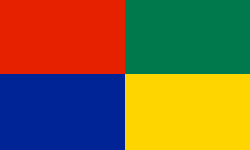
Red on top, yellow on bottom. Representative of the Aboriginal Flag. Green and blue representative of the Torres Strait Islander Flag.
Green and gold right next to each other, our de facto national colours. Red and blue next to each other, a hod to the British part of our history.
Very good.
You just explained this to me. Does that mean this rule of thumb won't work?Rule of thumb: if you have to explain it, it won't work.
You just explained this to me. Does that mean this rule of thumb won't work?
Hm. I don't understand.You may be shocked to hear that 'a rule of thumb' is a somewhat different concept from 'a flag'.
Hm. I don't understand.
Can you explain it?
So what makes us know that France's flag says France? Do any of us apart from the French know. It would need to be explained. Sorry if I'm not making sense.Rule of thumb: if you have to explain it, it won't work. Flags really need that instant connection with people's perceptions about their country.
I've noticed a lot of this from you, recently.Sorry if I'm not making sense.