Discussion Bad Graphic Design

Remove this Banner Ad

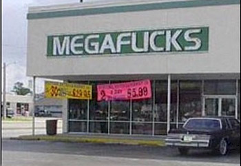
This isn't a "logos that look like sex things" thread. Create your own thread for that.

EDIT: on second thought, no huge deal. it's still bad graphic design.
 
Last edited:
BLK at it again! Borrowing Richmond_Groupie's images from the New Jumpers thread.

63C82E42-BD4C-4FCA-9783-2E83D3C874E2.png.jpeg
14FC85E5-BEDC-4D5F-955E-9F7DDE9534FE.jpg
 

Log in to remove this ad.

We had a mate called Clint who was a bit of a campaigner, so whenever we spoke to him online, we'd capitalize his name to CLINT.
 
I actually really like some aspects of this design (which is for Fremantle’s 2013 ‘Wear White on the Night’ jumper), BUT I recently noticed something rather weird about it…
While the height of numbers on an official footy jumper is consistent, I had not realized, until I saw these two jumpers together, that individual numbers actually differ in width, depending on whether the number stands alone or is part of a two-digit number.

In this case, I measured the base of the 2 on Morabito’s #2 jumper as almost 6 inches wide whereas on Neale’s #27 jumper the 2 is approximately 4.5 inches wide. This means the fan photos have been distorted in at least one of these guernseys- just not sure whether the faces have been made wider in the #2 or narrower in the #27! 2.jpg 27.jpg
 
Like a proverbial boy's schlong, the end of the shadow on my textbook is cut off prematurely.

Edit: adding image. Otherwise post makes no sense.

kimCEfE.png
 
Last edited by a moderator:

(Log in to remove this ad.)

I'm screwin' about (with) you?

Seriously. How is this meant to be taken?
"I'm [nuts] about you!" but the [nuts] is a bolt and nut.

I just laughed as the text got bigger :')
Me too. I thought it was ******* hilarious, I don't even know why I was laughing so hard.
 

Remove this Banner Ad

Back
Top