

*whispers* tripal em
Navigation
Install the app
How to install the app on iOS
Follow along with the video below to see how to install our site as a web app on your home screen.
Note: This feature may not be available in some browsers.
More options
You are using an out of date browser. It may not display this or other websites correctly.
You should upgrade or use an alternative browser.
You should upgrade or use an alternative browser.
Discussion Bad Graphic Design
- Thread starter Jones2ByrneJones
- Start date
- Tagged users None
Perhaps I can. Would be pretty good. I shall message them. Codym2723 I'm doing it!You should see if you can get an internship or something. Help this station out with some Graphic design.

Yeah, they're playing old songs now. No room for new up and coming talent (except on the Modern Rock digital radio channel)classic
- Aug 25, 2014
- 7,718
- 11,772
- AFL Club
- Richmond
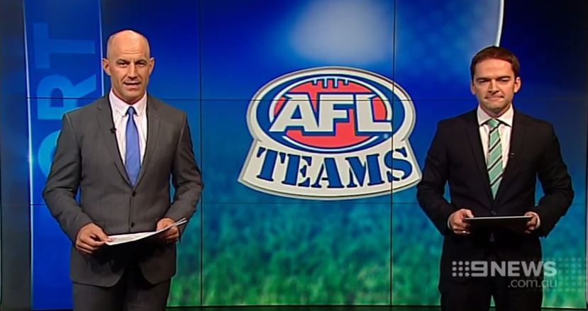
>Stencil
>ever
>ever
Klim
Brownlow Medallist
- Sep 17, 2013
- 12,532
- 10,363
- AFL Club
- Sydney

Im not seeing a problem. Its an adult putting a comforting hand on a childs head......ohhhhhh...
Get your head out of the gutter
That logo is really frustrating me. Especially the curve of TEAMS. It doesnt match the curve of the line below it>Stencil
>ever

demon_spud
Senior List
This breaks all of the AFLs branding standards.That logo is really frustrating me. Especially the curve of TEAMS. It doesnt match the curve of the line below it
demon_spud
Senior List
Guess those inter-club emails take awhile to get over to the west....
While not bad graphic design, just poor thought....from the Dockers FB page over the weekend.
While not bad graphic design, just poor thought....from the Dockers FB page over the weekend.

Mero
Norm Smith Medallist

Shouldn't the Bulldogs be above the Dockers on the scorecard. It was a Dogs home game.
American style
Javelin
All Australian
- Jun 6, 2013
- 849
- 1,116
- AFL Club
- West Coast
I'm not seeing what you're seeing. Can you explain, for the dim-witted like me?While not bad graphic design, just poor thought....from the Dockers FB page over the weekend.
- Moderator
- #114
I'm not seeing what you're seeing. Can you explain, for the dim-witted like me?
Old Bulldogs logo still used
Old Bulldogs logo still used
It's no biggie... I see this stuff on the sports report on news on occasion, sports report is still using an old logo of a side.
Javelin
All Australian
- Jun 6, 2013
- 849
- 1,116
- AFL Club
- West Coast
Of course it is!Old Bulldogs logo still used
Does the fact I didn't notice say more about me or their new logo?
HiReception
Club Legend
The Herald Sun's clearly off the mailing list as well. Every time the teams are published, or on the Super Ladder, the old logo's intact.Guess those inter-club emails take awhile to get over to the west....
While not bad graphic design, just poor thought....from the Dockers FB page over the weekend.
Jones2ByrneJones
Hour of Pessimism
- Jul 27, 2012
- 15,816
- 27,971
- AFL Club
- Port Adelaide
- Thread starter
- #118
Mepeyep
Team Captain
- May 25, 2015
- 310
- 403
- AFL Club
- Adelaide
Even afl.com.au itself has the old Carlton logo on its front page. Or is that the old new one? And we've now got the older new one.It's no biggie... I see this stuff on the sports report on news on occasion, sports report is still using an old logo of a side.
Even afl.com.au itself has the old Carlton logo on its front page. Or is that the old new one? And we've now got the older new one.
They are both one and the same.
It's just that back when playere were running around in the woolies, the same exact monogram as was shown on the logo was not able to be placed on wool jumpers at the time, so you had "classic" monogram which actually were different sizes/shapes when you looked at them from player to player.
then in the late 90s, they brought in the synthetic stuff and so the logo/modern monogram could now be used
this year, they've gone back to the "classic" look to be retro

- Jul 1, 2014
- 1,136
- 1,837
- AFL Club
- Carlton
The club logo was modernised in the 90s to make it look more corporate. They decided it was a bit bland, and changed it back for the 150th year.They are both one and the same.
It's just that back when playere were running around in the woolies, the same exact monogram as was shown on the logo was not able to be placed on wool jumpers at the time, so you had "classic" monogram which actually were different sizes/shapes when you looked at them from player to player. then in the late 90s, they brought in the synthetic stuff and so the logo/modern monogram could now be used
this year, they've gone back to the "classic" look to be retro
They changed the guernsey as well because it would naturally lead to greater on-field success. I have it on good authority that we're going with brown and gold stripes next year....

- Nov 15, 2010
- 2,409
- 2,157
- AFL Club
- Fremantle
- Other Teams
- WACA, Western Force, Arsenal, Glory
Is there any reason for the 'a'? Pretty stupid otherwise
Another thing that irritates me is when names have la, le, da, de, du and do at the beginning and they use a capital letter.
HiReception
Club Legend
Another thing that irritates me is when names have la, le, da, de, du and do at the beginning and they use a capital letter.
When it's named after a surname, isn't it supposed to be the same capitalisation as the surname? For example, Charles La Trobe's name is written with a capital L, and if I had to guess I'd say that's where the name of the company comes from.
Similar threads
- Replies
- 8
- Views
- 535
