BLK Clash Guernsey

Remove this Banner Ad

Well, my below quote got taken over to the PAP's board, about 10 mins after being posted, which is funny in itself that they are trolling so much, secondly, I didn't think it was that news worthy. Anyhoo, no doubt, because of the reputation that board has, I will be carded/banned for responding. SO, for preservations sake, I have copied and pasted it below if anyone is remotely interested.

WOW. Just saw that Powa Teal Guernsey. That makes my eyes hurt! Imagine watching 18 blokes on tv all wearing that(not that we'd watch them). Make sure to adjust the contract people!!

Yeah whatever ... it's for 3 games in the nab cup - we can live with that.

At least our clash jumper doesn't look like we're about to march in a Gay Pride parade ...
not that there's anything wrong with that lol

My response on their board:

Firstly sir, might I thank you for trolling the Adelaide FC board, then finding my comment and bringing it over here. I understand your inferiority complex in always wanting to look at what your bigger more popular brother is doing. I'm sorry for that. I am only here, as I have been given an 'Alert' to it.
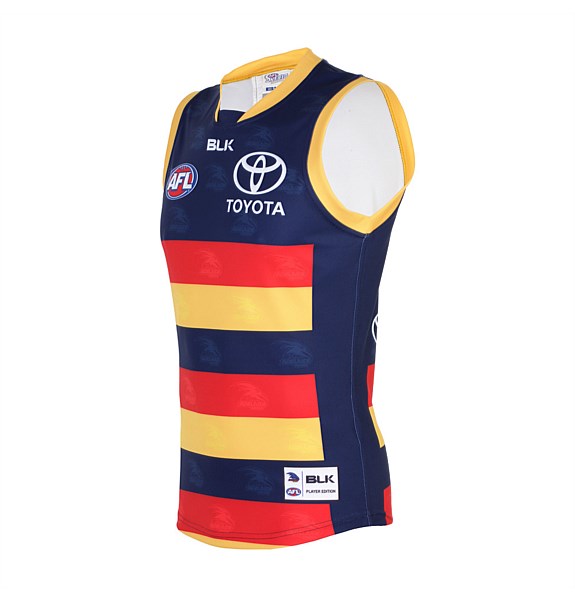
Secondly, yes it was a light hearted jab at your Papa Smurf clash Guernsey, between Crows supporters. I will fully admit that we haven't had good clash Guernsey's recently, and am on record at saying that. Big deal, and least we have NEVER struggled with identity, and have always had one, strong, traditional home Guernsey that will always remain true.
Oh, and nice little stab at our gay supporters, who we happily include, and don't discriminate against, ever, as we are of course, the team for All South Australians that want to be with us. We are Inclusive, rather than divisive.
Cheers, have a good day.
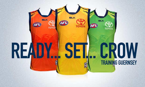
 

Log in to remove this ad.

trainingSliderAFC.jpg


The Yellow Guernsey would do the clash just fine I reckon
 
This is a pretty widely held opinion around here. Lots of people hate the side panels and I guess it makes sense if your a stickler for tradition.

I actually prefer the side panels. Not really sure why though to be honest. Just different strokes I guess.
I'm not a stickler for tradition, which is why I don't mind our latest clash guernsey or the 'murder of crows' one before it, although I agree with your view of the 'raven head' guernsey. In all honestly I don't think I've ever commented on the side panels before either, even though I've never been a fan of them. The reason I feel strongly about them this time around is because I think the designers have gone too far in how wide they've made them, because now I don't see yellow, red and navy blue horizontal stripes (hoops), what I see are yellow and red rectangles on a navy blue background.

91781_54ea2a2d2f63e00af77ffd93d72234af.jpeg

The strange thing about this one, is that there doesn't appear to actually be any 'side panels' on this guernsey preventing the hoops from going all the way around, like there have been on previous ones.
 
The Power 'teal' jumper for the pre-season certainly isn't great, but I do like their 'uniformity' across their strips - I wish Adelaide would do the same..


I also think it would be more effective for their away games against Collingwood instead of their white jumper

(also, why the hell did Adelaide wear white against Collingwood this season?)
 
I'm not a stickler for tradition, which is why I don't mind our latest clash guernsey or the 'murder of crows' one before it, although I agree with your view of the 'raven head' guernsey. In all honestly I don't think I've ever commented on the side panels before either, even though I've never been a fan of them. The reason I feel strongly about them this time around is because I think the designers have gone too far in how wide they've made them, because now I don't see yellow, red and navy blue horizontal stripes (hoops), what I see are yellow and red rectangles on a navy blue background.

91781_54ea2a2d2f63e00af77ffd93d72234af.jpeg
Exactly.
 

(Log in to remove this ad.)

I'm not a stickler for tradition, which is why I don't mind our latest clash guernsey or the 'murder of crows' one before it, although I agree with your view of the 'raven head' guernsey. In all honestly I don't think I've ever commented on the side panels before either, even though I've never been a fan of them. The reason I feel strongly about them this time around is because I think the designers have gone too far in how wide they've made them, because now I don't see yellow, red and navy blue horizontal stripes (hoops), what I see are yellow and red rectangles on a navy blue background.

91781_54ea2a2d2f63e00af77ffd93d72234af.jpeg
Id love to know why they have gone with the side panels the past 6 years or so. why did they get rid of the hoops. makes no sense
 
Id love to know why they have gone with the side panels the past 6 years or so. why did they get rid of the hoops. makes no sense
pretty sure it was initially brought in because of the jumper design template. A lot of modern jumpers have a panel of a different material so that the guernsey can be worn tighter and provide added flexibility/strength. These tend to be done in a solid colour (assuming as it is too hard to have the pattern and line it up with the rest properly).

Apparently this one doesn't have any such panels though and it is the 1st time it has been inserted as a true design feature rather than out of necessity.

I do think the theory that it has been done so the club can sell a 25yr anniversary guernsey has merit as if they were to do it with a jumper that is essentially the same design as the normal one they would find it harder to flog them off. Then after that they may revert to that design again possibly.
 
I like the 'ready set crow'. Maybe a preview of this years membership campaign?
strange it has the yellow one there and even on the homepage in the crowmania add scrolling through there was a link to the yellow one but it isn't actually on crewman site. That is the one I would buy
 
i hope not... another thing for others to laugh at us. need something that is tough.
JP what is it with this worry about what others will think mate?

You must have some pricks in your life that wind you up like a cheap watch - let it go man.

Ready, Set, Crow on the three coloured jumpers is a good headline for a marketing campaign ... nothing more.

You will find life a lot easier (IMO) when you stop giving a sh!t about what everyone else might think :cool:

My old man used to say "Never try and guess what someone else is thinking" - good advice.

If you are commenting on the headline as a marketer or designer - no issues - but this idea that we will get "laughed at" being a prime motivation for changing a bit of marketing is a bit sad.
 
The reason I feel strongly about them this time around is because I think the designers have gone too far in how wide they've made them, because now I don't see yellow, red and navy blue horizontal stripes (hoops), what I see are yellow and red rectangles on a navy blue background.

tumblr_nbcdl4pKhJ1td675io6_500.gif
 
pretty sure it was initially brought in because of the jumper design template. A lot of modern jumpers have a panel of a different material so that the guernsey can be worn tighter and provide added flexibility/strength. These tend to be done in a solid colour (assuming as it is too hard to have the pattern and line it up with the rest properly).

Apparently this one doesn't have any such panels though and it is the 1st time it has been inserted as a true design feature rather than out of necessity.

I do think the theory that it has been done so the club can sell a 25yr anniversary guernsey has merit as if they were to do it with a jumper that is essentially the same design as the normal one they would find it harder to flog them off. Then after that they may revert to that design again possibly.

Summed it up perfectly. If there isn't a 25 year full hoops jumper, then the designers at the Crows/BLK just look really stupid.
 
Summed it up perfectly. If there isn't a 25 year full hoops jumper, then the designers at the Crows/BLK just look really stupid.
if we do have the 25 yr anniversary guernsey it will be interesting to see if it is received as a positive by posters on here who are keen to buy it or if it will be criticised as a cash grab by charging a premium for a 1 off of what we should already have.
 
if we do have the 25 yr anniversary guernsey it will be interesting to see if it is received as a positive by posters on here who are keen to buy it or if it will be criticised as a cash grab by charging a premium for a 1 off of what we should already have.
It will be both for me! I just can't understand why we don't have the full hoops, best jumper for mine.
 
So apparently this is Richmond's new clash guernsey.

80A7A3F4-F4B0-4B46-9340-4A2E5081A3C6.png


So we already know that the AFC claims that it's an AFL directive that all clash guernseys must be white. I really hope that our next clash guersney uses this shade of white as well.
 

Remove this Banner Ad

Back
Top