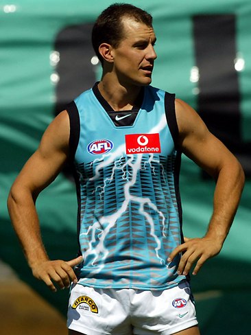
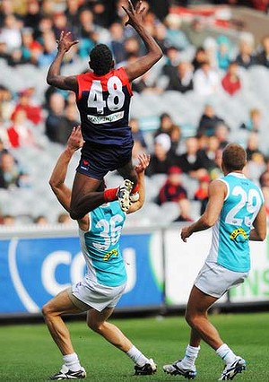
Meh, it looks so distinctly late 90s/early 2000s. Massive amounts of teal just looks.. tacky? There's a word but I can't think of it now.W
We won a premiership 10 years ago with a fair amount of teal on our jumper and it looked fantastic
Navigation
Install the app
How to install the app on iOS
Follow along with the video below to see how to install our site as a web app on your home screen.
Note: This feature may not be available in some browsers.
More options
You are using an out of date browser. It may not display this or other websites correctly.
You should upgrade or use an alternative browser.
You should upgrade or use an alternative browser.
Can someone make a teal guernsey?
- Thread starter brad the brain
- Start date
- Tagged users None
- Status
- Not open for further replies.
Contested Marx
Schrodinkley's Cat
- Jun 21, 2014
- 11,623
- 25,846
- AFL Club
- Port Adelaide
- Other Teams
- Maggies, Spurs, Raiders?
Not that this is even really on the radar of issues the club ships be dealing with now but I wouldn't mind a tall based clash strip for plating against c'wood, Caaarlton etc., because I'm sick of seeing every game being home team v white team.
That being said, something with a solid teal background looks like the m&m Carlton one (circa 1995?) And as much as I'd love to see the prison bars, they'd look horrible aka North Melbourne's Argentina strip of a few years back.
What I don't like is the teal band on the socks. Solid black or solid teal.
Didn't Tredders kick a handful the one game we wore that? Also made it easy to see on TV.
Kickpuncher
Now I am become Donuts, the Destroyer of Ports
- Feb 13, 2007
- 12,385
- 20,928
- AFL Club
- Port Adelaide
View attachment 71724 This or what we have now.
What we currently have. We really need to move on from the prison bars (other than when honouring a special even). Not to mention that teal would tarnish what is already a great jumper.
What we currently have is great. We have close too if not the best Jumper and Clash Jumper in the AFL.
The only time teal should be used as a dominant colour if ever is in a pre-season jumper.
TeeKray
Moderator
- Moderator
- #154
I think design is just as important as colour. Our current jumpers have a really strong design with the double v shape, and the white guernsey is made to look sharp by black trims in just the right amounts in all of the right places. No reason whatsoever why a teal (proper teal not Reebok aqua blue) version of the jumper wouldn't work well.
Don't like any variations or bastardisations of the classic prison bar strip though. Don't touch that.
Don't like any variations or bastardisations of the classic prison bar strip though. Don't touch that.
brad the brain
Team Captain
- May 11, 2014
- 587
- 342
- AFL Club
- Port Adelaide
- Thread starter
- #155
So our 2004 AFL premiership guernsey looks tacky?Meh, it looks so distinctly late 90s/early 2000s. Massive amounts of teal just looks.. tacky? There's a word but I can't think of it now.
Suffering snakes mate!
- Mar 3, 2014
- 12,124
- 20,269
- AFL Club
- Port Adelaide
- Other Teams
- dallas cowboys ferrari f1
its mostly black.So our 2004 AFL premiership guernsey looks tacky?
Suffering snakes mate!
Hong-Kong Phooey
Cancelled

teal and white.. never again
that was way too light though. a few tones darker and mix it with black instead of white. jeeez we looked like fairies that day
brad the brain
Team Captain
- May 11, 2014
- 587
- 342
- AFL Club
- Port Adelaide
- Thread starter
- #158
- Mar 3, 2014
- 12,124
- 20,269
- AFL Club
- Port Adelaide
- Other Teams
- dallas cowboys ferrari f1
i said mostly black.. and it is mostly black.Not much teal and mostly black you say?
View attachment 71774
View attachment 71776
Not much teal in the 10 year reunion one eitherView attachment 71772
- Apr 16, 2009
- 1,597
- 2,907
- AFL Club
- Port Adelaide
So our 2004 AFL premiership guernsey looks tacky?
Suffering snakes mate!
i always thought the SBS guernsey was a bad one. not the worst the AFL has ever seen, but still poor. but, so what? an issue as trivial as that was not going to stop me from supporting port adelaide, and i kind of got used to it over the years. acknowledging that it's a bad guernsey takes nothing away from the 2004 flag.
guess what? i think the current (and 'premiership') club logo is awful.
brad the brain
Team Captain
- May 11, 2014
- 587
- 342
- AFL Club
- Port Adelaide
- Thread starter
- #161
50% black is mostly I guess?there is a lot of white on the back panel too.i said mostly black.. and it is mostly black.
brad the brain
Team Captain
- May 11, 2014
- 587
- 342
- AFL Club
- Port Adelaide
- Thread starter
- #162
You will get crucified on here mate.Prison bars and magpies only with this lot.i always thought the SBS guernsey was a bad one. not the worst the AFL has ever seen, but still poor. but, so what? an issue as trivial as that was not going to stop me from supporting port adelaide, and i kind of got used to it over the years. acknowledging that it's a bad guernsey takes nothing away from the 2004 flag.
guess what? i think the current (and 'premiership') club logo is awful.crucify me.
John Hart Jnr
Cancelled
Haven't we had enough shocking teal jumpers over the years?
And now you want another one? No thanks.
I think teal works great as trim colour on a jumper but as base colour it is terrible.
Couldn't agree more. We only need two jumpers, the black one for home games and the white one as an away clash jumper.
Leave it at that.
This sounds reasonable to me.Couldn't agree more. We only need two jumpers, the black one for home games and the white one as an away clash jumper.
Leave it at that.
I love the current AFL and SANFL guernseys but I'm not adverse to alternative guernseys for pre-season or one-offs, eg: Indigenous Round.
John Hart Jnr
Cancelled
This sounds reasonable to me.
I love the current AFL and SANFL guernseys but I'm not adverse to alternative guernseys for pre-season or one-offs, eg: Indigenous Round.
Agree, the one-offs for promotional reasons are fine.
I would like to see us build a bit of proud history in this current jumper. Like we did when we adopted the prison bar jumper in the early 1900s.
And you cant do that by chopping and changing all the time.
Power Raid
We Exist To Win Premierships
what a shocker


Bringing this back up, I just remembered this was posted on the FJGD board a few days agoAgainst the likes of Collingwood and Carlton we should have an alternate guernsey, even if that means merely removing the black side stripes.
http://www.ebay.com.au/itm/Port-Ade...24?pt=LH_DefaultDomain_15&hash=item3f3a3a2d8c
Kickpuncher
Now I am become Donuts, the Destroyer of Ports
- Feb 13, 2007
- 12,385
- 20,928
- AFL Club
- Port Adelaide
brad the brain
Team Captain
- May 11, 2014
- 587
- 342
- AFL Club
- Port Adelaide
- Thread starter
- #169
I quite liked that onewhat a shocker

brad the brain
Team Captain
- May 11, 2014
- 587
- 342
- AFL Club
- Port Adelaide
- Thread starter
- #170
That was a bit poor.Not as bad as this *which I also own

Kickpuncher
Now I am become Donuts, the Destroyer of Ports
- Feb 13, 2007
- 12,385
- 20,928
- AFL Club
- Port Adelaide
That was a bit poor.
Not enough teal?
brad the brain
Team Captain
- May 11, 2014
- 587
- 342
- AFL Club
- Port Adelaide
- Thread starter
- #172
brad the brain
Team Captain
- May 11, 2014
- 587
- 342
- AFL Club
- Port Adelaide
- Thread starter
- #173
LOL! I was nearly going to say too much grey/silver and not enough teal. Just to upset the masses a bit more.But I thought I would leave it out.Not enough teal?
Power Raid
We Exist To Win Premierships
War Machine makes everything look good.what a shocker

- Status
- Not open for further replies.
Similar threads
- Replies
- 18
- Views
- 849
- Locked
- Replies
- 123
- Views
- 6K
- Replies
- 33
- Views
- 3K


