Klim
Brownlow Medallist
- Sep 17, 2013
- 12,532
- 10,363
- AFL Club
- Sydney
Not as big as their supporters heads.Biggest club in the world actually.
Follow along with the video below to see how to install our site as a web app on your home screen.
Note: This feature may not be available in some browsers.
Not as big as their supporters heads.Biggest club in the world actually.
Big Vic club*Didn't work for West Coast
")
Would love the second one.So it could go either way...unless it's a normal AFL club jumper selection poll
I'm feeling that way about the Retro one. Going backwards seems like a stupid idea. The club should be focusing on moving forward with their success, not backwardsDefinitely the old school one for me.
Seeing the two side by side, the current one seems so manufactured and sterile.
Interesting to note that the tweet only features the current monogram. Surely they could have resized to show both. Trying to influence the vote, perhaps?
EDIT: Or is that just the "retweet"? The original tweet does show both. Still, wondering...
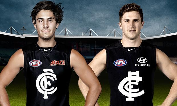
Here is the article on the Carlton website. The accompanying image actually makes the old monogram look bad because it isn't "raised"
http://www.carltonfc.com.au/news/2014-10-09/choose-our-guernsey
Voting semantics aside, I have a feeling this actually may not get up.
People that don't really care for sentimentality and heritage are more likely to stick with the modern 'progressive' status quo, it is more legible and 'professional looking'.
Of course most of us here think it should because it is so much more Carlton, but we aren't the demographic here.
The more I compare the two, the more reasons I can see why people would vote for the current one
Does the club want to be seen as moving backwards?
Exactly. I'm thinking they should arrive a middle ground between the two - the classic forms with the modern composition and sensibility.
Imac pls we know that already.who cares they're s**t
And I hope they're better than my disastersI reckon you have something up your sleeve design-wise.... I hope, anyway!
Right. I've been busy trying to come up with some way that every one can be happy. Didn't work.
I tried making the current monogram bolder as GG said it lacks 'boldness' ....instead I just gave it a bigger arse...

Then I tried combining both logos:


And that's the end of trying to improve the logo. Thank you for painfully reading this.
People that don't really care for sentimentality and heritage are more likely to stick with the modern 'progressive' status quo. It is more legible, 'professional looking' and consistent with the familiar logo brand that adorns people's caps and scarves. If this was proposed with a new logo, or a convincing logo strategy akin to the Yankees, it might sway these people.