

It would make sense. We wouldn't want the current monogram on it's own with the Heritage monogram on our jumpers... (as much as it's leaning towards that)...So are they going to return the old style logo as well (150 year logo)?
Navigation
Install the app
How to install the app on iOS
Follow along with the video below to see how to install our site as a web app on your home screen.
Note: This feature may not be available in some browsers.
More options
You are using an out of date browser. It may not display this or other websites correctly.
You should upgrade or use an alternative browser.
You should upgrade or use an alternative browser.
News Carlton guernsey monogram change? Club to put vote to members on 15 October
- Thread starter Hank93
- Start date
- Tagged users None
lmach
Naitanui2Yeo
Every thread about a major design change needs a narrow-minded comment of that ilk.Imac pls we know that already.
http://www.bigfooty.com/forum/threa...ow-with-chance-to-vote.1022603/#post-29406217
http://www.bigfooty.com/forum/threa...ow-with-chance-to-vote.1022603/#post-29406498
Teen Wolf
Norm Smith Medallist
- Jul 5, 2011
- 8,104
- 8,908
- AFL Club
- North Melbourne
- Other Teams
- Afghanistan women's cricket team
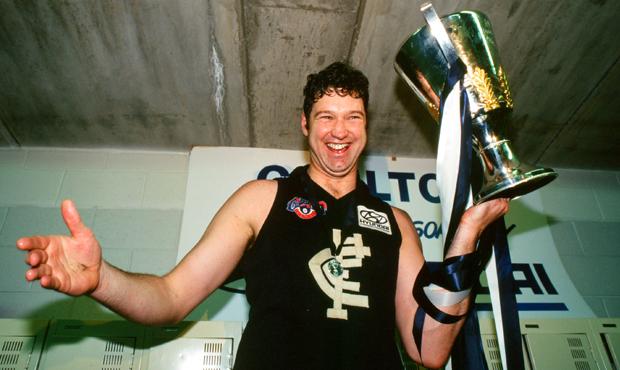
From their site: "So what's it going to be? Our current CFC emblem, or return to our iconic heritage CFC crest that adorned our 'old dark navy blue' guernseys for 70 years, including 11 Premierships"
Had a bit of a laugh when I read that too.
In other words: "You can pick the good one that won us our flags (as modelled by our beloved captain). Or if you like mediocrity and failure, go with the crappy one on the left which is CURSED!"
Mero
Norm Smith Medallist
The club will check out the feeling at the meeting, and even if they don't have the numbers, which is unlikely, they'll reveal a whole bunch of proxy votes showing they do have the numbers.
- Jul 9, 2010
- 24,163
- 26,536
- AFL Club
- Fremantle
If anything, this is the most likely of all (sans maybe Brisbane) of the votes to be genuine. Carlton have a new CEO and got rid of a quarter of their list last off-season and keep shedding players still. They seem intent on doing something. And a new CEO will want to come across as at one with the supporters, whereas the Eagles and Crows have a state full of supporters who'll stay regardless. Melbourne's footy culture is a lot more venomous and bitter (which is a good thing – that's the difference between a proper footy club and a monopoly franchise), so perhaps Carlton's going to actually take these numbers into account.
If it's like, 40/60 it might go whatever way the Blues' honchos want. If the margin is obvious, then...
I don't really get this whole 'going backwards' argument. Most footy fans don't really think like that, do they? Surely they'll pick the one they think looks the coolest – born from pure aesthetics, because they remember SOS and Optus Oval, or because they're 15 and it's all they've ever known. The Lions and Bullies haven't done a whole lot since their changes and nor have Carlton. Surely going 'backwards' to three-peats, 16 flags, and... ah... the.. Western.... Oval.... ICI? Ahh. Okay but the Bulldogs one looks a lot better and represents their heritage. I really don't see it that way at all and it personally seems a weird tangent; shouldn't the brethren here be more inclined to appreciate the retro/classic/mostly better?
As lmach said though, pretty rubbish club from top to toe. Princes Park will still be the best park in Melbs and Optus Oval an interesting relic. That's all Carlton really has.
Anyway, if the old monogram gets through, I hope BigFooty's next petition is for Hyundai's logo to have a white background again. That's proper Carlton. It just looks so complete
Compared to...
Going past Princes Park (aka Optus Oval aka MC Labour Park aka Visy Park) yesterday I would say that Carlton is behind the current logo on the jumpers. They have put up a huge new Carlton logo on the new part. The logo is the 150 years logo with the old motto instead of Celebrating 150 years.
E92_
Premium Platinum
If the old logo gets voted in I have a feeling it will be on-field only.
- Jul 1, 2014
- 1,136
- 1,837
- AFL Club
- Carlton
I'm sure Carlton will will appreciate heritage input from fans of the WCE franchise who can't even figure their club colours out, and zero-premiership Freo who've just ditched their guernsey, colours and logo.As lmach said though, pretty rubbish club from top to toe.
beef?I'm sure Carlton will will appreciate heritage input from fans of the WCE franchise who can't even figure their club colours out, and zero-premiership Freo who've just ditched their guernsey, colours and logo.
Bacon Warrior
D10
Now, now. Maybe Carlton will be relevant again one day.I'm sure Carlton will will appreciate heritage input from fans of the WCE franchise who can't even figure their club colours out, and zero-premiership Freo who've just ditched their guernsey, colours and logo.
- Jul 1, 2014
- 1,136
- 1,837
- AFL Club
- Carlton
Not so much, but fans of those two clubs in particular have no business calling anyone rubbish from a branding point of view. Sydney fans have a stronger position to comment frombeef?
MKMatty
Busy Vibin’
Sydney fans have a stronger position to comment from
May I ask why?
Not to seem like a dick, but I can't really see your argument here. West Coast I understand, our club branding is horrendous, it hasn't been any good since 1994. But Fremantle? What's wrong with their branding? Their latest logo and jumper update has generated a strong brand image? What they currently have now is leaps and bounds better then what they had.
This isn't about club vs club. Our opinions matter just as much as any other posters on this board. Don't knock the club, just because you're insecure of yourself. The topic of discussion is Carlton and their branding, the posters on this thread are discussing this from their point of view, not their clubs. Stop being so precious. Our opinions are all equally weighted, regardless of where our allegences lie.
- Jul 1, 2014
- 1,136
- 1,837
- AFL Club
- Carlton
Sure, and thanks for asking so politely.May I ask why?
I agree that Freo's new branding is really strong and consistent, and I like it. To get there though, they had to ditch their jumper, logo, and the two of their colours that related to to the maritime industry. They've still got a problem with the club song (fixable) and any real link to Freo (probably not fixable), but I agree they seem to have a plan.
Our opinions matter just as much as any other posters on this board. Don't knock the club.
You're right, and I over-reacted to lmach's comment, but I think if you want to write off a club "from top to toe" in a branding discussion you should make sure your own club hasn't changed your colours to sell more polo shirts...As lmach said though, pretty rubbish club from top to toe.
It's not like anyone on this board was involved in those decisions, in fact, several posters here disagree, and vehemently refute, several of the recent branding decisions by some of the clubs. There's no need to act all high and mighty, we're all just weirdos who like merchandise and colours in the end...[...]in a branding discussion you should make sure your own club hasn't changed your colours to sell more polo shirts...
thegreig
Club Legend
nah, doubt itNow, now. Maybe Carlton will be relevant again one day.
- Sep 5, 2011
- 8,248
- 15,913
- AFL Club
- Carlton
- Other Teams
- Dallas Cowboys, STL Blues
My first guensey had the logo in my avatar (old long sleeve woolen one)....to me, that is Carlton.
I'd certainly welcome the shift for the on field strip, whilst keeping the other monograms for other club stuff (scarves, official monogram etc).
I'd certainly welcome the shift for the on field strip, whilst keeping the other monograms for other club stuff (scarves, official monogram etc).
MKMatty
Busy Vibin’
If this change does occur. Can the club demand Hyundai go back to the white box for "the upkeep of heritage"? Doesn't look right without that box on the front.
Heardy_101
LET'S GO BRANDON
Given it's the 17th, do we know the result?
- Moderator
- #119
Given it's the 17th, do we know the result?
The voting process has only just got underway. There's a website to accompany it – how slick does this look? I love it. The Blues certainly have a lot of history. Despite barracking for Collingwood, they're not a team I really hate. There are a couple of clubs that are much worse.
http://selectourguernsey.com.au
Also note to Mero in that 'time warp' style video all the different monogram varieties throughout the 1933–1997 period! I think the way you have it is best though, because there wasn't really a standardised version up until the early 80s really
I noticed in the video that they didn't use the CFCC monogram (Cricket and footy club).The voting process has only just got underway. There's a website to accompany it – how slick does this look? I love it. The Blues certainly have a lot of history. Despite barracking for Collingwood, they're not a team I really hate. There are a couple of clubs that are much worse.
http://selectourguernsey.com.au
Also note to Mero in that 'time warp' style video all the different monogram varieties throughout the 1933–1997 period! I think the way you have it is best though, because there wasn't really a standardised version up until the early 80s really
- Jul 1, 2014
- 1,136
- 1,837
- AFL Club
- Carlton
Whichever one wins, you can buy it 50% off until th eend of October...
https://shopdesq.imgstg.com/index.cfm?fuseaction=productlisting&CategoryID=2555&OrgID=1745
https://shopdesq.imgstg.com/index.cfm?fuseaction=productlisting&CategoryID=2555&OrgID=1745
