

Who's that guy on the left? POBT any thoughts?View attachment 88912View attachment 88913
I think i prefer maroon as a longsleeve colour. It's just another reminder of the premiership days!
Navigation
Install the app
How to install the app on iOS
Follow along with the video below to see how to install our site as a web app on your home screen.
Note: This feature may not be available in some browsers.
More options
-


LIVE: Richmond v Melbourne - 7:25PM Wed
Squiggle tips Demons at 77% chance -- What's your tip? -- Team line-ups »
You are using an out of date browser. It may not display this or other websites correctly.
You should upgrade or use an alternative browser.
You should upgrade or use an alternative browser.
Changing the Original Lions Guernsey/Clash Jumper Discussion
- Thread starter Hysteria25
- Start date
- Tagged users None
HowYouDoin
Club Legend
- Banned
- #402


No smile, he's gone. Aish and Beams for Walker and Dangerfield.
Caiphus
*error*
Confirmed today in the lions shop that only the player worn guernseys have the watermarks for anyone still wondering.
Away jumper too, missing Melbourne already.No smile, he's gone. Aish and Beams for Walker and Dangerfield.
This was actually the wrong thread. This thread, as the title suggests was for change suggestions to the new guernsey.How about someone renaming this thread more appropriately, coz a momentous event such as this deserves recognition?
The returning jumper thread is this; http://www.bigfooty.com/forum/threa...emiership-fitzroy-lion-its-back-baby.1008695/
it's just that we were all too lazy to go find it to post this week's return posts.
No smile, he's gone. Aish and Beams for Walker and Dangerfield.
Would take a straight Dangerfield/Aish swap! Smiles irrelevant.
- Moderator
- #409
Back2Back2Back
In Fagan we trust.
Hmmm, indeed. Very very interesting, going by this:
I especially like this bit.
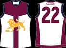
Based loosely on early Fitzroy designs which had chamois leather collars and lace-up fronts, panels on its front give the jumper and the wearer an “armour-plaited” appearance accentuated further by the body-hugging material used in today’s garments. The colour-way also serves to provide a connection to our unique merged past while the introduction of white in line with AFL specifications, plus an angled keyline reminiscent of the “vee” on the Bears’ jumper of the mid 1990s, gives it a “traditionalistic but contemporary” appearance.
I especially like this bit.
This is our jumper and we’re in it together. This is season 2015 and we’re in it together. #PrideInTheJumper #BelieveBelong #BeyondLimitsKnown
Simba Moyo
Hakuna Matata
Badass. Love it, I wonder if the Lion will be on there?
Football Pope
Norm Smith Medallist
- Sep 24, 2009
- 8,345
- 4,151
- AFL Club
- Brisbane Lions
- Other Teams
- Australian International Sides
HowYouDoin
Club Legend
- Banned
- #414
I love how the lions managed to somehow include the bears in that description. Even though it is blatantly obvious that this design is purely based of a Fitzroy Guernsey with no inspiration from the bears.
Anyways... I'm not liking what i am seeing. Who thought it was a good idea to use a design from the late 1800's?
I'll reserve my judgements until it is officially unveiled, though.
Anyways... I'm not liking what i am seeing. Who thought it was a good idea to use a design from the late 1800's?
I'll reserve my judgements until it is officially unveiled, though.
If by chance its this one.....
View attachment 88643
... then the irony to me is that that is the most Bears-like jumper the Roys ever wore. Maroon with Gold/Yellow 'Vee' kinda seems familiar don't it?
However, I would be very confused if it turned out to be that one, given its predominantly maroon, like our main jumper. Unless they reverse the colors, or make the laceup parts up the middle super wide.
Quoting myself here HowYouDoin.....
That specific Roys design was ironically similar to the Bears Vee design. Well put it this way, Gold Vee on Maroon jumper for both.
Also reserving judgement to the unveil though. I like the club has put out the 'its coming' article with details, but I'm struggling to imagine what its actually going to be like at this stage based on those details.
Tairy Greene
Premiership Player
- Aug 12, 2010
- 3,865
- 10,478
- AFL Club
- Brisbane Lions
- Other Teams
- Steelers, Maroons, Reds, Bulls.
Anyways... I'm not liking what i am seeing. Who thought it was a good idea to use a design from the late 1800's?
Can you show me what you've seen because I'm yet to see anything resembling a guernsey.
HowYouDoin
Club Legend
- Banned
- #417
Can you show me what you've seen because I'm yet to see anything resembling a guernsey.

This was used between the years of 1897-1907.
Simba Moyo
Hakuna Matata
I kinda hope they use the vee on the back too, that would look great
Back2Back2Back
In Fagan we trust.
Doesn't there have to be a predominantly white body on the clash jumpers though? I'm wondering if they're going to go for something like a white 'armour plate' area, a blue and/or gold V and centre stripe and a maroon top...
edit: Or perhaps... white 'armour plate', blue V / middle stripe, maroon top, and a gold Lion front and centre? edit2: yeah, like that down there vvv LOL
edit: Or perhaps... white 'armour plate', blue V / middle stripe, maroon top, and a gold Lion front and centre? edit2: yeah, like that down there vvv LOL
Last edited:
The Flying Belgian
Third Tall
I posted on the other jumper thread, but perhaps this is the better spot for it.
My read on it would be something like this (excuse dodgy MS Painting)...

My read on it would be something like this (excuse dodgy MS Painting)...
- Moderator
- #422
Doesn't there have to be a predominantly white body on the clash jumpers though? I'm wondering if they're going to go for something like a white 'armour plate' area, a blue and/or gold V and centre stripe and a maroon top...
edit: Or perhaps... white 'armour plate', blue V / middle stripe, maroon top, and a gold Lion front and centre? edit2: yeah, like that down there vvv LOL
I'm almost certain the 'armour plate' reference is just marketing fluff and there will be no such thing on the guernsey.
- Moderator
- #423
I posted on the other jumper thread, but perhaps this is the better spot for it.
My read on it would be something like this (excuse dodgy MS Painting)...
I'm not even confident there'll be a lion on there. Yellow on white overlapping like that looks a little strange. I think if you take off the lion, that's what it's likely to be
Back2Back2Back
In Fagan we trust.
Calling it that is just marketing fluff yeah, but I'm not really trying to think of another name to call it.
Here's hoping they're not taking it literally and colouring it like actual plates of armour.
Here's hoping they're not taking it literally and colouring it like actual plates of armour.
whatboutbob
Serial Avatar Troll
Would it look stupid to have a small lion on the top right of the white?I'm not even confident there'll be a lion on there. Yellow on white overlapping like that looks a little strange. I think if you take off the lion, that's what it's likely to be
Similar threads
- Replies
- 272
- Views
- 9K
- Locked
- Replies
- 358
- Views
- 11K
- Locked
- Replies
- 421
- Views
- 17K
