Hollow Knight
Imperfect vessel
- May 3, 2005
- 96,471
- 106,624
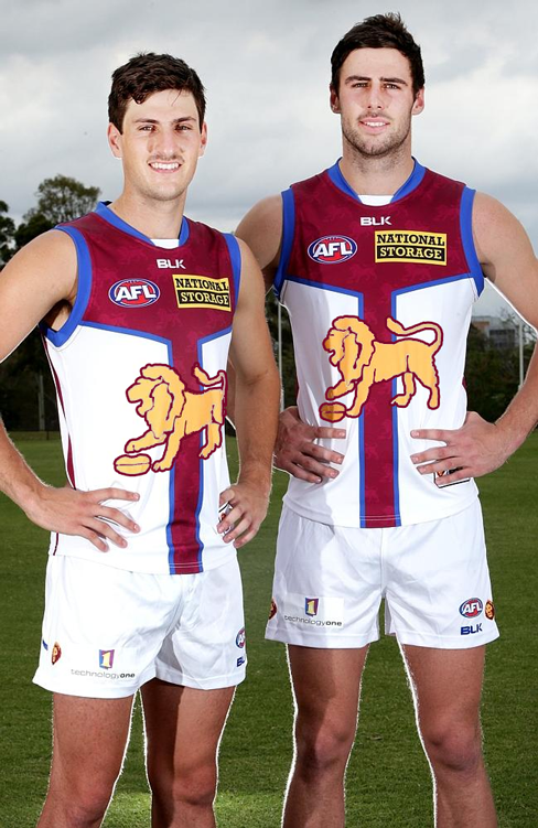
- AFL Club
- Brisbane Lions
- Other Teams
- Scuderia Ferrari, Dallas Cowboys
Yeah, not bad.
Would look even better with maroon shorts, but yeah... the AFL...
Would look even better with maroon shorts, but yeah... the AFL...
 from me too.