


Dammit
Challenge Accepted
Honestly, they are really bad haha. I voted 1, but... wowee. Unimaginative!
Follow along with the video below to see how to install our site as a web app on your home screen.
Note: This feature may not be available in some browsers.
50 bucks.. jesus
3 looks like an adelaide jersey. its the worse one..yellow blue is goodThey're all shite, but I voted for 3. The others are unimaginative and bland, but as least option 3 is somewhat unique.
While the fugly GC logo is on the front and the AFL continues to enforce their arbitrary clash rules there's really no chance of it getting any better hahanumber 1 is the only one I really like, and even that is a stretch. let's hope we get something a bit more imaginative in 2018.
i liked the clash we hadWhile the fugly GC logo is on the front and the AFL continues to enforce their arbitrary clash rules there's really no chance of it getting any better haha
i like it better than option 2, but it has to be "predominantly white" which is probably why they didn't have the full stripes.View attachment 185364
Thoughts on this instead of option 2?

View attachment 185364
Thoughts on this instead of option 2?
It's more of a beach towel to meIt's a CATastrophy
See what I did there
Considering that there is 7 white bars to 6 blue and yellow on the front, that the back would be even whiter with the number panel, and that yellow (and the blue) are also light coloured, it would be fine.i like it better than option 2, but it has to be "predominantly white" which is probably why they didn't have the full stripes.


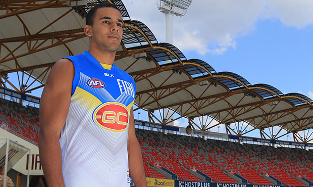
Finally, the votes have been counted, and the people have spoken – we have a new clash guernsey for the 2016 season.
More than 5000 people went to the polls and in a tightly fought duel, the winning option secured the rights by collecting 34 per cent of the votes from the people.
The competition captivated a large portion of the Gold Coast SUNS community, with many supporters and members embracing the opportunity to have a say on how the club looks on-field.
The new guernsey, with its white backing, has a chevron design emblazoned on the front and a striking v-shaped design.
The winner, ladies and gents.
Not sure how I feel as it wasn't the one I voted for, but it's still 100% better than our old one.

I actually don't mind the one campaigner is wearing. The GC logo kinda ruins the look. If the logo itself were in blue and white as well it'd look pretty cool.Where is the consistency and evolution, The wave, the arch and now the chevron. If I had to pick one it was the wave.
BTW looking back to the launch of the club (was looking at clash pics) and I found this, all gone


