

Klim
Brownlow Medallist
- Sep 17, 2013
- 12,532
- 10,363
- AFL Club
- Sydney
They will for away games.Does any one think Australia will go for a green away one day kit ??
Follow along with the video below to see how to install our site as a web app on your home screen.
Note: This feature may not be available in some browsers.
They will for away games.Does any one think Australia will go for a green away one day kit ??
It's pretty obvious. Its always been vice versa with the green being the home and yellow the away but now they've changed it.Are you sure?
Source please.
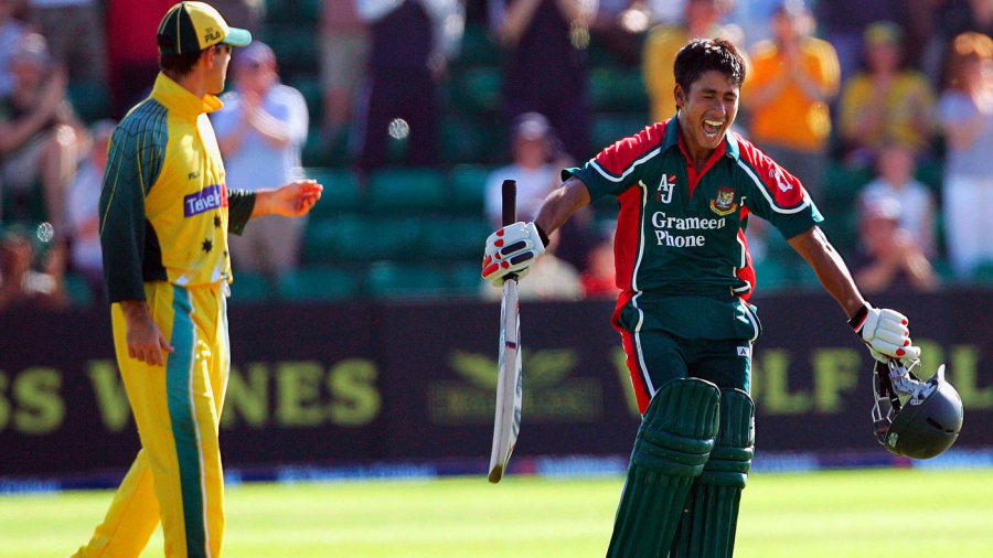
This happened before?It'd be silly to wear green away when Pakistan, South Africa and Bangladesh wear green as well.

What I'm saying it, it was silly then, it'd be silly now. It was silly in 2006 when they wore green shirts away too.This happened before?


Always since like 2006.It's pretty obvious. Its always been vice versa with the green being the home and yellow the away but now they've changed it.
No one watches test matches, that's whyIn Test matches all teams wear the same colours,I can't see why they can't in limited overs cricket?
Coz coloured clothing was introduced to limited-overs cricket to be bright and colourful and exciting.In Test matches all teams wear the same colours,I can't see why they can't in limited overs cricket?
And there's yellow trim everywhere on it.Thunder really need to cut their losses and just recolour their shirt yellow. Its already part way there
Seems as though they've kept the black for the front, and made the rest dark green for the T20 kit. Looks much better then being mostly black. Although I'd rather have a variation of light green instead.
very dark blue on the black I reckon.

So, it's a very very dark blue?
As much as I like the NZ shirt, it's feels odd because it was originally an ODI concept. And I don't like when T20s push their way into the ODI landscape.Have a look at what New Zealand have done with there T20, why not use it as a chance to go retro rather than this black rubbish, we are green and gold.

So, it's a very very dark blue?
The sleeves being solid dye black & the front being printed, resulting in mismatched black tones is a pretty piss poor effort from the amateurs at asics.Nope, black. The front material is different to the rest (shinier material) giving the effect that they are different, but the design is clearly black.
