Jones2ByrneJones
Hour of Pessimism
- Jul 27, 2012
- 15,820
- 27,995
- AFL Club
- Port Adelaide
This post was originally published in the '2016 Jumper Ideas' thread, intended to help out Cody with the execution of his designs. I feel it deserves its own thread, and it would be fantastic if people could contribute ITT with their own "small things" that people often overlook.
Cody, mate. Your designs are good but your execution is lacking. If you're going to use El_Scorchos' template, or any template with shading, then you have to do it properly. It's been said before to you. If you don't, it looks downright awful.
Here's some helpful hints. This is common-sense kind of stuff so it shouldn't really need to be taught, but, hey, sometimes not everything is obvious to everyone. It's not just you, by the way, I've noticed this a lot in recent competitions such as FIRA and ANAL. People aren't paying attention to their own designs.
Now, to start, look at your North Melbourne guernsey (left). Notice how the cuffs are lighter than the guernsey that it is touching?


What you should do is change the colour of the cuffs to the exact same colour of the blue next to it. (on the right). That makes it 'fit in' and look more realistic. It's something you should be aware of as a designer. The smaller details, because it makes a huge difference.
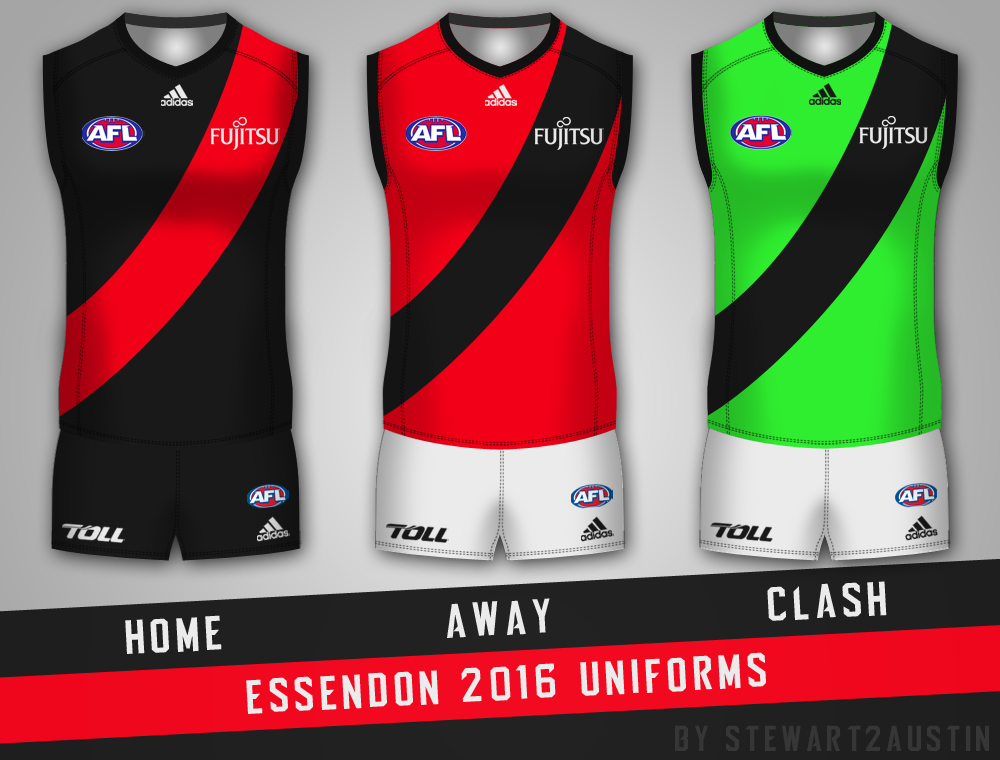
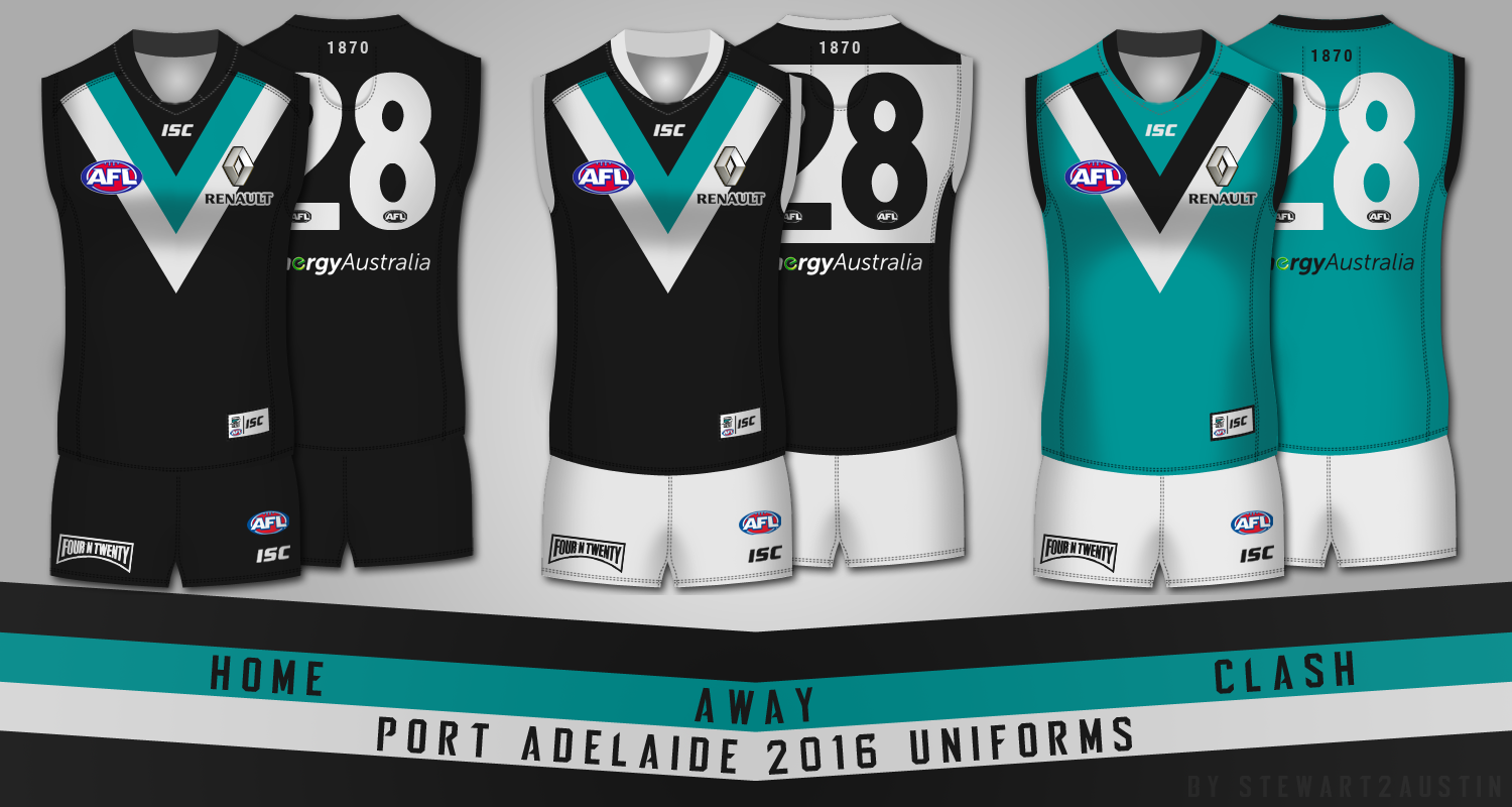
Secondly, and this really shouldn't have to be said, because this one is painfully obvious, but the shorts. Look at the shading of the shorts. It's at 100% right now. Turn it down. 20% might look good, you'll have to experiment. See the difference below. What looks better?

Now, for light colours - yellow, white, what-have-you, the transparency of the shading needs to be low. For dark colours, it needs to be very high. Up to 80% or more. Look below. On the left we have a black guernsey, and on the right we have a white one. On both of these guernseys, the transparency of the shading is 85%.

The one on the right looks awful. This is just to illustrate why the transparency on light coloured things should be low and dark coloured things should be high.
For guernseys like Collingwoods, with both black and white, this can create issues. What should transparency the shading be? Well, look below. On the left it's 85%, and it looks bad, because the shading is too obvious on the white stripes. On the right, it's at 15%, and while it doesn't look as bad, the shading is almost invisible on the black.

So, out of these two, you'd probably use the one on the right. It looks better. There is a more complicated method to make the shading darker over the black and lighter over the white, and then it looks incredible, but I'll save that for another time. Using 15% or 25% will suffice for now.
Finally, is the use of black and white. Consider the fact that the shading layer is black. What happens when you put this layer over a completely black guernsey? Nothing. You won't be able to see it. It's black. It will be like the shading isn't there at all. If you want to have a black guernsey, you need to make it a very dark grey, rather than pure black. Pure black, in RGB, is 0, 0, 0. You should use 25, 25, 25 (as I have above). In regards to white, you can use pure white (255, 255, 255), it doesn't affect the design too much, but using an incredibly light grey (235, 235, 235) looks infinitely better.
These are the sorts of things that good designers pay attention to. These are the sorts of things that are the difference between finishing first and last in a competition. It's that important.
Just to clarify, it's not just the things I've mentioned above. It's the ability to look at your design and notice the small things, and make them look better, using your own problem solving skills. That's what separates the best from the rest.
Cody, mate. Your designs are good but your execution is lacking. If you're going to use El_Scorchos' template, or any template with shading, then you have to do it properly. It's been said before to you. If you don't, it looks downright awful.
Here's some helpful hints. This is common-sense kind of stuff so it shouldn't really need to be taught, but, hey, sometimes not everything is obvious to everyone. It's not just you, by the way, I've noticed this a lot in recent competitions such as FIRA and ANAL. People aren't paying attention to their own designs.
Now, to start, look at your North Melbourne guernsey (left). Notice how the cuffs are lighter than the guernsey that it is touching?
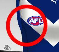
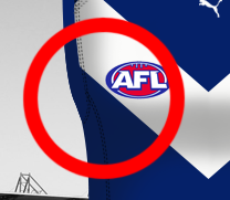
What you should do is change the colour of the cuffs to the exact same colour of the blue next to it. (on the right). That makes it 'fit in' and look more realistic. It's something you should be aware of as a designer. The smaller details, because it makes a huge difference.
Secondly, and this really shouldn't have to be said, because this one is painfully obvious, but the shorts. Look at the shading of the shorts. It's at 100% right now. Turn it down. 20% might look good, you'll have to experiment. See the difference below. What looks better?

Now, for light colours - yellow, white, what-have-you, the transparency of the shading needs to be low. For dark colours, it needs to be very high. Up to 80% or more. Look below. On the left we have a black guernsey, and on the right we have a white one. On both of these guernseys, the transparency of the shading is 85%.
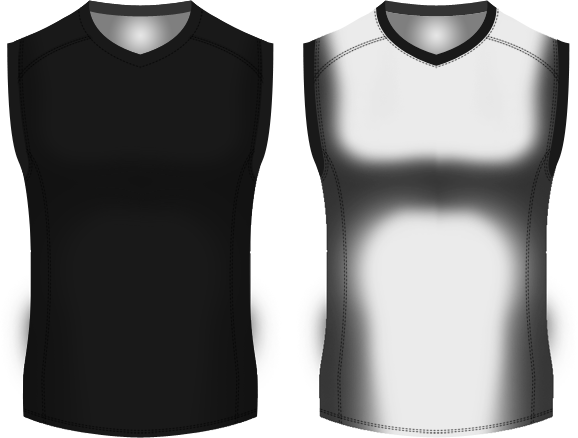
The one on the right looks awful. This is just to illustrate why the transparency on light coloured things should be low and dark coloured things should be high.
For guernseys like Collingwoods, with both black and white, this can create issues. What should transparency the shading be? Well, look below. On the left it's 85%, and it looks bad, because the shading is too obvious on the white stripes. On the right, it's at 15%, and while it doesn't look as bad, the shading is almost invisible on the black.
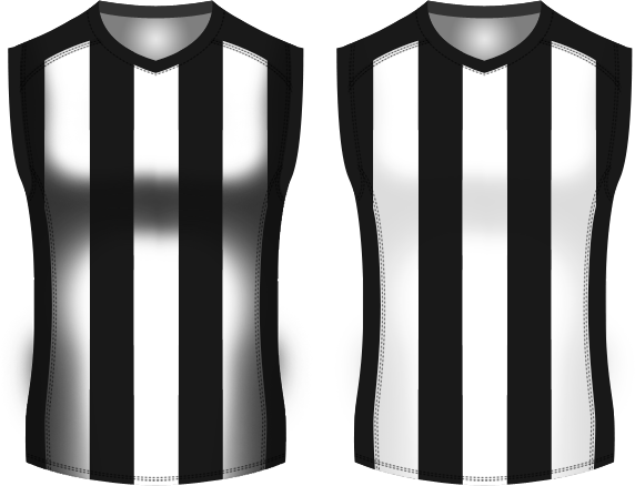
So, out of these two, you'd probably use the one on the right. It looks better. There is a more complicated method to make the shading darker over the black and lighter over the white, and then it looks incredible, but I'll save that for another time. Using 15% or 25% will suffice for now.
Finally, is the use of black and white. Consider the fact that the shading layer is black. What happens when you put this layer over a completely black guernsey? Nothing. You won't be able to see it. It's black. It will be like the shading isn't there at all. If you want to have a black guernsey, you need to make it a very dark grey, rather than pure black. Pure black, in RGB, is 0, 0, 0. You should use 25, 25, 25 (as I have above). In regards to white, you can use pure white (255, 255, 255), it doesn't affect the design too much, but using an incredibly light grey (235, 235, 235) looks infinitely better.
These are the sorts of things that good designers pay attention to. These are the sorts of things that are the difference between finishing first and last in a competition. It's that important.
Just to clarify, it's not just the things I've mentioned above. It's the ability to look at your design and notice the small things, and make them look better, using your own problem solving skills. That's what separates the best from the rest.


