


When has est meant anything other than established on a sport logoWould rather established than est. Est could mean bloody anything. Of the words that began with est.
Navigation
Install the app
How to install the app on iOS
Follow along with the video below to see how to install our site as a web app on your home screen.
Note: This feature may not be available in some browsers.
More options
You are using an out of date browser. It may not display this or other websites correctly.
You should upgrade or use an alternative browser.
You should upgrade or use an alternative browser.
Is it time to freshen up the logo?
- Thread starter El_Scorcho
- Start date
- Tagged users None
Every time the prison bars and V is combined it looks like s**t.
When has est meant anything other than established on a sport logo
It could literally be any of the these 116
establish
establishable
established
establisher
establishers
establishes
establishing
establishment
establishmentarian
establishmentarianism
establishmentarianisms
establishmentarians
establishments
estaminet
estaminets
estancia
estancias
estate
estated
estates
estating
esteem
esteemed
esteeming
esteems
ester
esterase
esterases
esterification
esterifications
esterified
esterifies
esterify
esterifying
esters
estheses
esthesia
esthesias
esthesis
esthesises
esthete
esthetes
esthetic
esthetician
estheticians
estheticism
estheticisms
esthetics
estimable
estimableness
estimablenesses
estimably
estimate
estimated
estimates
estimating
estimation
estimations
estimative
estimator
estimators
estival
estivate
estivated
estivates
estivating
estivation
estivations
estop
estopped
estoppel
estoppels
estopping
estops
estovers
estradiol
estradiols
estragon
estragons
estral
estrange
estranged
estrangement
estrangements
estranger
estrangers
estranges
estranging
estray
estrayed
estraying
estrays
estreat
estreated
estreating
estreats
estrin
estrins
estriol
estriols
estrogen
estrogenic
estrogenically
estrogens
estrone
estrones
estrous
estrual
estrum
estrums
estrus
estruses
estuarial
estuaries
estuarine
estuary
Kickpuncher
Now I am become Donuts, the Destroyer of Ports
- Feb 13, 2007
- 12,393
- 20,932
- AFL Club
- Port Adelaide
Estragons 1870
Jones2ByrneJones
Hour of Pessimism
- Jul 27, 2012
- 15,820
- 27,995
- AFL Club
- Port Adelaide
Port Power Estuary 1996It could literally be any of the these 116
establish
establishable
established
establisher
establishers
establishes
establishing
establishment
establishmentarian
establishmentarianism
establishmentarianisms
establishmentarians
establishments
estaminet
estaminets
estancia
estancias
estate
estated
estates
estating
esteem
esteemed
esteeming
esteems
ester
esterase
esterases
esterification
esterifications
esterified
esterifies
esterify
esterifying
esters
estheses
esthesia
esthesias
esthesis
esthesises
esthete
esthetes
esthetic
esthetician
estheticians
estheticism
estheticisms
esthetics
estimable
estimableness
estimablenesses
estimably
estimate
estimated
estimates
estimating
estimation
estimations
estimative
estimator
estimators
estival
estivate
estivated
estivates
estivating
estivation
estivations
estop
estopped
estoppel
estoppels
estopping
estops
estovers
estradiol
estradiols
estragon
estragons
estral
estrange
estranged
estrangement
estrangements
estranger
estrangers
estranges
estranging
estray
estrayed
estraying
estrays
estreat
estreated
estreating
estreats
estrin
estrins
estriol
estriols
estrogen
estrogenic
estrogenically
estrogens
estrone
estrones
estrous
estrual
estrum
estrums
estrus
estruses
estuarial
estuaries
estuarine
estuary
I think there is enough teal in the picture.needs more teals
chiwigi
I’ll make tears from your Wines.
This thread is far less excruciatingly pre-season than the 'we should be Pirates' thread.
Literally!It could literally be any of the these 116
establish
establishable
established
establisher
establishers
establishes
establishing
establishment
establishmentarian
establishmentarianism
establishmentarianisms
establishmentarians
establishments
estaminet
estaminets
estancia
estancias
estate
estated
estates
estating
esteem
esteemed
esteeming
esteems
ester
esterase
esterases
esterification
esterifications
esterified
esterifies
esterify
esterifying
esters
estheses
esthesia
esthesias
esthesis
esthesises
esthete
esthetes
esthetic
esthetician
estheticians
estheticism
estheticisms
esthetics
estimable
estimableness
estimablenesses
estimably
estimate
estimated
estimates
estimating
estimation
estimations
estimative
estimator
estimators
estival
estivate
estivated
estivates
estivating
estivation
estivations
estop
estopped
estoppel
estoppels
estopping
estops
estovers
estradiol
estradiols
estragon
estragons
estral
estrange
estranged
estrangement
estrangements
estranger
estrangers
estranges
estranging
estray
estrayed
estraying
estrays
estreat
estreated
estreating
estreats
estrin
estrins
estriol
estriols
estrogen
estrogenic
estrogenically
estrogens
estrone
estrones
estrous
estrual
estrum
estrums
estrus
estruses
estuarial
estuaries
estuarine
estuary
Estrogen 1870... women's thread plz
AdsGoNads
Club Legend
Every time the prison bars and V is combined it looks like s**t.
Disagree - It demonstrates our history perfectly, with the V layered over top of the Bars, signifying our roots in the SANFL being behind our progression into the Nation competition - I don't think anyone could disagree that without the success of the Magpies, there would be no PAFC in the AFL.
AdsGoNads
Club Legend
It could literally be any of the these 116
establish
establishable
established
establisher
establishers
establishes
establishing
establishment
establishmentarian
establishmentarianism
establishmentarianisms
establishmentarians
establishments
estaminet
estaminets
estancia
estancias
estate
estated
estates
estating
esteem
esteemed
esteeming
esteems
ester
esterase
esterases
esterification
esterifications
esterified
esterifies
esterify
esterifying
esters
estheses
esthesia
esthesias
esthesis
esthesises
esthete
esthetes
esthetic
esthetician
estheticians
estheticism
estheticisms
esthetics
estimable
estimableness
estimablenesses
estimably
estimate
estimated
estimates
estimating
estimation
estimations
estimative
estimator
estimators
estival
estivate
estivated
estivates
estivating
estivation
estivations
estop
estopped
estoppel
estoppels
estopping
estops
estovers
estradiol
estradiols
estragon
estragons
estral
estrange
estranged
estrangement
estrangements
estranger
estrangers
estranges
estranging
estray
estrayed
estraying
estrays
estreat
estreated
estreating
estreats
estrin
estrins
estriol
estriols
estrogen
estrogenic
estrogenically
estrogens
estrone
estrones
estrous
estrual
estrum
estrums
estrus
estruses
estuarial
estuaries
estuarine
estuary

This thread is far less excruciatingly pre-season than the 'we should be Pirates' thread.


Concussion
Helmet
EstimatedWould rather established than est. Est could mean bloody anything. Of the words that began with est.
Boss351
Premiership Player
Swampie 4 LyfePort Power Estuary 1996

Port Power Estuary 1996
Estuarine Crocodillus
Not bitey enough
But..Never Smile At A Crocodile would be a catchy song...
Concussion
Helmet
Sorry, I deleted because I thought u were talking about a freshwater.But..Never Smile At A Crocodile would be a catchy song...
Sorry, I deleted because I thought u were talking about a freshwater.
That's Crocodillus Jonstoneye or something
Concussion
Helmet
Sorry to sound like an uber-nerd but I was researching my mistake and a salty is a crocodilus porosus but known as an estuarine crocodileThat's Crocodillus Jonstoneye or something
Johnstoneye hey.......I'm not even gonna go there.
Sorry to sound like an uber-nerd but I was researching my mistake and a salty is a crocodilus porosus but known as an estuarine crocodile
Johnstoneye hey.......I'm not even gonna go there.
I'd go there before I'd go the porous ones
Dalphonso
Premiership Player
- Oct 10, 2009
- 3,716
- 1,905
- AFL Club
- Port Adelaide
- Other Teams
- Territory Thunder,Waratahs FC
Ports have rivers and estuariesIt could literally be any of the these 116
establish
establishable
established
establisher
establishers
establishes
establishing
establishment
establishmentarian
establishmentarianism
establishmentarianisms
establishmentarians
establishments
estaminet
estaminets
estancia
estancias
estate
estated
estates
estating
esteem
esteemed
esteeming
esteems
ester
esterase
esterases
esterification
esterifications
esterified
esterifies
esterify
esterifying
esters
estheses
esthesia
esthesias
esthesis
esthesises
esthete
esthetes
esthetic
esthetician
estheticians
estheticism
estheticisms
esthetics
estimable
estimableness
estimablenesses
estimably
estimate
estimated
estimates
estimating
estimation
estimations
estimative
estimator
estimators
estival
estivate
estivated
estivates
estivating
estivation
estivations
estop
estopped
estoppel
estoppels
estopping
estops
estovers
estradiol
estradiols
estragon
estragons
estral
estrange
estranged
estrangement
estrangements
estranger
estrangers
estranges
estranging
estray
estrayed
estraying
estrays
estreat
estreated
estreating
estreats
estrin
estrins
estriol
estriols
estrogen
estrogenic
estrogenically
estrogens
estrone
estrones
estrous
estrual
estrum
estrums
estrus
estruses
estuarial
estuaries
estuarine
estuary
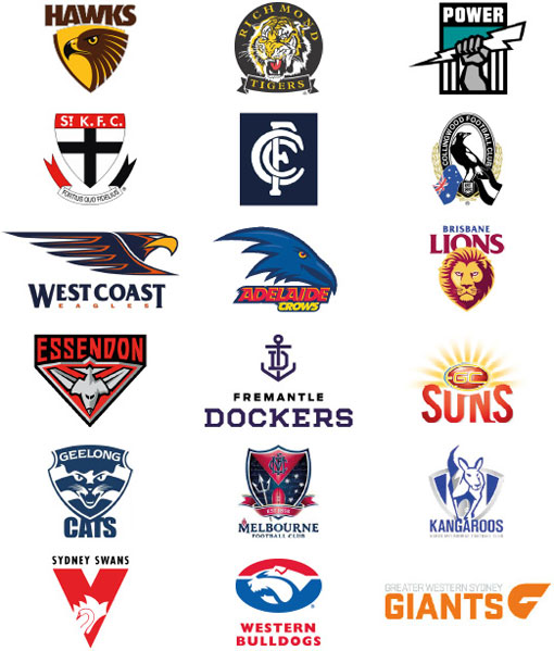
Ours is the best of the 18 club logos, followed by Collingwood's
Yup.
Close thread.
Close thread.
1. CollingwoodOurs is the best of the 18 club logos, followed by Collingwood's
2. Sydney
3. St. Kilda
4. Carlton
5. Meh...
Similar threads
- Replies
- 54
- Views
- 3K
- Replies
- 12
- Views
- 408
- Replies
- 582
- Views
- 25K
