Workshop Jumper Ideas for 2016

Remove this Banner Ad

Status
Not open for further replies.

NM_Mitchell

Norm Smith Medallist
May 3, 2014
5,131
6,026
#westside
AFL Club
North Melbourne
Other Teams
We put the U in CGU
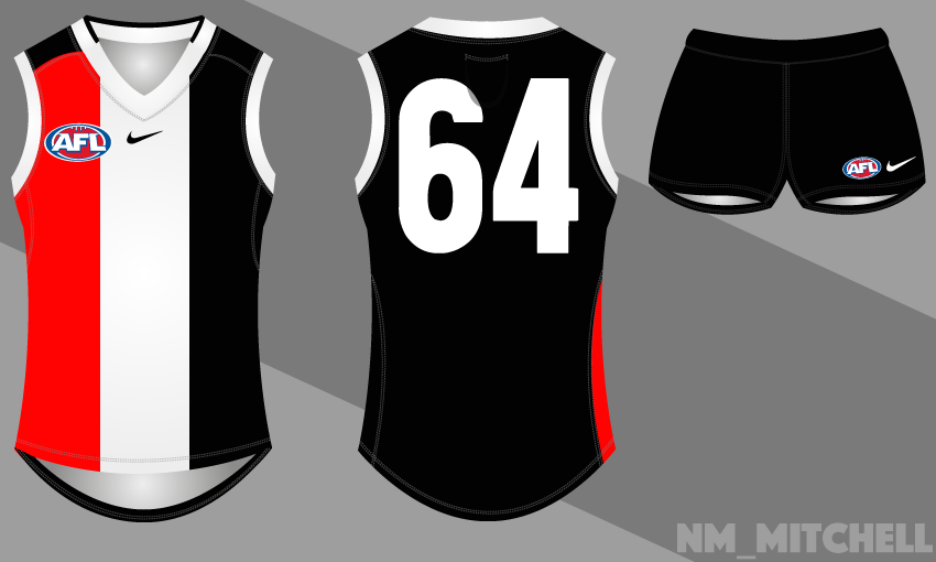
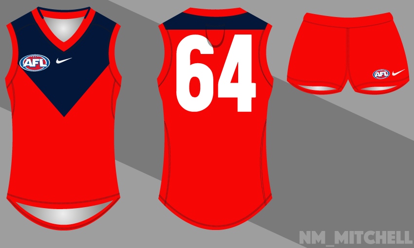
Here we are, another season has started, and now we have more guernseys to imply they're s**t by saying it slightly less shitly.
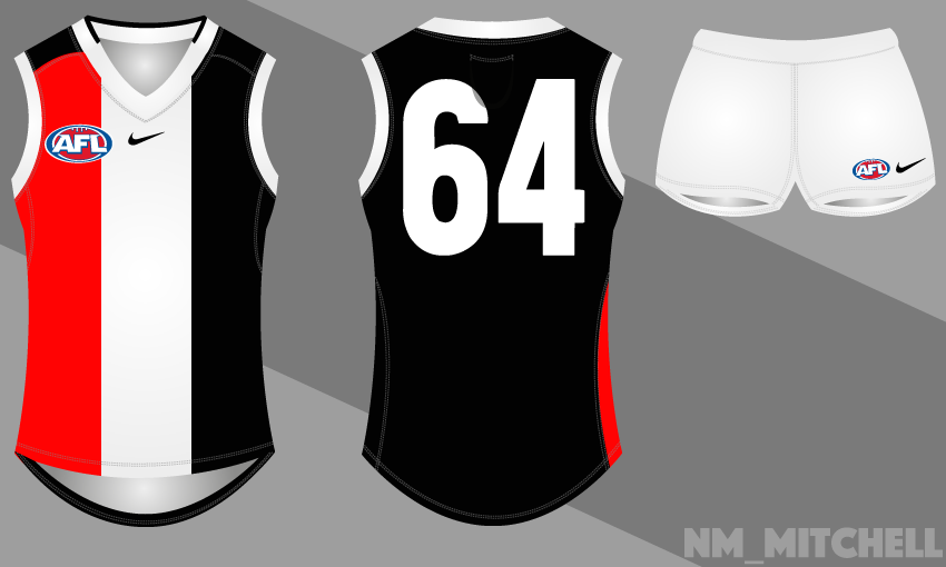
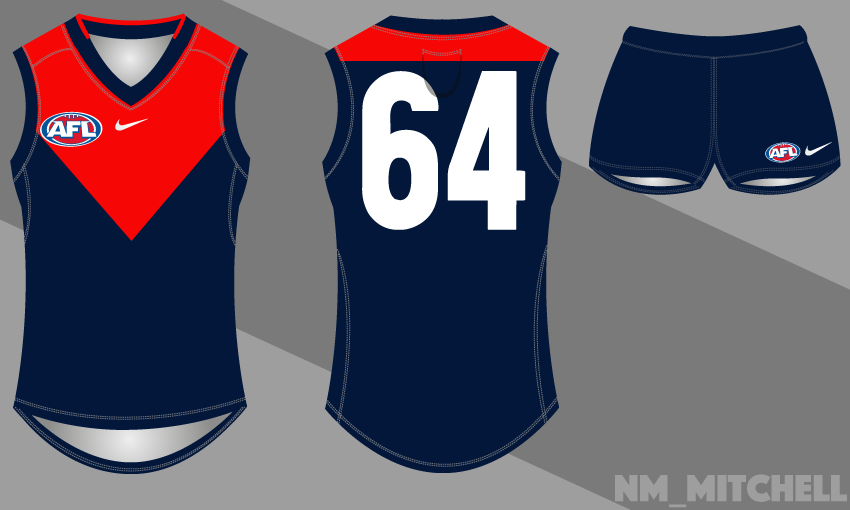
Here's where we can show the terrible, and I mean terrible, guernsey designers that actually get paid for their mediocrity (much like the players of the Carlton Football Club) how to design a set of jumpers that:
a) Look good;
b) Doesn't look like their mascot spewed on a blank guernsey;
c) Correct colours; and;
d) There's always a guernsey that prevents a clash.
 
St Kilda
Home:
K6HL1wa.png

Away
MtuVe7b.png

Clash - as is
 
May as well get these out of the way
Bigfooty Jumper Board yearly trends:

• Freo's jumper has some green and red added to it as a nod to the past
• dozens of potential clash strips for the Crows are proposed – they either look empty, derivative, saccharine, or too complex
• GWS and Gold Coast jumpers are also slaved over, with armchair designers unable to grabble with bad logos or the way all-grey looks boring and with all-orange, the grey seems to float and never look right... feedback, re-editing is futile
• Hawks, Tiges, and Essendon secondary jumpers revolve around yellow stripes or sashes, with added keylines and experimental (re: white) backgrounds
• a Brisbane Bears design is heralded as the ultimate Brisbane Lions clash
• the Fitzroy Lion is tweaked with extra slashes, curves, embossing, and size manipulation
• someone attempts to merge the Prison Bars into a Port Adelaide design; end result being more cluttered than Sydney's 2005 backline
• someone proposes new Port clash jumper – in turquoise
 

Log in to remove this ad.

nah, most people are still rockin' the socks, i'm still trying to make up my mind whether i'd like to leave that space for logos or make socks.
 

(Log in to remove this ad.)

Just swap it out for this as a Dark away kit instead. :cool:
1670bo.jpg
There was actually heaps of talks about this happening about 4 years ago, but instead they just decided to make it a pre-game warm up top.

P1000839.jpg
 
Yeah, remembering back it was also sold in sleeveless form?

Such a nice kit, Should have had Hawks in that last week vs north in there V for 90 years (to the day I believe) since there move to the VFL would have been pretty cool.
 
Yeah, remembering back it was also sold in sleeveless form?

Such a nice kit, Should have had Hawks in that last week vs north in there V for 90 years (to the day I believe) since there move to the VFL would have been pretty cool.
That was Norths commemoration game for the '75 Grand Final win over Hawthorn.

Fairly sure we had them in their full home and us in our home with white shorts to have the same kits as that day.

Though maybe in ten years time there will be a bunch of commemorative games between North, Hawthorn and the Doggies wearing their first kits to commemorate 100 years since joining.
 
It must have been done, but I've never seen a Dees away jumper where the design is the same but the yoke is simply much deeper? If they moved it down so the jumper was 60-70% red, squared it off at the back and changed the cuffs and maybe shorts to red, it'd become a red based jumper and solve any clashes.

Does the same job as an inversion, but without the straight swap, which is becoming a bit common. What do you think?
then the back will still be mostly navy blue. maybe if it were a deeper red yoke and a red back it'd work, but not if the back remained navy.
i'll mock one of what you suggested up when i get home.
 
then the back will still be mostly navy blue.
Yeah, I meant take the horizontal back of the yoke (like Brisbane's) 60% down the back of the jumper. I guess it'd have to sit at the top of the yoke, so there'd be more blue on the back than the front.

I expect it'd look a bit like the Carlton clash from the front, but without the monogram...
 
Mostly just some updated reused ideas here (I feel like every obvious idea has more or less been covered on this forum) but there's a few things I wanted to share.
Carlton 3 Clash.png
I don't know about everyone else but I feel like Carlton's new (actually old) monogram looks weird when it's blue on white so I've kept it white on blue by giving it a thick outline. I pitched Carlton using a Brisbane style yoke a while ago so I've brought that back, just to keep it a bit more interesting than a plain white jumper with side panels.

Adelaide 3 Clash.png
The basic idea of this is nothing new. It's based off the 2005 heritage guernsey but I've made the hoops more fitting with the home jumper, keeping the same order of colours. I'd also like to see some more interesting shorts to replace thin lines so I've used the hoops as inspiration. The socks look a bit weird but I feel like they'd work better in real life with boots on.

StKilda 2 Away.png
This definitely isn't an original idea but I definitely think they should bring it back as a pre-season/away jumper. It would also be a better clash jumper to use against Collingwood.

Western Bulldogs 3 Clash.png
Another re-used idea that I've posted before but I just think this would be a lot more interesting than their current clash jumper and it's a tribute to their old hooped VFA jumper.
 
Last edited:
Status
Not open for further replies.

Remove this Banner Ad

Back
Top