Workshop Jumper Ideas for 2016

Remove this Banner Ad

Status
Not open for further replies.
Why is everyone so keen to get rid of St Kildas clash jumper? We currently have the second nicest one we've ever had, and it's basically the best one after it's let itself go a bit. I'd even venture to say it's among the nicest strips in the league, home or away.

Also, I'd be more than happy to see the HCB again, but not as the home, it should never have replaced the tri panel in that respect to begin with. Maybe have it as the third kit and wear it a few times (Collingwood, North) but otherwise it's time to move on.
I'm not one to buy other team's guernseys. But if I were the St Kilda clash would be the first one on my list. It simply is amazing.
 
Best clash jumpers of 2015: (in no order)
Collingwood-Away-2013.gif

GWS-Away-2015.gif


Melbourne-Red-2015.gif

North-Away-2015.gif

Richmond-Clash-2015.gif

StKilda-Clash-2015.gif
 

Log in to remove this ad.

I'd wipe Collingwood off of that list purely because it should be their home but agreed otherwise. Expect the same next year but with a different Giants kit and adding the wings
yeh agreed 100% #returnthewings #piestradition
Yeh collingwoods would be if they actually wore it.
love the pies clash jumper, especially with a blue CGU logo
 
Melbourne
Home

Status Quo. Only thing I changed were the socks. Made them to fit in better with the kit.
Melbourne Home.png
Clash

Really like the use of the monogram in this years clash/red jumpers. Also kept the yoke incorporating all three demons colours.
Melbourne Clash.png
Clash with no monogram
Melbourne Clash No Monogram.png
 
really? I honestly like it way more than all the other white clashes out there, also way better than there previous clash
Andonis1997
373491.jpg
373537.jpg
373542.jpg

373549.jpg
That being said, the front design is very nice.
373437.jpg

But the joining is 'meh'.
 
373491.jpg
373537.jpg
373542.jpg

373549.jpg
That being said, the front design is very nice.
373437.jpg

But the joining is 'meh'.
I still think the cricket vest clash design would be perfect. They could easily say it's a heritage guernsey too ;)
that's all well and good but nothing beats this:
38926-richmond-tigers-2015-mens-official-clash-guernsey-2000.jpg
So many years of campaigning paid off, cheers Groupie_
 
really? I honestly like it way more than all the other white clashes out there, also way better than there previous clash
Andonis1997

From a technical standpoint it's just horrible. I legitimately thought it was an error when the graphic was first posted; the diagonal pattern is exactly the same on the front as it is the back. There is zero symmetry. 2/10.
 

(Log in to remove this ad.)

From a technical standpoint it's just horrible. I legitimately thought it was an error when the graphic was first posted; the diagonal pattern is exactly the same on the front as it is the back. There is zero symmetry. 2/10.
you and Ando make a good point, I would agree with you there, really does need fixing up but it's still good
It's just like a puzzle that needs solving , kinda.
 
I like the orange bib. I wouldn't put it past BLK stuffing up the artwork when they sent it off. Didn't they forgot to put full hoops on the Adelaide jumper or something?
BLK are a renouned "class act" when it comes to doing things properly.
 
Why is everyone so keen to get rid of St Kildas clash jumper? We currently have the second nicest one we've ever had, and it's basically the best one after it's let itself go a bit. I'd even venture to say it's among the nicest strips in the league, home or away.

Also, I'd be more than happy to see the HCB again, but not as the home, it should never have replaced the tri panel in that respect to begin with. Maybe have it as the third kit and wear it a few times (Collingwood, North) but otherwise it's time to move on.
Because the clash jumper you guys had in 2009-10 was perfect for you guys, that one didn't ever had to be changed
 
Because the clash jumper you guys had in 2009-10 was perfect for you guys, that one didn't ever had to be changed
It was a perfect clash jumper, but it was a pretty boring design.

This year's is almost as effective as a clash, but a far more interesting design, and one that'll sell a heck of a lot better.
 
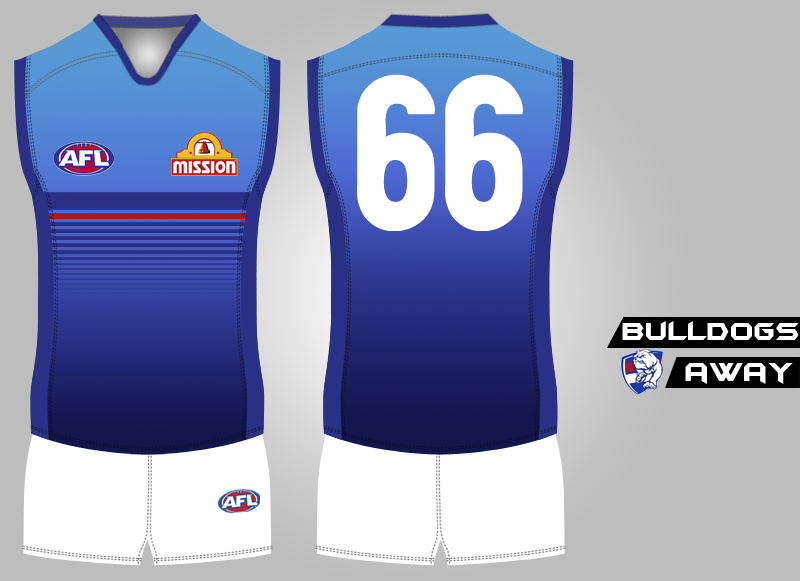
Love the design and would make a great training jumper, but Bulldogs home and clash jumper is perfect as is. Away should be home if no clash
Thanks, the idea behind their current kits is perfect, but I've got a problem with how far down their hoops appear, reminds me of Essendon's drooping sash period from 2009-10.
 
Last edited:
Thanks, the idea behind their current kits is perfect, but I've got a problem with how long their hoops appear, reminds me of Essendon's drooping sash period from 2009-10.
Yeah Mission sponsor could be adjusted but very minor.

If the Bulldogs were a new team starting up, your jumper design would be great.
 
Status
Not open for further replies.

Remove this Banner Ad

Back
Top