Workshop Jumper Ideas for 2016

Remove this Banner Ad

Status
Not open for further replies.
Not what I meant. That is a Puma template with BLK logos on it.
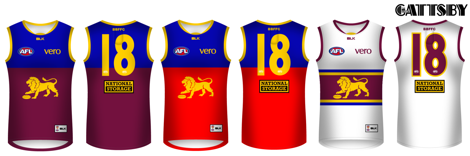
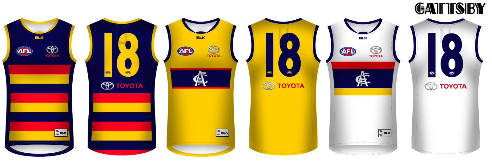
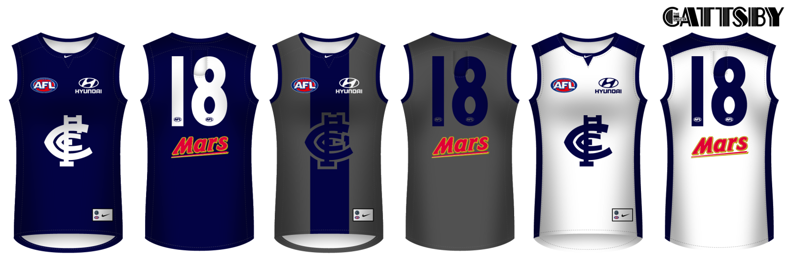
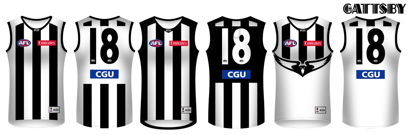
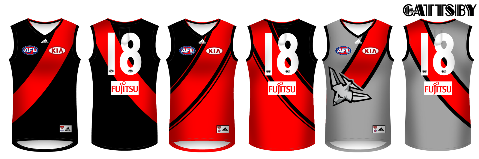
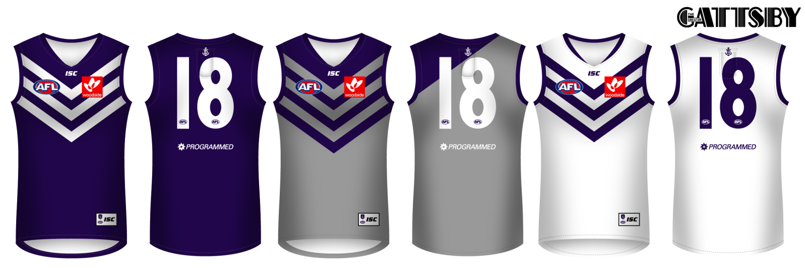
Nah, it's got regular side panels, instead of the weird puma ones. But still, BLK's are 'fake' side panels with no stitching.
 
Where does the monogram originate from? Someone should try and incorporate the old Adelaide Football Club into clash guernseys or use the font styles. I know it is a completely different club but it would be a nod to football history in the state.
I thought it was one that Adelaide 'made up' so to speak.

So it has no heritage to the club, other than it appears in their heritage jumpers and logos every now and then.

Any Adelaide supporters have more of an idea?
 
Brisbane.

They've got it right at the moment, except for the clash.

4rojfs.png
 

Log in to remove this ad.

Just don't let the Maroon droop too far down. Looks best when the blue ends before the arms.
I dunno, I think it looks better below the cuffs tbh

For example, I thought the 2009 home jumper looks better than the 2002 home jumper

Brisbane-2008.gif


Brisbane-2000.gif
 
I dunno, I think it looks better below the cuffs tbh

For example, I thought the 2009 home jumper looks better than the 2002 home jumper

Brisbane-2008.gif


Brisbane-2000.gif
In the flesh it just looks more, I don't know the word, proud? The lion above half way comes across as the chest being more pumped up whereas half way it looks deflated, again in person. I also think Maroon should be more dominant for the home strip.
 
I dunno, I think it looks better below the cuffs tbh

For example, I thought the 2009 home jumper looks better than the 2002 home jumper

Brisbane-2008.gif


Brisbane-2000.gif
Look at real photos. You'll change your mind
 
**** the hoops
Controversial post there from Gattsby.

3430064-5753440611-ohhhh.gif


I dunno, I think it looks better below the cuffs tbh

For example, I thought the 2009 home jumper looks better than the 2002 home jumper

Brisbane-2008.gif


Brisbane-2000.gif
VmzcYoATGAq3iZCbark_UUAhEZs2W6FsCzOq5G71KxuConHPbsziQZ5P6FLT7QY87BDw7fYU_gcJpVne5VYRU2lX1TcusDt_11maOaeckWVrAqRlG7JWiL1pmzjWP-bS-eo8nt_T3zKNUPGDRdtqNR6KOvLmPg8PhooA1-nJ-A=w443-h332-nc


220px-Matthew_Leuenberger.jpg

Higher yoke for mine. Looks like Brisbane was trying to go for a predominately blue jumper with the lower yoke.
 
Controversial post there from Gattsby.

3430064-5753440611-ohhhh.gif
:cool::cool::cool:
VmzcYoATGAq3iZCbark_UUAhEZs2W6FsCzOq5G71KxuConHPbsziQZ5P6FLT7QY87BDw7fYU_gcJpVne5VYRU2lX1TcusDt_11maOaeckWVrAqRlG7JWiL1pmzjWP-bS-eo8nt_T3zKNUPGDRdtqNR6KOvLmPg8PhooA1-nJ-A=w443-h332-nc


220px-Matthew_Leuenberger.jpg

Higher yoke for mine. Looks like Brisbane was trying to go for a predominately blue jumper with the lower yoke.
But also bear in mind that AFL logos on the chest are now in a fixed position, and the look of having them half on the blue and half on the maroon doesn't look right IMO.
 

(Log in to remove this ad.)

:cool::cool::cool:

But also bear in mind that AFL logos on the chest are now in a fixed position, and the look of having them half on the blue and half on the maroon doesn't look right IMO.
A compromise should be made in that case. Enough blue to cover all the logos and s**t on top of it, but still restrain it from sinking too low.


I'd shrink the G a tad and align it with the grey stripes.

Collingwood.

Revert back to home jumper and inverse swooping magpie for clash jumper.

efph0z.png
Swooping clash is gorgeous. Would buy one for sure.
 
A compromise should be made in that case. Enough blue to cover all the logos and s**t on top of it, but still restrain it from sinking too low.
But... I'm stubborn and lazy :(
Swooping clash is gorgeous. Would buy one for sure.
Cheers, yeah I don't mind it either ;)
 
Fremantle.

Just the status quo. Tried to play around with the away kit, but yeah...

2sanl0k.png


The Half Back is the shading on the white one better?
 
Status
Not open for further replies.

Remove this Banner Ad

Back
Top