Turned those radial gradients back off mayn
Nice template rly like the socks.
Nice template rly like the socks.
Follow along with the video below to see how to install our site as a web app on your home screen.
Note: This feature may not be available in some browsers.
All 18 AFL teams are investing pre season jumpers for 2016.
first up Here is the Brisbane Lions Pre Season 2016:
View attachment 148734
Just get rid of them. Unless you can actually properly execute it, it just looks silly.looks like I cooked the gradients by using the wrong one, will fix next time.
West Coast.
I'm ok with returning the wings, but only if they're big and not the current pissy ones on their away jumper.
View attachment 147694
nar mate, just need to take my time and double check.Just get rid of them. Unless you can actually properly execute it, it just looks silly.
-Socks should never have a radial gradient, especially that strong. It's a different material to the jumper, so they should not have the same gradient.nar mate, just need to take my time and double check.


Looks like a bunch of bowtie's tbh.St Kilda 2016 Pre Season.
Inspired by the Hawks diamonds jumper, this jumper is a modern alternative for the saints. Also features inspiration from Fed Square and Victoria's transport operator PTV.
View attachment 148783
Is it just me or does that look a bit like Fed Square?St Kilda 2016 Pre Season.
Inspired by the Hawks diamonds jumper, this jumper is a modern alternative for the saints. Also features inspiration from Fed Square and Victoria's transport operator PTV.
View attachment 148783
Sorry.Is it just me or does that look a bit like Fed Square?
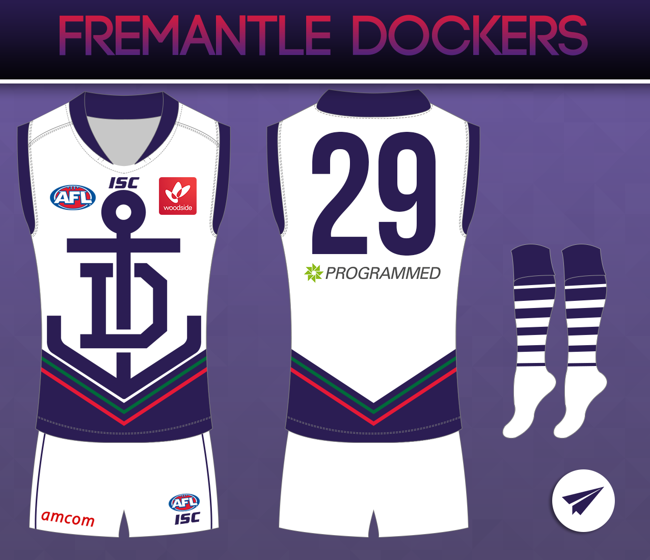
This could work as a Freo clash, but I don't think that really needs changing. Mightn't be a bad training jumper.

These in-jokes really hurt the newbies....Sorry.
I'll remove myself.
Hi there. Welcome to BigFooty and the Footy Jumper and Graphic Design Board. It's great to hear you might be interested in some designing. This link should provide some answers to your question.Just a newcomer here, trying to get into this thread but wondering how to do shading on jumpers (photoshop or illustrator)
Hi there. Welcome to BigFooty and the Footy Jumper and Graphic Design Board. It's great to hear you might be interested in some designing. This link should provide some answers to your question.
http://www.bigfooty.com/forum/threads/how-to-add-shadows-to-your-template-in-illustrator.1102106/
We have also started up a "How To" thread that might also be something to look at for tips and ideas.
http://www.bigfooty.com/forum/threads/how-to-megathread.1095508/
In the meantime, I can recommend our competitions. We almost always have something running that anyone can enter and improve their skills.
Great. I look forward to seeing it, as I am sure everyone here isThanks heaps man started up a lions design
Brycey linking to the megathread. You da real MVPHi there. Welcome to BigFooty and the Footy Jumper and Graphic Design Board. It's great to hear you might be interested in some designing. This link should provide some answers to your question.
http://www.bigfooty.com/forum/threads/how-to-add-shadows-to-your-template-in-illustrator.1102106/
We have also started up a "How To" thread that might also be something to look at for tips and ideas.
http://www.bigfooty.com/forum/threads/how-to-megathread.1095508/
In the meantime, I can recommend our competitions. We almost always have something running that anyone can enter and improve their skills.
It's also got too much yellow/red for games against Hawthorn (apparently). Not my only reasoning but I feel it looks stronger and cleaner.I still prefer your home to the one above, hitthepost .
You have a unique(ish) design, why change it? It's got enough navy anyway.