


Anything would be better than slapping their s**t-tastic logo on a red jumper.I would love to see Gold Coast do a new jumper with basically a rip off of Freo's chevrons.
Red base, yellow chevrons. Would look really powerful imo.
Love the Crows & Port mocks above.
I can't Photoshop sadly.
Navigation
Install the app
How to install the app on iOS
Follow along with the video below to see how to install our site as a web app on your home screen.
Note: This feature may not be available in some browsers.
More options
You are using an out of date browser. It may not display this or other websites correctly.
You should upgrade or use an alternative browser.
You should upgrade or use an alternative browser.
Workshop Jumper Ideas for 2016
- Thread starter NM_Mitchell
- Start date
- Tagged users None
- Status
- Not open for further replies.
- Nov 15, 2010
- 2,409
- 2,157
- AFL Club
- Fremantle
- Other Teams
- WACA, Western Force, Arsenal, Glory
A Southport-style chevron might work for Gold Coast perhaps?
Heya
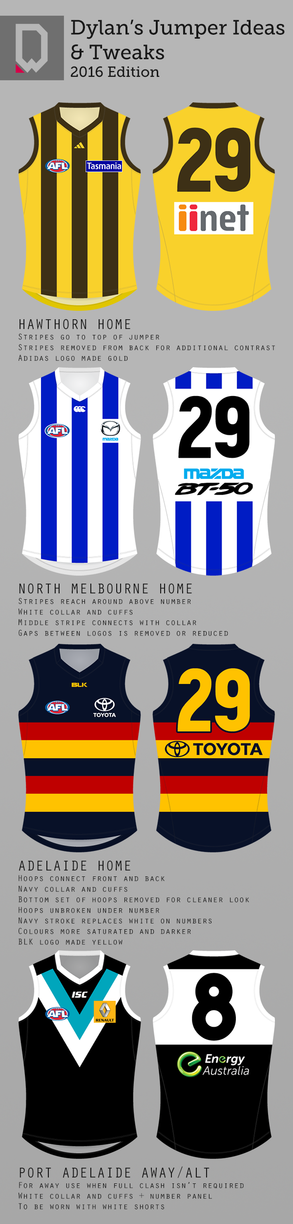
Instead of doing assignments I put some of my minor ideas into visual form tonight.

Liking that Crows jumper mate... especially the cleaned up bottom part
- Moderator
- #1,279
Okay, Let me ask you this: If it was a requirement for each club to have an ANZAC Day Guernsey, how would you represent this?
Is anyone else reading between the lines on this?
It's a bit like indigenous round guernseys – optional in 2013, compulsory in 2014.
I would hate to see the same thing happen with the commercialisation of what should be a day of remembrance.
- Jul 9, 2010
- 24,163
- 26,536
- AFL Club
- Fremantle
Already gone unfortunately. There are now more arrests on Anzac Day than Australia Day. It's now just another day to get pissed and with jingoism involved, that ends up being a very attractive thing to sell to the lowest common denominator.Is anyone else reading between the lines on this?
It's a bit like indigenous round guernseys – optional in 2013, compulsory in 2014.
I would hate to see the same thing happen with the commercialisation of what should be a day of remembrance.
Comparing footballers to war heroes is offensive. Even calling them "heroes" or saying how they have no concern for their safety is just Luke Darcy-level shite... but it's all part of banding it up with war imagery and selling it as a day that's now really no longer about anything.
The Half Back
BC Approved
It looks purple...
i agree, i hate it haha.Anything would be better than slapping their s**t-tastic logo on a red jumper.
i did these up sometime last year, and just remembered them!


also have these chevron versions:


MKMatty
Busy Vibin’
I swear you posted these last year. Still awesome.i agree, i hate it haha.
i did these up sometime last year, and just remembered them!
View attachment 176401
View attachment 176402
also have these chevron versions:
View attachment 176403
View attachment 176404
yeah i did haha. another year of hating our dumb logo on the front of our guernseys brings me back here again!I swear you posted these last year. Still awesome.
Mitch3ll
Rookie
It's been a solid two and a half years since I last created a guernsey and today I made a return, which also means it's been two and a half years since I've posted on Bigfooty. Yes, I still use Paint but here's two designs I believe both Freo and the Swans should adopt respectively next year.
Freo Clash: Honouring the past by placing an anchor on the front but also representing the current as its currently the anchor that is located on the clubs logo. I obviously removed the D from the anchor.
Swans Home: I believe the guernsey should have always looked like this. I Incorporated their name sake onto their already lovely looking guernsey. Swans and the opera house? Doesn't get more 'Sydneyish' than that.


but here's two designs I believe both Freo and the Swans should adopt respectively next year.Freo Clash: Honouring the past by placing an anchor on the front but also representing the current as its currently the anchor that is located on the clubs logo. I obviously removed the D from the anchor.
Swans Home: I believe the guernsey should have always looked like this. I Incorporated their name sake onto their already lovely looking guernsey. Swans and the opera house? Doesn't get more 'Sydneyish' than that.


- Nov 15, 2010
- 2,409
- 2,157
- AFL Club
- Fremantle
- Other Teams
- WACA, Western Force, Arsenal, Glory
Swans Home: I believe the guernsey should have always looked like this. I Incorporated their name sake onto their already lovely looking guernsey. Swans and the opera house? Doesn't get more 'Sydneyish' than that.
View attachment 176417
I've always wanted to see a Swans design like that.
wing it
Club Legend
- Jun 6, 2013
- 2,427
- 3,917
- AFL Club
- West Coast
Is that a waterfowl?I know the new Adelaide clash jumper for 2016 has already been decided, but I think this one wouldn't look that bad compared to past clash jumpers of the Crows.
View attachment 176377
Yes.Is that a waterfowl?
dylancox08
Senior List
- May 10, 2015
- 174
- 138
- AFL Club
- Collingwood

Adding 1 more chevron and lowering the logo would look fantastic!i agree, i hate it haha.
i did these up sometime last year, and just remembered them!
View attachment 176401
View attachment 176402
also have these chevron versions:
View attachment 176403
View attachment 176404
i agree, i hate it haha.
i did these up sometime last year, and just remembered them!
View attachment 176401
View attachment 176402
also have these chevron versions:
View attachment 176403
View attachment 176404
These are awesome man, you should submit these to the Gold Coast clash jumper comp!
MKMatty
Busy Vibin’
Transfer them to the BLK template and send it to them. They're running a clash competition right now, I'm sure you could argue a case for consistent home and clash kits. Especially with kits as quality as yours.i agree, i hate it haha.
i did these up sometime last year, and just remembered them!
View attachment 176401
View attachment 176402
also have these chevron versions:
View attachment 176403
View attachment 176404
Comp?These are awesome man, you should submit these to the Gold Coast clash jumper comp!
There's a thread upComp?
Yeah. Saw it just after I posted. My badThere's a thread up
Jones2ByrneJones
Hour of Pessimism
- Jul 27, 2012
- 15,820
- 27,995
- AFL Club
- Port Adelaide
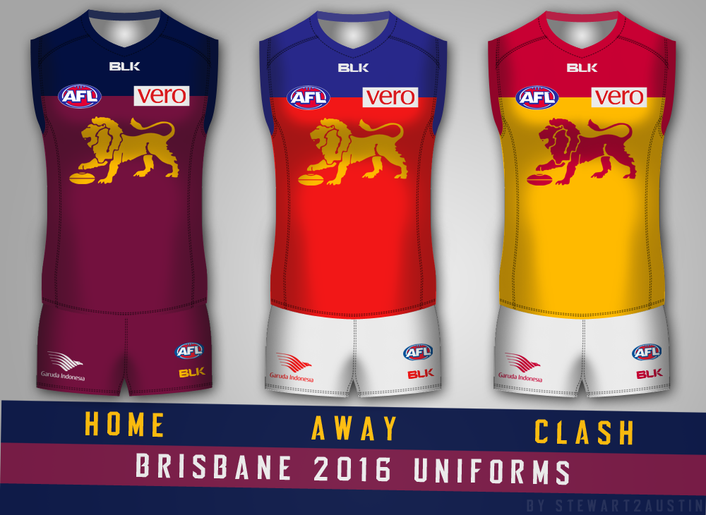
Langers89Okay so Brisbane.
Again, nothing much. Navy at home, Fiztroy away, Bears clash. Simple and well-versed in these parts but, hey, don't fix something that ain't broken.
- Oct 19, 2013
- 1,785
- 2,758
- AFL Club
- Melbourne
They are all great, but that Crows guernsey is absolutely incredible. Would turn it from being one of my least favourites to my favourite if they could make something that clean.Heya
Instead of doing assignments I put some of my minor ideas into visual form tonight.
Langers89
Rookie
- Aug 18, 2015
- 45
- 113
- AFL Club
- Brisbane Lions
Sorry mate. The images didn't load. Do you have a screen grab available?
Jones2ByrneJones
Hour of Pessimism
- Jul 27, 2012
- 15,820
- 27,995
- AFL Club
- Port Adelaide
Sorry mate. The images didn't load. Do you have a screen grab available?

Lachy_b1999
Rookie
- Sep 20, 2015
- 40
- 120
- AFL Club
- Sydney
- Other Teams
- Buckley Ridges CC, Melbourne Stars
Hi I'm new here and have a few ideas I'd like to share but im having trouble with templates... anyone able to help me out?
I have downloaded El Scorcho's template but am struggling with it
I have downloaded El Scorcho's template but am struggling with it
Langers89
Rookie
- Aug 18, 2015
- 45
- 113
- AFL Club
- Brisbane Lions
Just and FYI that the Navy on the Home strip is meant to be the same PMS as the Away strip

In regards to the clash in 2016, this will not be possible as the Clash Guernseys are on a 2 year cycle. The current cycle is 2015-2016. The next update will be for season 2017.
....is the clash strip a cerise or maroon?
- Status
- Not open for further replies.
Similar threads
- Replies
- 726
- Views
- 78K
