Discussion Jumpers That Never Were

Remove this Banner Ad

Adding options 2 and 3 below to this thread as proposed jumpers that will never see the light of day, option 1 will be worn by the Dogs in round 6 this year (unfortunately). They all stink.
BMBGuernseyVote-HeroWEB.jpg
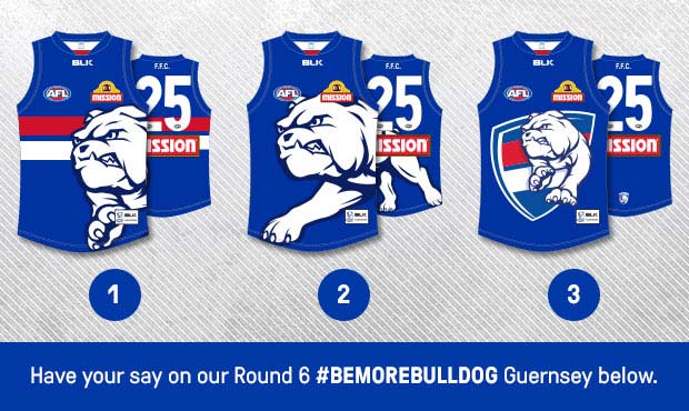
Oh well, you'll never watch the replay, so you'll never have to look at it again ;)
 
We might watch the first half! Great comeback saints. Dogs fans were very disappointed with that guernsey. We fought hard to get the traditional hoops back only to cop that under 9s rubbish. Never again we hope.
 
Those really are guidelines in the vaguest sense aren't they? Hell I think Channel Seven probably bust half a dozen every round they broadcast...
Have you ever noticed how they think PMS values have different RGB values depending on which club it applies to?

RED:
Adelaide & Bulldogs PMS 186 - RGB 198,12,48
Essendon PMS 186 - RGB 201,5,39

StKilda PMS 485 - RGB 237,27,46
Gold Coast PMS 485 - 238,49,36

NAVY
Geelong & Adelaide PMS 289 - 0,34,68
West Coast PMS 289 - RGB 0,42,92
 

Log in to remove this ad.

The more I go through this document the more I doubt its accuracy.
Is this a legit document from the AFL? Or did someone make it themselves?
There's so many errors I just don't see how the AFL have put it out.
I got it from demon_spud who said it was from The AFL Brandzone
 
I got it from demon_spud who said it was from The AFL Brandzone
Well it certainly says it's from there.
There's so many differences between official merchandise information I've found, though some of it is, admittedly, a little old.
As for getting different RGB values for the same PMS number, that's completely defeating the purpose of having something like this in the first place.

Palette-template2.gif


Here's mine from AFL Merchandise information.
Palette-template.gif
 
So which one of the graphics is correct? Mero here's your Carlton colours from your merchandise info compared to the one you put up a while ago.. How come they're so different? :confused:
View attachment 134388
One's Royal Blue, the other's Navy.
I don't think I ever put out anything with Carlton using Royal Blue.
Perhaps the difference is between RGB, CMYK and Book Colours.
 
I'm in RGB at the moment. CMYK seems the same, but I can't really tell.
Colours on your computer will be different, even between software packages. It is a complex system differences between CMYK and RGB, without getting into colour theory and the systems. Another difference will be your monitor settings, which again throw a spanner in the works.

What is most interesting if you get your hands on a Pantone book check out the PMS 485, it has orange in it. When you look at a Swans top/logo it doesn't look orange. I even have an official rep top and the PMS 485 swatch doesn't match. It's like that dress that blew up the internet.

I did some merch for a club and it took a long time to get the best red.

Mero is doing the best he can, with little to no support,

When you are designing it is best to look at what your final output would be, screen, print, merch etc,. Then use the 'eye' for your work.

Here are the AFLBrandzone website images for the Bulldogs guernsey.....something is not right....
572.jpg
573.png
 
Last edited:

(Log in to remove this ad.)

Puma have a great tradition

The Hawthorn Diamond - Puma
West Coast Ochre - Puma
Brisbane wee stain - Puma
Adelaide Murder of Crows - Puma

4 of the worst jumpers to ever grace the field. All designed by Puma.
Add paddle pop to that list
 
Add paddle pop to that list
I almost bought a Paddle pop jumper today...

Was cheap, and I thought in 20 years it could be the next ochre

Got a Melo knicks alt jersey instead, The Half Back will be proud of this :p
 
View attachment 138597

How about these flipped chevron St Kilda NZ jumpers? via demon_spud

source
Looks like a design from the 1920s. I mean that in a good way. South Fremantle once had a jumper with nothing but red and white chevrons, and I could imagine that being striking in person. Dig this one too - unique, and the balance of red and white and then minimal black is definitely something new from St Kilda (they seem to like an even split, all white, or that red and black hooped one from a few years ago).

Still, I see no point in them trying to grow their brand (in futility, probably - they're a classic Melbourne club. Milk that) in New Zealand but then not even showcasing the biggest part of their brand: their home jumper.
 
I almost bought a Paddle pop jumper today...

Was cheap, and I thought in 20 years it could be the next ochre

Got a Melo knicks alt jersey instead, The Half Back will be proud of this :p
I too have said alt jersey and am indeed proud.
 

Remove this Banner Ad

Back
Top