Discussion Logo Discussion Thread

Remove this Banner Ad

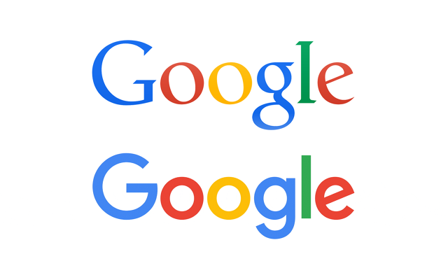
A comparison between the old and the new.

CN3I6IRUwAAuvJC.png


The logo's growing on me.

I like how they've retained their multi-colour branding.

Absolutely love its new favicon.
Big ups from me.
 
KN-NzuRl.png


CN1CDHTWUAENd0p.png:large


google5ap8q.gif


booooooooooooooooooooooooooooooooooooooooooo

Definitely like the change they've made. I know it's not very creative really. But I've always hated that font they've used from the beginning. It's like some desktop designer thought they were being so creative using a Times style font.
I do agree that so many companies seem to 'change' their brand and all thats changed is some minor font detail. Such as True Value and Facebook for example, and you wonder was it worth it..
 

Log in to remove this ad.

Realising the irony as Mero called out a recent post of mine saying that a zebra did in fact look like another zebra, yes, the new Google G does look like other Gs.


Think that's the logo for the google authenticator app. :p
 

(Log in to remove this ad.)

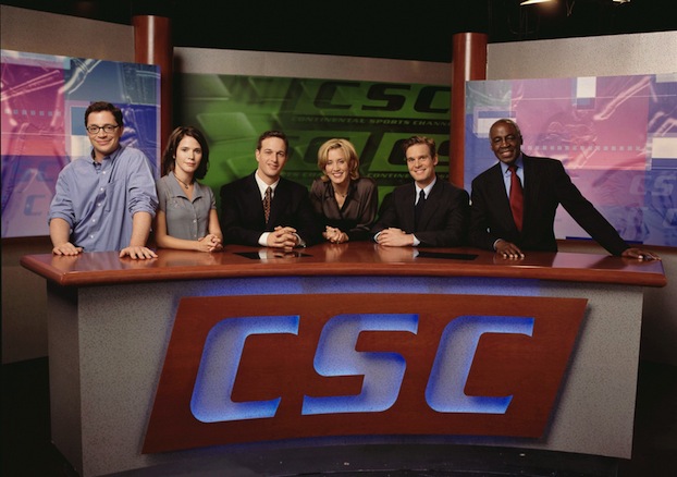
Sorry to break up the logo news, but it bugs me that these two logos are so similar
sports_night-castjpg.jpeg


International_Sports_Clothing_Logo.png


Surely International Sports Clothing (ISC) didn't copy/redesign the CSC logo from Sorkin's Sports Night
Don't forget this as well.
isc_logo_detail.gif
 
This annoys me more. It's the exact same font, same industry, same position on the guernsey

twp1.png
Possibly owned by the same people?
 
Sorry to break up the logo news, but it bugs me that these two logos are so similar
sports_night-castjpg.jpeg


International_Sports_Clothing_Logo.png


Surely International Sports Clothing (ISC) didn't copy/redesign the CSC logo from Sorkin's Sports Night
Concentrate on the small serifs in the CSC version.
Also, the S is more curved in the ISC, it's a harsher stop on the bottom curve, yet the same on the top.
Yes, it's still Serpentine, but it's Serpentine Serif. So... you know...it's technically different.
 
Concentrate on the small serifs in the CSC version.
Also, the S is more curved in the ISC, it's a harsher stop on the bottom curve, yet the same on the top.
Yes, it's still Serpentine, but it's Serpentine Serif. So... you know...it's technically different.
I've noticed that, and try to focus on the slight difference when I watch the show. But it still bugs me.
 

Remove this Banner Ad

Back
Top