News MFC Rebrand??

Remove this Banner Ad

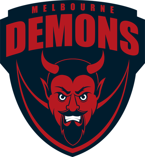
That's kind of the point, though. One of the biggest complaints about the last one was that kids couldn't draw it into their exercise books at school. Seriously.

Eh, you could say the same about the Collingwood logo. I did hate the old logo though so I'm happy with this. Could use the demon but at least it's neat and the colours are right.
 
This whole biz is brilliant. I'm so psyched my three year old girl will grow up knowing there's a female captain of the Demons who's just as fierce as Jonesy. Also, reckon they should name the inaugural Women's B&F after her.

I was just about to reply to the post that mentioned "the women's Brownlow" with something like "I think you mean the "Pearce Medal"
 
Thought the same, but I've never liked New Era hats. They look stupid to me.

#old
The one with just the monogram looks way better...I'm getting one for sure.

Actually going to wear it like a baseball cap though
 

Log in to remove this ad.

The one with just the monogram looks way better...I'm getting one for sure.

Actually going to wear it like a baseball cap though

I actually bought the one with the old school monogram last night ... i figured, now that it's been redone, it may not show up on too much stuff anymore. I'll also drop some hints about the new one for xmas ... oh and the first thing i'll be doing to both is bending that brim ... bloody kids these days ...
 
I said something yesterday about wanting to see a Secondary Logo with an actual Demon on it ... So I decided to put my money where my mouth is and make one. I used the 70's royal blue demon as inspiration for it and went from there ... and now I should probably get back to the work I've put off for the last 24hrs or so ...

7VxRDIE.png
 
Last edited:
Anyone else look at the AFL website? Maybe it's just the 'newness' of it but the logo looks absolutely striking amongst all the others.

Looks like a tiny dark blob to me but to be a bit fair, they're all so small that you can really only a couple of the logos look clear at all.
 
I like the new logo, but I actually liked the old one too, and yet I'm seeing a lot of comments from Dees supporters about wanting to get rid of the old one.

What's the deal there? Was there something about the old one that was unpopular with your supporter base?
 
I like the new logo, but I actually liked the old one too, and yet I'm seeing a lot of comments from Dees supporters about wanting to get rid of the old one.

What's the deal there? Was there something about the old one that was unpopular with your supporter base?
It's inexorably linked to Schwab and Neeld.
 
Like the new logo, was gonna rock a hat and hoodie but I was kinda embarassed by the old logo

Ill buy some merch to wear in Canada with that new logo, Ill get people over here to associate it with the city of Melbourne and have us 2 million new members by wednesday
 

(Log in to remove this ad.)

I said something yesterday about wanting to see a Secondary Logo with an actual Demon on it ... So I decided to put my money where my mouth is and make one. I used the 70's royal blue demon as inspiration for it and went from there ... and now I should probably get back to the work I've put off for the last 24hrs or so ...

7VxRDIE.png
Awesome work there and a stark reminder to the kiddies to brush heir teeth.

Seriously though that looks very good. Goes to show what is old can be modern if done the right way. 90s demon could work as well but I like the idea of using retro demon.
 
Awesome work there and a stark reminder to the kiddies to brush heir teeth.

Seriously though that looks very good. Goes to show what is old can be modern if done the right way. 90s demon could work as well but I like the idea of using retro demon.

I actually tried to make the eyes and teeth red, in keeping with the "only red and blue" brief set out with the actual logo ... but went back to white because (a) the eyes lose all intensity, and (b) it made it look like he had bleeding gums, and I didnt think such a pro-gingivitis, anti-teeth brushing message was the right one to send
 
I actually tried to make the eyes and teeth red, in keeping with the "only red and blue" brief set out with the actual logo ... but went back to white because (a) the eyes lose all intensity, and (b) it made it look like he had bleeding gums, and I didnt think such a pro-gingivitis, anti-teeth brushing message was the right one to send
Perusing the AFL club logos there is no clear trend to one style or another or having the text above or below the graphic image.

With your version which looks the goods I just wonder if the Demon would look better above the text. I like the bold 'Demons' too but understand why the club wants to emphasise 'Melbourne'.

Above or below is really what the designer things works best ... I've had a go at below, but i think i prefer above.
upUXAAe.png
 
Above or below is really what the designer things works best ... I've had a go at below, but i think i prefer above.
upUXAAe.png
Wow, you're bloody good at this!

I think I prefer this one. Just has a nicer balance about it IMO. In the other one it looks like the demon is holding a sign above its head - getting a bit crowded out - I don't know what I saying here tbh haha I just like this one. Looks more natural, not top-heavy, the subtle red yoke down the bottom is great too.
 
I hope they release a hat like the members cap in 2013 i think. All blue with a red MFC monogram, normal curved baseball cap style, best bit of merch of any AFL club i've seen.

Also wish they made the spray jackets without the sponsor logos on it. Some MFC jackets from the late 90's are mental and didn't have any logos or sponsors, just big red V patterns, so nice. Although, the hoodie is tempting, usually not a fan of covering myself in club merch but that jumper is getting there.
 
I said something yesterday about wanting to see a Secondary Logo with an actual Demon on it ... So I decided to put my money where my mouth is and make one. I used the 70's royal blue demon as inspiration for it and went from there ... and now I should probably get back to the work I've put off for the last 24hrs or so ...

7VxRDIE.png

This is god damn ******* winning. Seriously mate, thats awesome. :thumbsu:

Love this one the best. How is this not our logo? :cry::cry::cry::cry:
 
I said something yesterday about wanting to see a Secondary Logo with an actual Demon on it ... So I decided to put my money where my mouth is and make one. I used the 70's royal blue demon as inspiration for it and went from there ... and now I should probably get back to the work I've put off for the last 24hrs or so ...

7VxRDIE.png

You just stuck horns on the Ming the Merciless and passed it off as your own work. Having Ming on our badge would be sweet.

14d.jpg
 

Remove this Banner Ad

Back
Top