News MFC Rebrand??

Remove this Banner Ad

What the chances that Melbourne changes it's moniker? I know this happened a lot in the old days but not in the modern era.

'Officially' disowning it? Slim I'd imagine. There's nothing wrong with the Demons name as a kind of nickname/thing for the fans. But as part of the brand it's surplus to requirements. But I guess you could say we haven't really used it in branding since the 2007(8?) logo.
 
Everyone's entitled to an opinion, obviously, but I wish people would realise the ambition behind this move. The club knows that, as things stand, we are not a viable organisation - and they are doing things to change it. Maybe it works, maybe it doesn't - but returning to a Demon is about a retrograde a move as Schwab's bugler and flag ceremony.

Every rebranding has ambition otherwise they wouldn't do it.

I really like the concepts. Simplified, only use our colours, promote the monogram "Yankees style", it all works for me. Unfortunately I'm not thrilled with the execution, particularly robbing the monogram of its character and printing it all on an acorn.

So just because an ambition makes sense it doesn't mean everyone has to like the end product.
 
Even if we were to be called the 'Melbourne Football Club' officially we'll still be known as "the Dees" colloquially, and so on. Easier for kids to say that they barrack for the Demons than the MFC or whatever.

Works for North Melbourne because "North" in itself is a pretty attractive name for a team. Not the same for us.
 

Log in to remove this ad.

Even if we were to be called the 'Melbourne Football Club' officially we'll still be known as "the Dees" colloquially, and so on. Easier for kids to say that they barrack for the Demons than the MFC or whatever.

Works for North Melbourne because "North" in itself is a pretty attractive name for a team. Not the same for us.
Never really thought of it until now but this post made me think, but could the demon association start to die out? i mean this is a long shot, but if the club doesn't reference the demons for the next 30 years could referring to them as such start to disappear? At this point i'm just pointlessly pondering, so carry on
 
Never really thought of it until now but this post made me think, but could the demon association start to die out? i mean this is a long shot, but if the club doesn't reference the demons for the next 30 years could referring to them as such start to disappear? At this point i'm just pointlessly pondering, so carry on
I don't think it matters, except I think the 80's cartoon demon might appeal to a kid. Melbourne haven't always been the Demons in any case. I no nothing of branding, but the club had to choose between a bunch of symbols to focus on and they chose "Melbourne". I think it's a good move. Not just "North" Melbourne, not just Collingwood - a little bit of Melbourne, not just Western something. Melbourne. I like it.
 
Last edited:
What's with all the comments about it being small, or not looking good when scaled down to half a five cent piece on the AFL website?

It is whatever size the person transmitting it chooses to transmit it in.

All the tiny little half five cent piece size logos on the AFL website look s**t. Except when you put them on a big HD screen.

Duh. The size is completely irrelevant.
also, if you have a retina Mac screen, it looks fine.
 
What's with all the comments about it being small, or not looking good when scaled down to half a five cent piece on the AFL website?

It is whatever size the person transmitting it chooses to transmit it in.

All the tiny little half five cent piece size logos on the AFL website look s**t. Except when you put them on a big HD screen.

Duh. The size is completely irrelevant.

Only because it was one of the main aims for the new logo to still be clear at a reduced size and the first site it is put on (outside the clubs home site) is the AFL website and it's illegible.
 
Did this. New logo isn't overly clear at on the banner on afl website. At that size, Giants logo is clear winner for me

Agreed. I think whoever does the branding at the Giants has done a great job. Nice acronym, unique colours, recognisable symbol, great team song, I like their guernseys.
 

(Log in to remove this ad.)

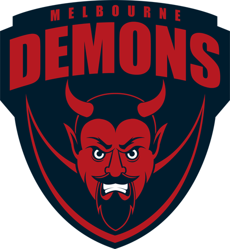
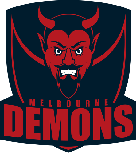
I said something yesterday about wanting to see a Secondary Logo with an actual Demon on it ... So I decided to put my money where my mouth is and make one. I used the 70's royal blue demon as inspiration for it and went from there ... and now I should probably get back to the work I've put off for the last 24hrs or so ...

7VxRDIE.png

Very nice TC :thumbsu:;)
 
Above or below is really what the designer things works best ... I've had a go at below, but i think i prefer above.
upUXAAe.png

Much, much better than the official one. Would look great on a baseball cap.

The main issue that I have with the official logo is that it is too crowded and the colour scheme doesn't work. A logo should be instantly recognisable regardless of size.

If the administration had gone to a branding company, instead of doing it internally, they would have got a better result.

 
The Demon isn't going anywhere (and never should). It's just not the main focal point at this point in time.
 
We're now the only club to not have our nickname referenced in our logo (allowing for Carlton to get away with just having a navy background).
But we aren't the only one to pull away. Port have gone right away from the Power. Freo barely use the Dockers.
 
But we aren't the only one to pull away. Port have gone right away from the Power. Freo barely use the Dockers.
The Fremantle logo is an anchor shaped into a D. The Port logo literally has the word 'Power' on it as well as a lightning bolt.
 
not too keen on the new logo, I am a graphic designer, I designed the Relive the Rivalry logo for the charity game played here in Tasmania, I was touched up by another designer slightly but the original still floats around on their facebook page. Any way, I love the old school MFC letter overlay, great to see it, but the Melbourne is written in a modern font and I feel they clash being old school and new school, the colours do a bit too, the dark blue makes te red look really dark, maybe if the colours were inverted it may appear better. It shouldnt matter what the logo looks like at the size of a 5cent piece but it does because logos are meant to be used at all shapes and sizes in a number of locations. I believe it is an improvement or at least a step in the right direction, the previous one reminded me of a half full shopping basket, still its better than Adelaide's cartoon crows head, we should of kept the 90s crow or gone with the heritage logo we used a few times.
 

Remove this Banner Ad

Back
Top