Discussion NAFL 2014-15 Franchise Owner Announcement and Discussion

Remove this Banner Ad

I'm happy to stick to 4 kits, I might just request that one kit only gets used for one or two rounds and stick to just a home and clash for the majority of games.
 

Log in to remove this ad.

vjy1XOp.png
 
Mine would be in but I spent the time I was going to spend finalising it making that teaser. Sorry.
 

(Log in to remove this ad.)

Lion removed, jagged edges cleaned up (tracing error), Hornet made smaller and white outline thing removed and replaced with a white stroke. Didn't move the Hornet higher because the nose is supposed to be pointing to the rough location of Hobart (imagine the shield is a map of Tasmania).

The stars are not for any premierships (lol) but for previous incarnations of the club; going back from the original Hornets in a Designathon to the old NAFL pink Hornets. Pink and green flashes on the nose are a nod to that era.

Logo.png
 
Lion removed, jagged edges cleaned up (tracing error), Hornet made smaller and white outline thing removed and replaced with a white stroke. Didn't move the Hornet higher because the nose is supposed to be pointing to the rough location of Hobart (imagine the shield is a map of Tasmania).

The stars are not for any premierships (lol) but for previous incarnations of the club; going back from the original Hornets in a Designathon to the old NAFL pink Hornets. Pink and green flashes on the nose are a nod to that era.

View attachment 74984
Man that is terrific. What did you base the jet on?
 
That's why I don't bother with that kind of stuff, get straight to the designing, instead of fluffing around.

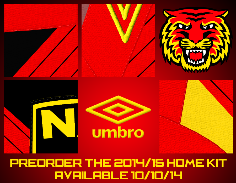
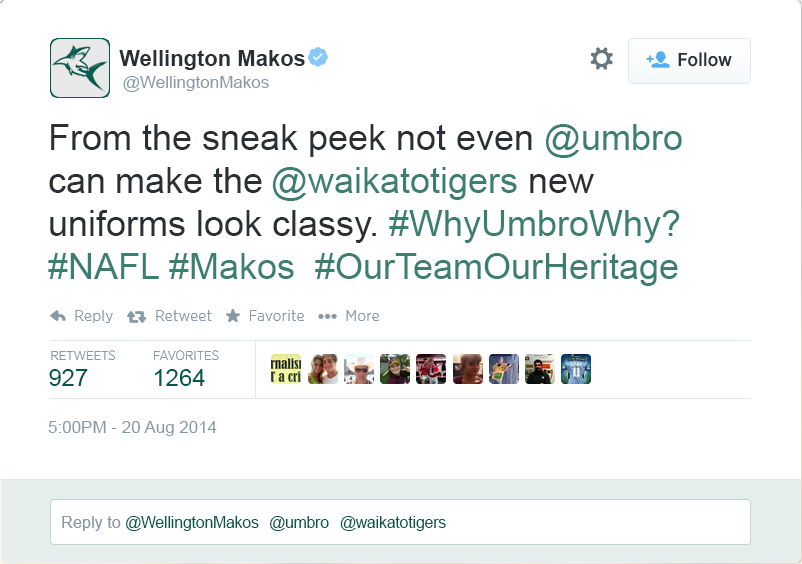
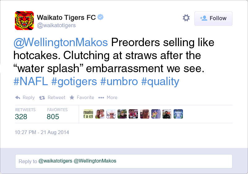
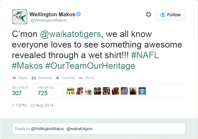
Fluffing around makes these competitions fun, as i'm about to show with another volley in the NZ twitter battle. I picked up a few handy little ideas from working that teaser out that I plan to apply if I ever get around to making my own template.


AlmKibM.png
 
Lion removed, jagged edges cleaned up (tracing error), Hornet made smaller and white outline thing removed and replaced with a white stroke. Didn't move the Hornet higher because the nose is supposed to be pointing to the rough location of Hobart (imagine the shield is a map of Tasmania).

The stars are not for any premierships (lol) but for previous incarnations of the club; going back from the original Hornets in a Designathon to the old NAFL pink Hornets. Pink and green flashes on the nose are a nod to that era.

View attachment 74984
I'm liking the pink and green highlights on the plane as a throwback to last year. Nice touch.
 

Remove this Banner Ad

Back
Top