Poll NAFL Round 12

Which jumper do you prefer? Do not vote for yourself.


  • Total voters
    23
  • Poll closed .

Remove this Banner Ad

NAFL Round 12
Poll will be open for 4 days.
Do not vote for yourself, you will be penalised.
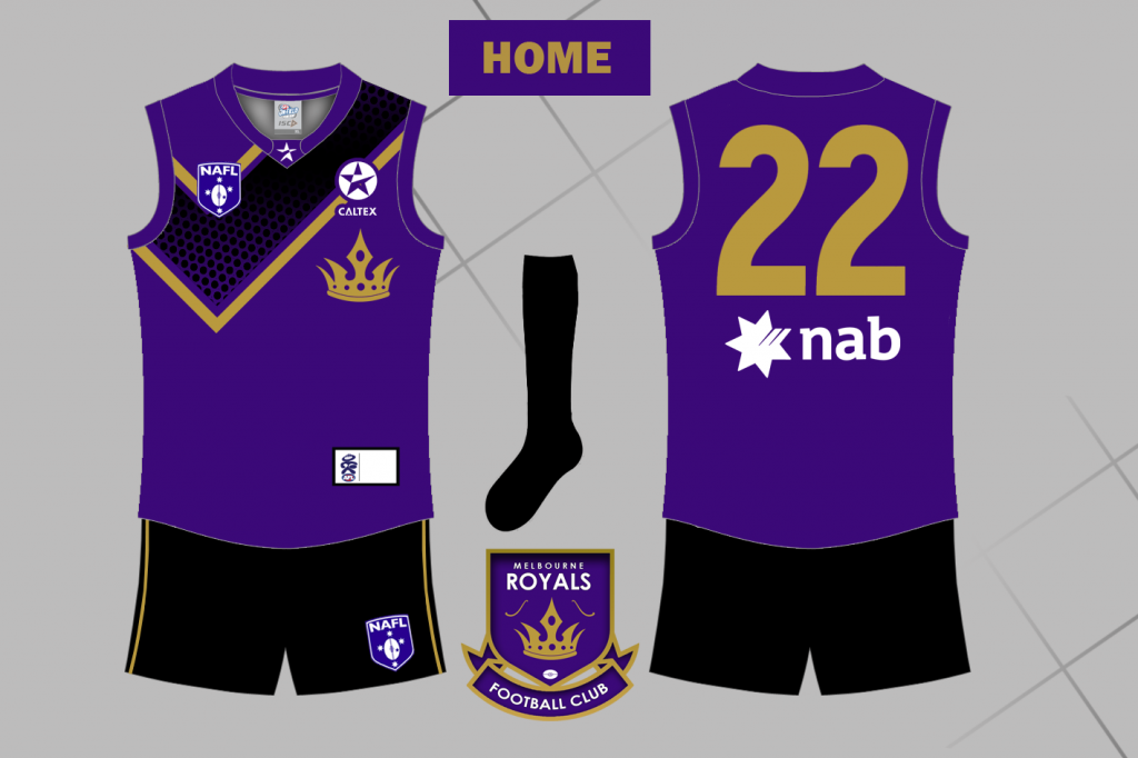
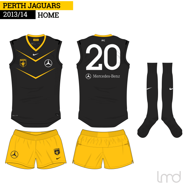
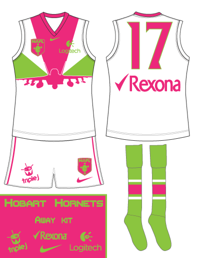
Home team is on top


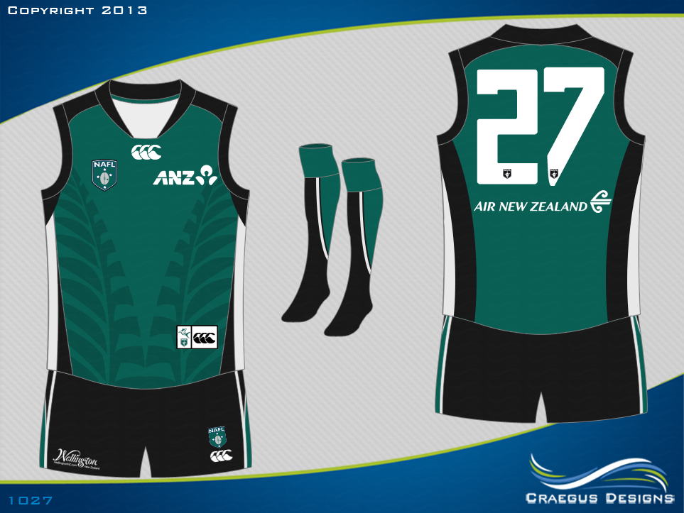
Wellington Makos v Perth Phoenix
WellingtonMakosHome_zps13a0be30.png
9jjgp2.png
Melbourne Royals v Uluru Emus
Home-Jumper_zps7cdee97c.png
35d5jph.png
Perth Jaguars v Wangaratta Wombats
2h6caap.png
WangWombatsAway_zpse2cd94b7.png
Launceston Buccaneers v Berwick Bobcats
LBHome_zps9968708b.png
opbm.png
Darwin Jets v Hobart Hornets
Home_zps1b4c8cd5.png
Away.gif
SS Scorpions v Canberra Griffins
4HxZM7Ah.png
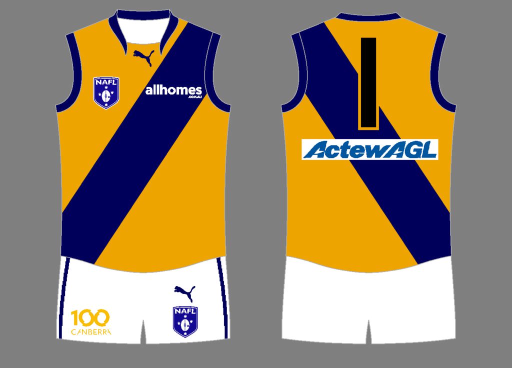
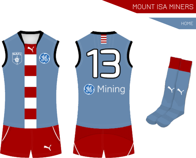
Capital Hill Kookaburras v Mount Isa Miners
CapitalHillHome.png
2cdu5a8.png
Cairns Tropics v Adelaide Pipers
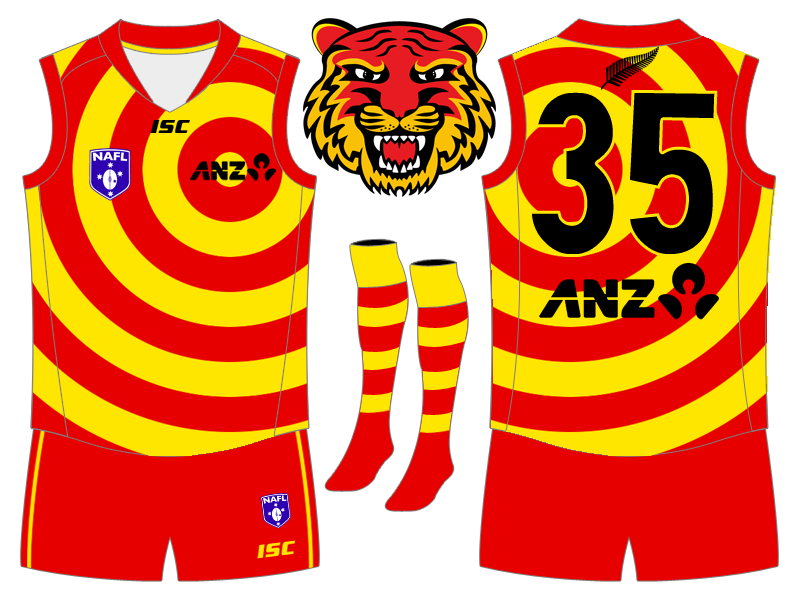
Wollongong Wolves v Waikato Tigers
wollongongwolveshome_zps1f059f0c.png
suSzo9e.png
 

Log in to remove this ad.

Surely Mount Isa's (still unseen) clash jumper could make an appearance this round? From the back they're both essentially just blue with white numbers; even the cuffs and collars match.
 
I thought the light blue was a big enough difference but I considered the clash quite a bit.


I can change it if you want Gibbsy.


Nah i'm not too fussed. Bring it out next when you see fit. Perhaps the fact that it doesnt clash with anything is the mark of a good design? :p
 
Yeah - simple designs are great, symbolic simple designs are even better. The Miners is my favourite design in the NAFL, but I'm predicting Melbourne to defeat Uluru in the final (and Ballarat to defeat the Dropbears in the Reserves for the Victoria-NT double).
 
Eh i've been diplomatic for long enough in this competition.

I'm getting robbed this week. No offence to the wolves as i've voted for them several times, but my guernsey is better.

Fair enough. I mostly just want to see the clash design.

Clash guernseys have been dramatically underused in this competition. I would have erred on the side of using them more as it's a guernsey design comp and we'd probably like to show off what we've made. Based on the fixture and the history of clash use in this comp my clash might possibly be used once this season if i'm lucky. What's the point? I wish i'd just called it an away guernsey.

I'm bitter because after some pretty harsh losses IMO (and some baffling results in games that didn't involve me), in the logo round where I expected a win I got pitted against one of the 2, maybe 3 logos that are both a) original, not recolours and b) arguably better than mine.
 
Eh i've been diplomatic for long enough in this competition.

I'm getting robbed this week. No offence to the wolves as i've voted for them several times, but my guernsey is better.
Yes, according to you and 5 others, not to the 12 that voted for the Wolves.

I don't understand what you see as a baffling result. Everyone votes for the design that they think is best, which may be different to your opinion. You can't definitively say "this design is better than the other". Even if you think it's a 50/50 contest, it can still be one sided because the majority of people who vote could all lean to the one side.
 
There is almost a game a round where I think I am voting for a far superior design that is nailed on for the win, that either loses or just scrapes home.

It happens far more in this competition than any other comp I remember. Maybe that's because of the overall high quality of the comp but i've been shocked quite a few times.
 

(Log in to remove this ad.)

I'd have a Pipers/Jaguars/Emus/Royals top 4. Throw a blanket over the next 8 or 9.
 
Eh i've been diplomatic for long enough in this competition.

I'm getting robbed this week. No offence to the wolves as i've voted for them several times, but my guernsey is better.
I'll give you some constructive criticism as to why I chose to vote for the wolves.
Wollongong Wolves:
  • Nice simple kit, not too much going on
  • Number and sponsors blend into the kit rather nicely
  • Awesome vee design on the front, looks amazing
  • The rest of the kit fits nicely with the jumper itself
Waikato Tigers:
  • First up, I love your logo, it looks brilliant
  • The guernsey itself has too much going on, in my own opinion, with two predominantly light colours
  • Personally, I would have recoloured the NAFL logo to suit your kit's colours
  • Sponsors logos and numbers, it's really hard to make them blend nicely into a guernsey where too much is going on, whilst they are visible, they dont really look like they belong with the design(if you get what I mean?)
  • Shorts and socks, perfect for the kit
Also, might I ask the inspiration behind the kit with the circles, because perhaps nobody knows the inspiration behind the kit like @Gibbsy 's team?
 
Having only won two from twelve, could I please ask what people have thought of my designs? The Berwick Bobcats have constantly been getting scores below ten while their opposition clearly surpasses this each week. Id like to know what it is that I could improve on the Bobcats design for another time... Much appreciated.
 
Also, might I ask the inspiration behind the kit with the circles, because perhaps nobody knows the inspiration behind the kit like @Gibbsy 's team?

Appreciate the measured feedback NMD.

The design inspiration was to basically have stripes (like a tiger) but obviously do something I hadn't seen before, because it's a guernsey comp. I settled on the concentric circles because it fulfilled the stripes criteria while also being slightly reminiscent of the curves used prominently in Maori designs. I could have gone further with that and actually made it a more obvious Maori inspired design, but as you say it looked busy enough as it was.

That said it would have probably resonated more with people and i'd probably have more votes. Oh well.

I originally had black as a more integral part of the design, as you can see by the logo, but it spoiled it. I was and still am happy with an all light coloured kit, like Gold Coast. It then followed that i'd use black for the guernsey furniture, as it contrasted well against the circles and I couldn't really work in red or gold numbers without putting in a big number panel that would spoil the design.

The clash kit is probably better. It's the same concentric circle design but in black on black, with white numbers and sponsors etc. Very NZ.

Having only won two from twelve, could I please ask what people have thought of my designs? The Berwick Bobcats have constantly been getting scores below ten while their opposition clearly surpasses this each week. Id like to know what it is that I could improve on the Bobcats design for another time... Much appreciated.

Mate, when I talk about people who are being hard done by in this comp, i'm mainly talking about you. I love the Bobcats design and I vote for it most weeks. It's innovative, yet still basically a classic yoke design. The colours are well balanced and work well together. Your shorts are a bit off, I don't know if that sort of flared out side stripe works on footy shorts, and it clashes a bit with the straight lines in your guernsey, but the guernsey itself is an absolute winner for me.

I would love to see it out on the field. I have absolutely no idea why you don't get more votes and i'd love to hear what people don't like about it.
 
I have absolutely no idea why you don't get more votes and i'd love to hear what people don't like about it.
It just looks too messy. There's too many lines contradicting each other - the yoke with each line a different thickness, the side panels and the short pattern don't flow, the weird cuffs. The diagonals also have a bumpy edge, which I'm not sure is deliberate or not.
 
I don't disagree about the cuffs, and i'm assuming the lines are meant to be straight and not pixelated, but the line weight at the bottom of the yoke is a specific pattern and is definitely meant to be like that.

The shorts don't flow though.

I'd love to see it on an illustrator or photoshop template with the shorts fixed.
 
Imagine what competitions would be like if every single design was on the same template, rendered at the same size and designed in the same program? We'd see some different voting patterns for sure, I reckon.

Yeah, My excuse is that my jumper is too small on a s**t template. And I'll stick to that excuse!!!!!
 
Back
Top