Poll NAFL - Round 15 - Heritage Round

Which jumper do you prefer? Do not vote for yourself.


  • Total voters
    31
  • Poll closed .

Remove this Banner Ad

NAFL - Round 15 - Heritage Round


Poll will be open for 4 days.


Do not vote for yourself or ask people to vote for you, you will be penalised.


Vote once in each game (besides your own).


Home team image is on top.


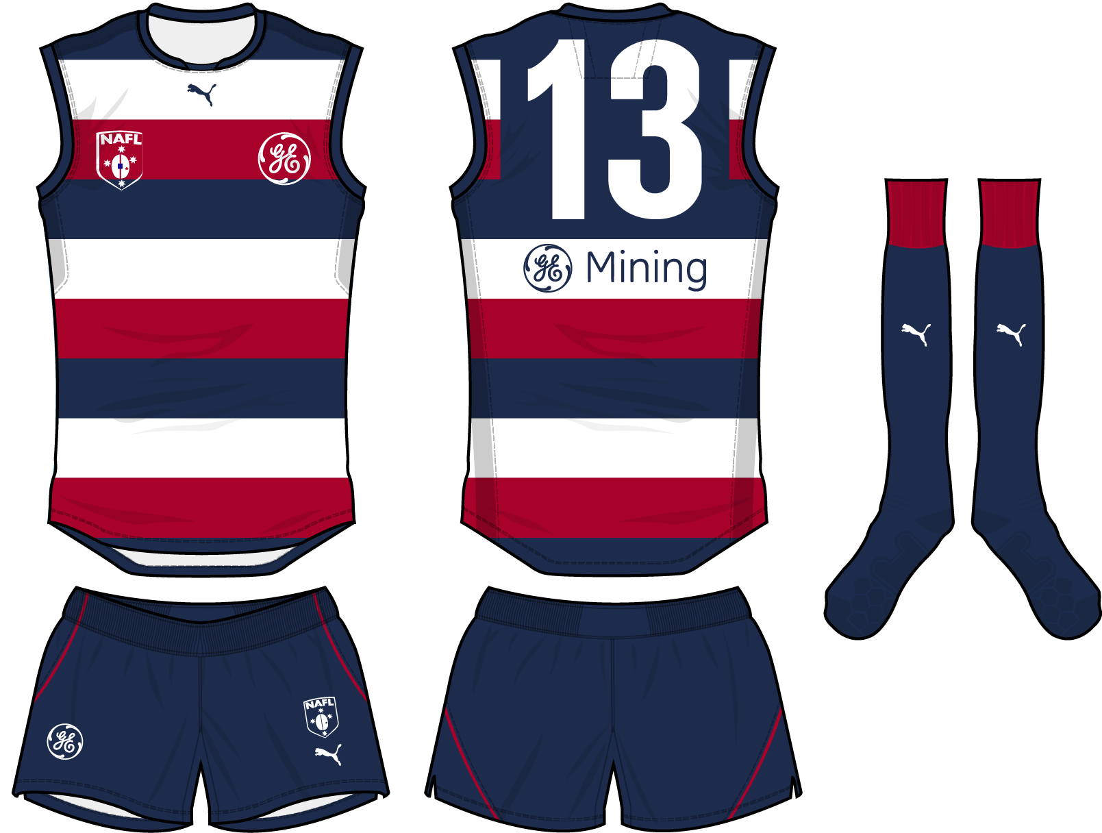
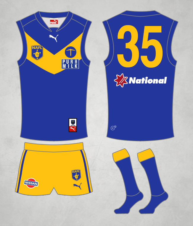
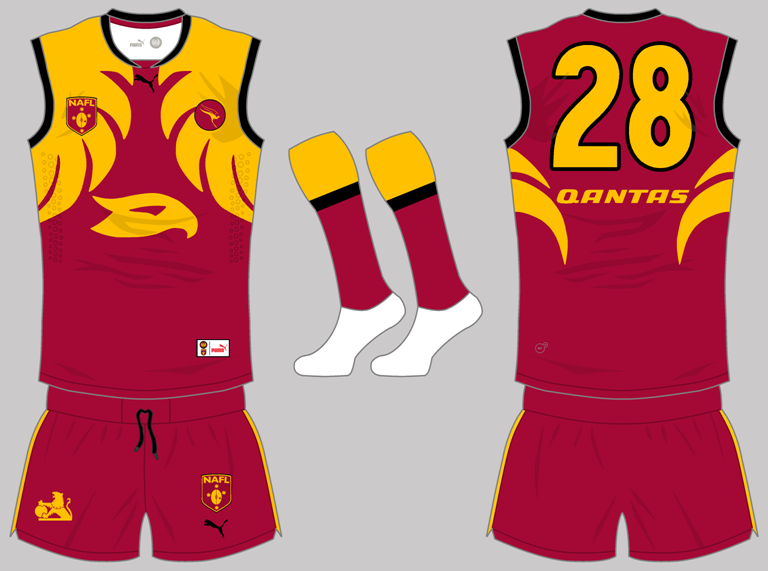
Mount Isa Miners v Canberra Owls


98915_d62d12e1d7e1dac3b32ae5aa816f7889.png


24bn8u9.png


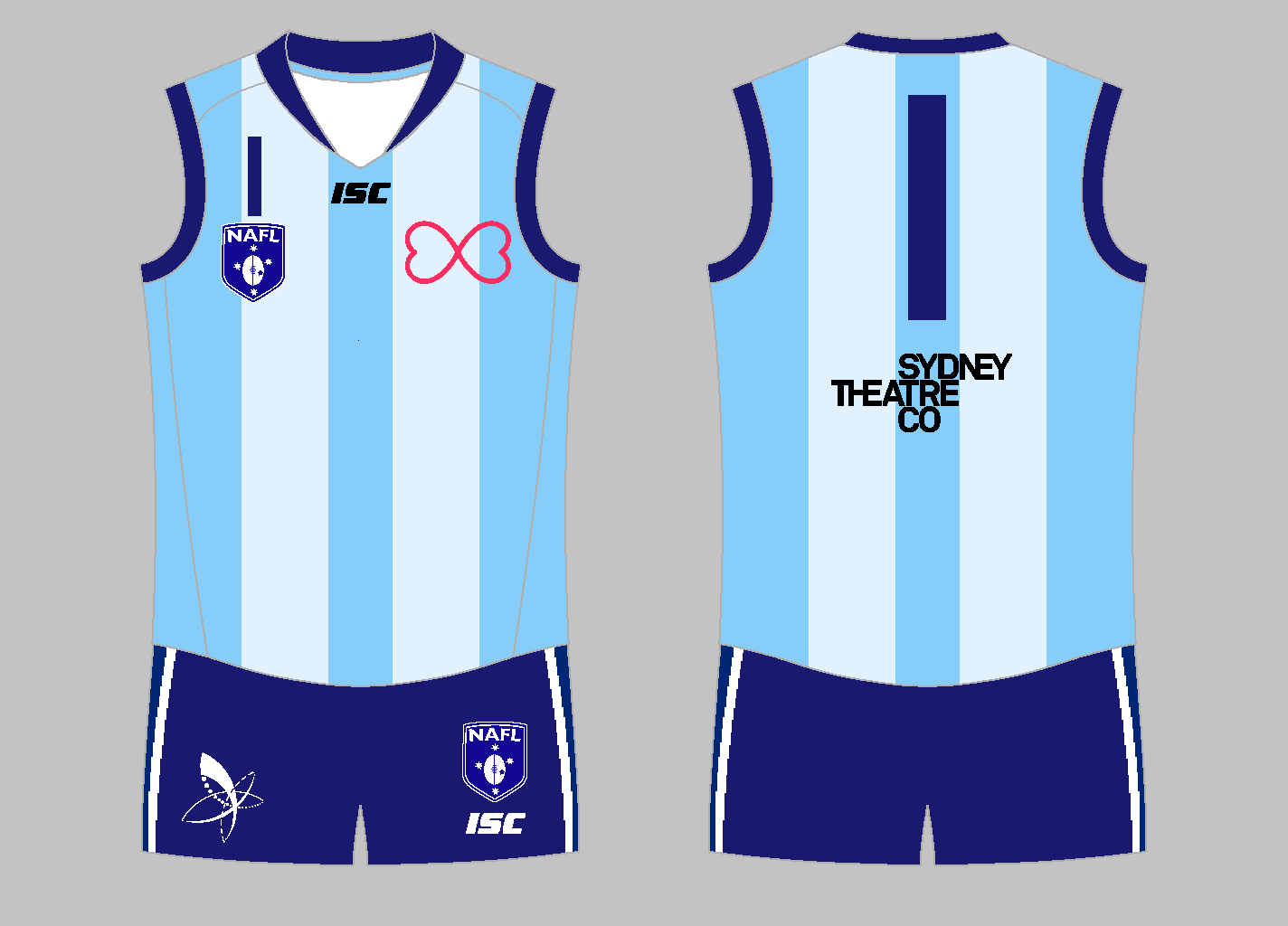
Ballarat Diggers v Sydney Blues


heritage_zps00e8e447.png~original


fWoMuHB.png


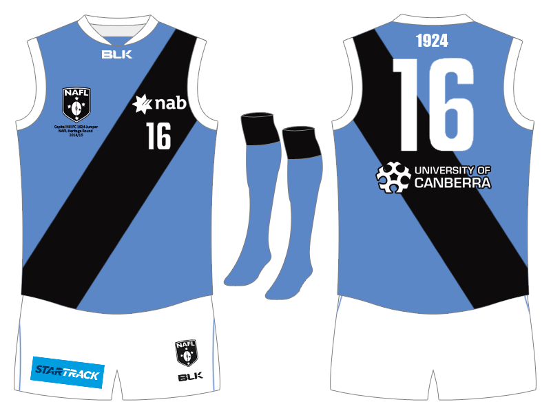
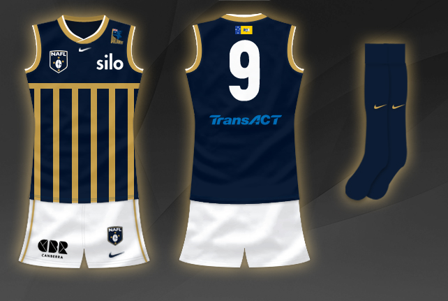
Wellington Makos v Capital Hill Kookaburras


WellingtonMakosHeritage201415_zps7a2ab70e.png


CapitalHillFCHeritageNEW_zps5559d949.png


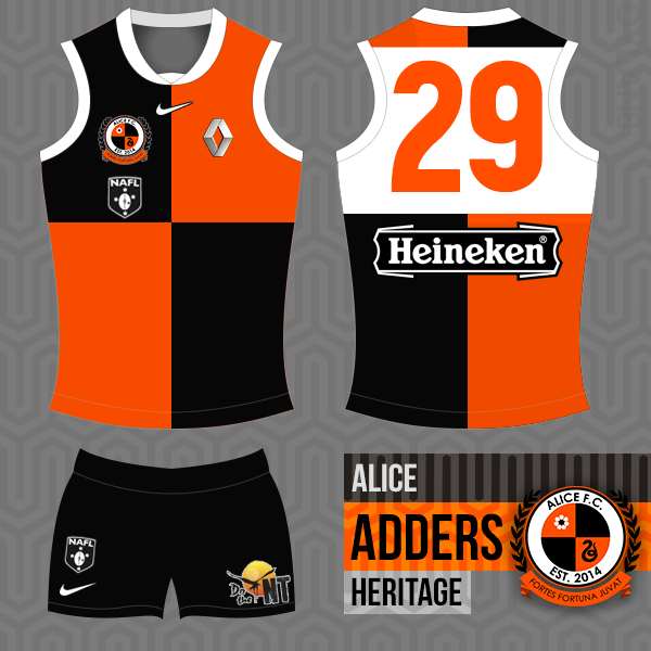
Alice Springs Adders v Perth Jaguars


rKItOx7.png


n2oq5x.png


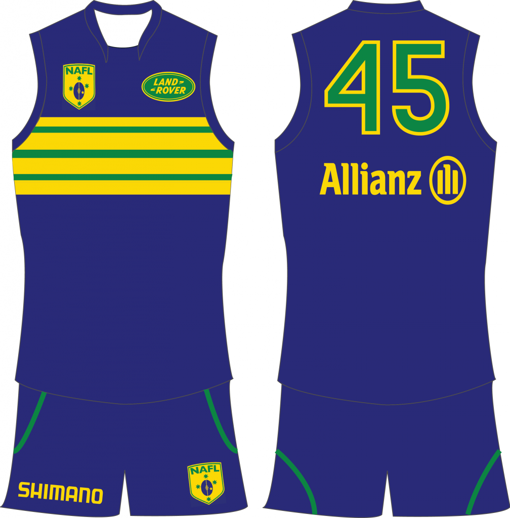
Adelaide River Crocodiles v Perth Phoenix


AdelaideRiverCrocodilesheritage_zps7a66dc1f.png


PerthPhoenixHeritage_zpscf7bd53d.png~original


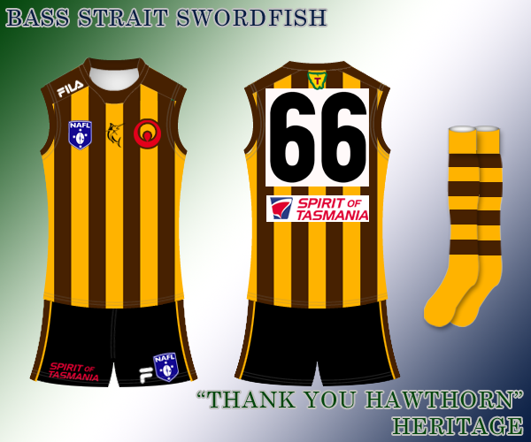
Hahndorf Eagles v Bass Strait Swordfish


Heritage_zpsd18f59f5.png


Canberra Parliament v Cairns Chargers


CanberraParliamentheritage_zps32a10be2.jpg


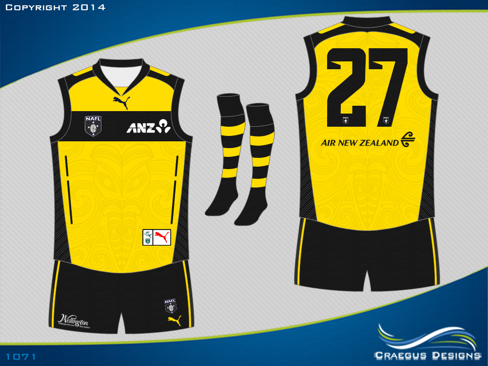
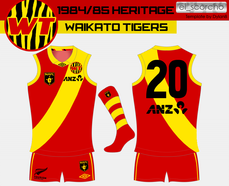
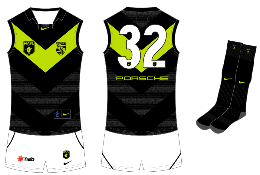
Waikato Tigers v Port Macquarie Power


EpgDelr.png


Heritage_zpscbbdc06b.png


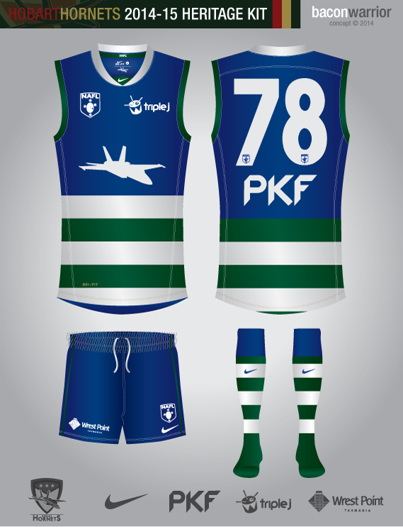
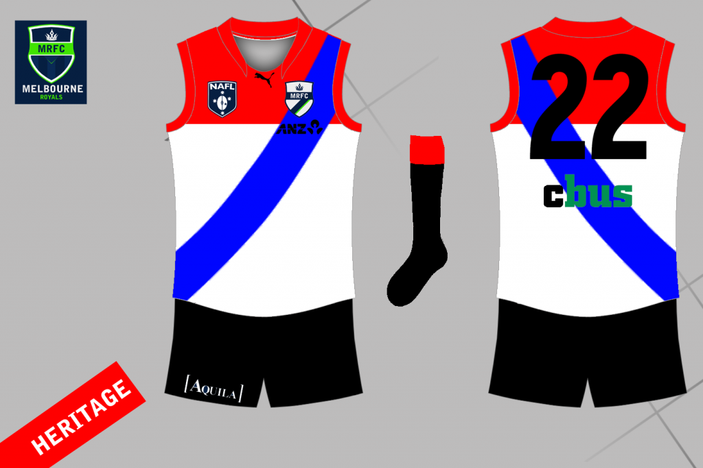
Hobart Hornets v Melbourne Royals


bYiwWFP.png


Melbourne-Royals-HERITAGE-JUMPER_zps98d335c0.png


Log in to remove this ad.

For me this was Bizzarro round, I don't normally vote for a lot of the teams I voted for but their heritage designs were incredible
 
I figured I should put some explanation into my, slightly blatant ripoff of Hawthorn.

Basically if is a ripoff. The Bass Strait Swordfish were only created in 2013/14, so the heritage is a tribute to Australian Rules Football in Tasmania. Hawthorn, along with their front of guernsey sponsor, are known for playing games and spreading the sport into Tasmania. As such, the Swordfish are using the same design that Hawthorn used when they started to play in the state, as well as the Tasmania AFL symbol over the top of the numbers

I'm surprised you're not winning by more. What you're going up against is a plain white kit with plain black shorts...
 
I meant to post this in the hub thread in the lead up to this round
heritage_round_zpsab4e739b.png

In the 70's, with the invention of colour television, the Ballarat Diggers (known colloquially at the time as the Disco Jivers) moved to brighter colours and a simplified chevron design. This included bright yellow shorts, which were seen as supremely desirable amongst fashionistas. Ballarat continued to wear this guernsey until you were roughly 7 years old, making this a particularly nostalgic Heritage Round guernsey.
 
I feel like a lot of people used 'heritage' as an excuse to roll out lazy designs. Recoloured hoops/sashes/stripes with a monogram?

Please.

I made the WT logo purely because the sash by itself was really boring. I was just going to do what lmach and E92 did and post last year's design on the new template, but then I remembered the regular savage beatings that concentric circle design copped. Maybe next year i'll wheel it out again for a heritage round.
 

(Log in to remove this ad.)

I made the WT logo purely because the sash by itself was really boring. I was just going to do what lmach and E92 did and post last year's design on the new template, but then I remembered the regular savage beatings that concentric circle design copped. Maybe next year i'll wheel it out again for a heritage round.


#returnthehypnojumper
 
Wow. Them Hornets. Actually making blue and green look amazing.

Green and Blue go. There are so many good looking Green and Blue teams. There seems to be some sort of stigma against them but IMO they work pretty regularly, especially with those shades.

I'm surprised you're not winning by more. What you're going up against is a plain white kit with plain black shorts...

It was a very, very bold move to submit a guernsey without a design on it. As Stewart2Austin says, in a competition like this if you're going to do a simple or commonly used design, you're going to need to make the template/extras an absolute knockout.
 
It was a very, very bold move to submit a guernsey without a design on it. As Stewart2Austin says, in a competition like this if you're going to do a simple or commonly used design, you're going to need to make the template/extras an absolute knockout.
Plain is a design, what are you talking about? :p
I don't mind the template, it's nice. Especially after he changed the number font! And he's resized it as well, which means less noticeable edges. :thumbsu:
 
I'll take my plain white kit and hide in a corner now.....

By the way, it's an homage to the old East German kits which were plain white plus black trim

Don't let us bother you, you're only one vote behind. The crisp clean design and obvious German inspiration were a good idea and are getting you votes.

Everyone votes differently, obviously.
 
Lol no not bothered. Honestly, I'm one of the weaker designers here, I do this for fun as a hobby, and just enjoy the thrill and, honrstly, privilidge of having my desogns alongside the absolutely amazing works you see in this comp :)
 
The Owls have been a bit unlucky here, going up against an opponent with basically the same design, but with more vibrant colours and on a better template.
I think it's purely because the Mount Isa design is winning as well because it looks like a "heritage" guernsey. The grey and blue combination didn't scream "heritage" but "fauxback" in my opinion.
 
I think the all white Eagles jumper just looks classy, and it'd look classy on the field. Ties in pretty well with the home, as well.

And I'd say that the Owls are struggling because the Miners have a very similar design, just with a nicer set of colours
 
Back
Top