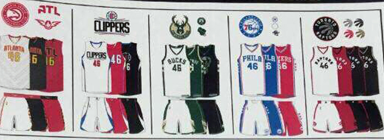
News New basketball uniforms/logos/courts etc.

Remove this Banner Ad

100% looks very much like a training singlet, needs black accents somewhere. Still would love for a black away uni, but would clash with Melbourne and NZ's home strip.

The away jerseys are black this season, but they won't be available for purchase. They'll obviously wear red against Melbourne and NZ on the road, just like they did last year.
 
Why are sleeved jerseys still a thing?

lnwh.gif
 

Log in to remove this ad.

Still Adidas for this season, then the contract expires. Nike take over as of next season. Adidas dont have their logo on player jerseys.
 

(Log in to remove this ad.)

That's the biggest thing to happen to the NBL in 2 decades.

Now all they need to do is realise the marketing potential of basketball jerseys and minimise the ads so people will look at say, a 36ers jersey, as an option to wear around in summer instead of totally ignoring the NBL for the NBA.
 
That's the biggest thing to happen to the NBL in 2 decades.

Now all they need to do is realise the marketing potential of basketball jerseys and minimise the ads so people will look at say, a 36ers jersey, as an option to wear around in summer instead of totally ignoring the NBL for the NBA.
Had the same deal just before the (edit: 2011-ish) reboot IIRC
 
That's the biggest thing to happen to the NBL in 2 decades.

Now all they need to do is realise the marketing potential of basketball jerseys and minimise the ads so people will look at say, a 36ers jersey, as an option to wear around in summer instead of totally ignoring the NBL for the NBA.

So so much this. As soon as I read this I thought 'hey let's grab. Sydney Kings jersey'. Then I saw this ugly ass jersey with "Mighty mite" standing out more than the Kings logo. NBL jerseys are hideous.
 
So so much this. As soon as I read this I thought 'hey let's grab. Sydney Kings jersey'. Then I saw this ugly ass jersey with "Mighty mite" standing out more than the Kings logo. NBL jerseys are hideous.
I grabbed a #33 Damian Keogh jersey from the Kings a few years back. Basically unsponsored and it's a heritage too ;).
kingsjersey.jpg
 
Massive bump, but ewwww at the new Raptors jerseys. Absolutely no character to any of them, except for maybe the Drake night one.

Would not mind seeing a purple throwback- still have no clue why they needed to get rid of it.

Yeah agree. They basically just went for a total Brooklyn copy. What a waste of potential in terms of imagery.
 
Massive bump, but ewwww at the new Raptors jerseys. Absolutely no character to any of them, except for maybe the Drake night one.

Would not mind seeing a purple throwback- still have no clue why they needed to get rid of it.
Just curious, what are your thoughts on the Clippers new logo?
 
Just curious, what are your thoughts on the Clippers new logo?

I didn't really like the old one, but I don't like the new one either. Reminds me way too much of the EA Sports covers around the time of FIFA 06. The little "LAC" monogram though isn't too bad. I feel like a logo that incorporates some ships or something like that would be a step in the right direction, seeing as that is what a "clipper" is supposed to be.

I guess I singled out the Raptors as I've been a fan since I was a kid, but with the new designs across the board, it feels like a lot of teams are losing their character.
 

Remove this Banner Ad

Back
Top