Dannnnnnnnnn
Moderator
- Aug 24, 2012
- 37,305
- 53,469
- AFL Club
- Western Bulldogs
- Other Teams
- T'Wolves/Patrick Beverley/Footscray
- Moderator
- #151
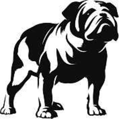
Agree with all that. The face of the dog is terrific, no complaints there. The dog sort of hanging off the side is my biggest frustration with it. In full colour it might look alright (although that wouldn't work on a logo) but a blob of white space with a thick stroke line hanging off the side just looks wrong.The fact that it's off centred still annoys me. Move the Dog a little to the left and maybe somehow make it full bodied and I'd be happy. I think the face looks great.