Navigation
Install the app
How to install the app on iOS
Follow along with the video below to see how to install our site as a web app on your home screen.
Note: This feature may not be available in some browsers.
More options


You are using an out of date browser. It may not display this or other websites correctly.
You should upgrade or use an alternative browser.
You should upgrade or use an alternative browser.
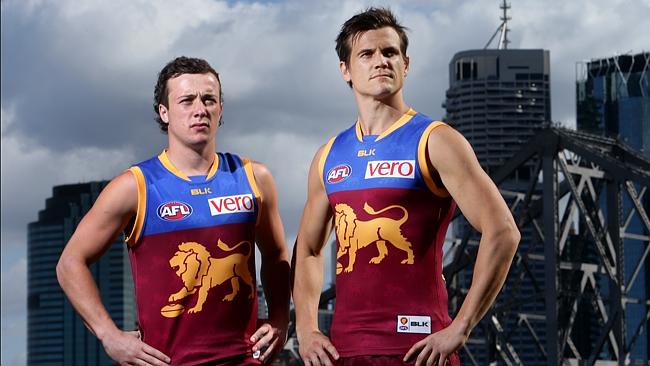
News New Jumpers for 2015
- Thread starter Gibbsy
- Start date
- Tagged users None
- Status
- Not open for further replies.
Hopefully the wings are back.
DARK BLUE FTW!
Love the 1999 Eagles guernsey.
#ReturnTheWings.
#ReturnTheOldEagle.
Yeah if it comes back that will be the winner. Navy home royal away, who knows what happening with the clash but for now, wings at home will do.
whatboutbob
Serial Avatar Troll
It is high, similar to the paddlepop, but straight across, not curved. Looks good.The blue better go all around like it use to.
It is high, similar to the paddlepop, but straight across, not curved. Looks good.
Any pics of the back? Would love to see if the unnecessary white outline on the numbers is gone
- Thread starter
- Moderator
- #555
Any pics of the back? Would love to see if the unnecessary white outline on the numbers is gone
Doubt the white keyline will go. Hawthorn had no outline for one year in 2013 on their away jumper, it looked great, then the idiots brought it back in 2014 for no good reason
whatboutbob
Serial Avatar Troll
Nope. Will be released in the morning anyway. Dunno about the numbers.Any pics of the back? Would love to see if the unnecessary white outline on the numbers is gone
Dannnnnnnnnn
Moderator
- Aug 24, 2012
- 37,303
- 53,461
- AFL Club
- Western Bulldogs
- Other Teams
- T'Wolves/Patrick Beverley/Footscray
- Moderator
- #557
Sexy.
The guernsey's OK too.
Seriously though I like the BLK; not a huge difference but it looks a bit cleaner for mine.
TheHoneyBadger
"I lost my phone"
- Sep 17, 2012
- 13,060
- 18,201
- AFL Club
- Western Bulldogs
- Other Teams
- Footscray
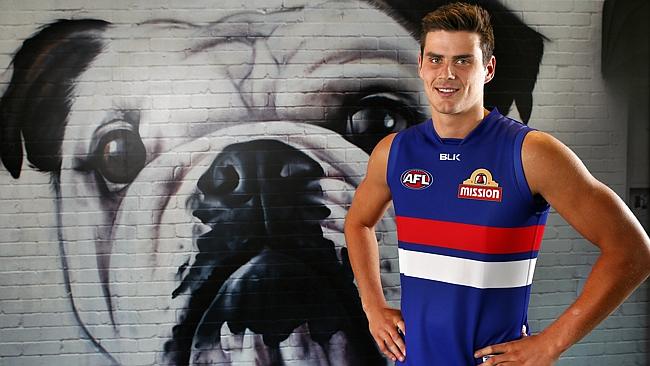
Looks good, 'BLK' looks more balanced than 'KooGa'.
Now all they need to do is sort out the terrible placing of the MISSION logo on the back of the guernsey, and they'll have it right.
Now all they need to do is sort out the terrible placing of the MISSION logo on the back of the guernsey, and they'll have it right.
MKMatty
Busy Vibin’
So glad Boyd didn't pick a high profile Melbourne club. The dogs were crying out for a key foward, now they have one. Top stuff 
hitthepost
Norm Smith Medallist
The BLK ad indicates the lion is the same size. Maybe they played with it to make it look like that though. No pulling the wool over our eyes here!they forgot to mention... 40% bigger lion!!! that thing is huge, hopefully it looks alright out on the park

hitthepost
Norm Smith Medallist
God, I never noticed! He is too! Hello
Sexy.
The guernsey's OK too.
Seriously though I like the BLK; not a huge difference but it looks a bit cleaner for mine.
God, I never noticed! He is too! Hello
...are we talking about the player or the dog?
Jones2ByrneJones
Hour of Pessimism
- Jul 27, 2012
- 15,820
- 27,995
- AFL Club
- Port Adelaide
If it wasn't so obviously different from the gold lion then it wouldn't be so bad.I honestly think the very box suits it. Although the national storage box completely ruins our away Guernsey
Like would it be so hard to integrate the colours? Make NS gold?
HowYouDoin
Club Legend
- Banned
- #565
As a logo I think it's fine, it's just the way they incorporated it on the full body which made it look horrific.
As a logo it looks decent. But, it's still the paddlepop regardless and we aren't using that lion anymore. So, there isn't any point in keeping it anymore
Doubt the white keyline will go. Hawthorn had no outline for one year in 2013 on their away jumper, it looked great, then the idiots brought it back in 2014 for no good reason
It just makes no sense. At first I figured it must have been better for visibility on TV, but having seen our numbers this year with no outline, they actually stand out more without it. It's just not needed for teams who have no other white on their guernseys.
- Jul 9, 2010
- 24,163
- 26,536
- AFL Club
- Fremantle
First time Tom Boyd has ever looked anything other than sullen?
BLK is a big improvement. KooGa, as people have noted, ended up wobbling the balance of the jumpers. It was a little to long, and although it wasn't big or anything, it really looks so much better with bolder lettering and the three initials (I'm guessing it's a backronym...) rather than the full on Kooga wordmark. The Bullies jumper looks so straight forward now, in a good way. Imagine if they had ICI or another two-tone logo?
BLK is a big improvement. KooGa, as people have noted, ended up wobbling the balance of the jumpers. It was a little to long, and although it wasn't big or anything, it really looks so much better with bolder lettering and the three initials (I'm guessing it's a backronym...) rather than the full on Kooga wordmark. The Bullies jumper looks so straight forward now, in a good way. Imagine if they had ICI or another two-tone logo?
Simba Moyo
Hakuna Matata
BLK = Beyond Limits KnownFirst time Tom Boyd has ever looked anything other than sullen?
BLK is a big improvement. KooGa, as people have noted, ended up wobbling the balance of the jumpers. It was a little to long, and although it wasn't big or anything, it really looks so much better with bolder lettering and the three initials (I'm guessing it's a backronym...) rather than the full on Kooga wordmark. The Bullies jumper looks so straight forward now, in a good way. Imagine if they had ICI or another two-tone logo?
Fatcat08
Cool and Footbally
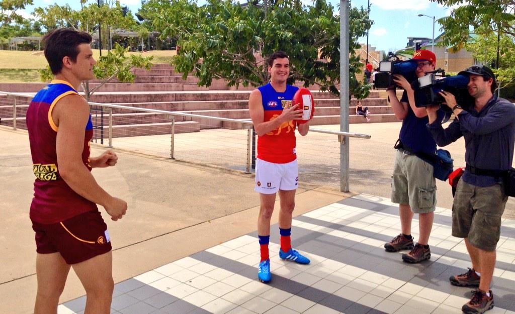
Here's the back of the guernsey, can see a bit of it from the photo
SEQ AFL fan
Cancelled
- Sep 12, 2013
- 24
- 23
- AFL Club
- Brisbane Lions
- Other Teams
- NY Giants, Wallabies, QLD Maroons
Wouldn't have minded if they had kept the back of "paddle pop" guernsey.Here's the back of the guernsey, can see a bit of it from the photo
I reckon the straight line works better than the curved. Interested to see what the numbers look like.
DelishDockers
Senior List
No clash jumper update from the Lions?
whatboutbob
Serial Avatar Troll
Will be released later this year.No clash jumper update from the Lions?
Groupie_
time to return the traditional Richmond yellow
Reckon the new material makes yellow look a bit less dull than it used to on the old BLK material. Hopefully the yellow on the 2015 Richmond jumpers is better than the cream/beigey yellow we've had with KOOGA/BLK up until now
lmach
Naitanui2Yeo
I'd say it will be the same.
- Status
- Not open for further replies.
Similar threads
- Replies
- 175
- Views
- 14K
