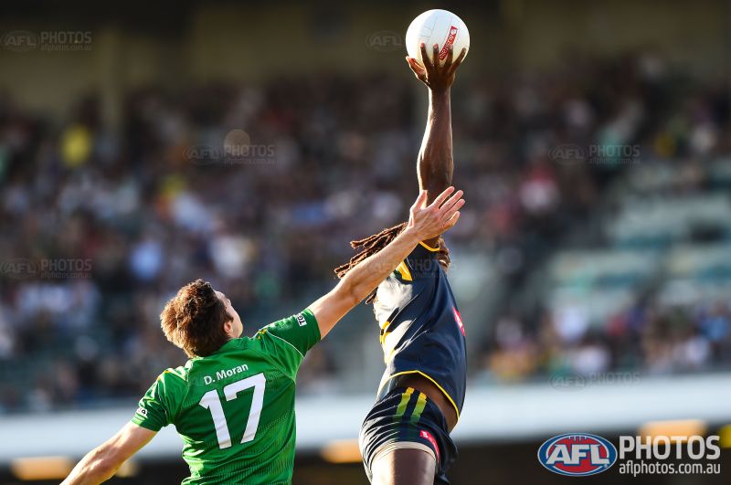
Are they a really murky green?It's a bit hard to make out, but the stripes on the top left hand side of our shorts look really crap.
View attachment 93615
Navigation
Install the app
How to install the app on iOS
Follow along with the video below to see how to install our site as a web app on your home screen.
Note: This feature may not be available in some browsers.
More options
You are using an out of date browser. It may not display this or other websites correctly.
You should upgrade or use an alternative browser.
You should upgrade or use an alternative browser.
News New Jumpers for 2015
- Thread starter Gibbsy
- Start date
- Tagged users None
- Status
- Not open for further replies.
hitthepost
Norm Smith Medallist
Are they match shorts?
If they are, then perhaps to make the manufacturer's mark not visible on match-days when they're not allowed?
If they are, then perhaps to make the manufacturer's mark not visible on match-days when they're not allowed?
- Sep 4, 2013
- 5,532
- 8,595
- AFL Club
- Carlton
Those shorts are terrible, Adidas has managed to screw up everything this year for the Hawks
It's a bit hard to make out, but the stripes on the top left hand side of our shorts look really crap.
View attachment 93615
The person modelling them seems to find them at least semi-arousing.
Those shorts are terrible, Adidas has managed to screw up everything this year for the Hawks
Hawthorn wooden spoon next year, Hodge to die in tragic fried chicken avalanche
Javelin
All Australian
- Jun 6, 2013
- 849
- 1,116
- AFL Club
- West Coast
Actually, it looks like it serves a similar function to that of Carlton's shorts which have that wipe material for 'sweaty hands'.Are they match shorts?
If they are, then perhaps to make the manufacturer's mark not visible on match-days when they're not allowed?
Personally, I think they're just trying to give players a plausible reason for rubbing each other on the backside.
hitthepost
Norm Smith Medallist
I'm cool with that!Personally, I think they're just trying to give players a plausible reason for rubbing each other on the backside.
They look grey-black to me, and...
This.
(We need a name for these sorts of things, btw.)
Actually, it looks like it serves a similar function to that of Carlton's shorts which have that wipe material for 'sweaty hands'.
This.
(We need a name for these sorts of things, btw.)
Simba Moyo
Hakuna Matata
Javelin
All Australian
- Jun 6, 2013
- 849
- 1,116
- AFL Club
- West Coast
The ass-wipe?They look grey-black to me, and...
This.
(We need a name for these sorts of things, btw.)
I see the AFL's policy on white is extending to the polo as well...
MKMatty
Busy Vibin’
Looks like a compromise between someone who wanted a white polo and someone who wanted a maroon one.
"can we atleast have a maroon sleeve"? "It'll look edgy".
hitthepost
Norm Smith Medallist
Not as fetching as white shortsI don't mind it. White polos are quite fetching.
E92_
Premium Platinum
Don't mind it, would've liked a maroon polo though.
- Jul 9, 2010
- 24,163
- 26,536
- AFL Club
- Fremantle
Not only is the design asymmetrical, but they've made the colour balance totally warped and lopsided. And white? Now it seems as though neutral colours are becoming trendy, and you can see how the Hawks could prefer a grey/navy to brown, but when navy blue and a dark maroon are your two big colours, why would you choose a totally redundant neutral colour?
Bizarre. And probably the worst polo I have ever seen in the AFL.

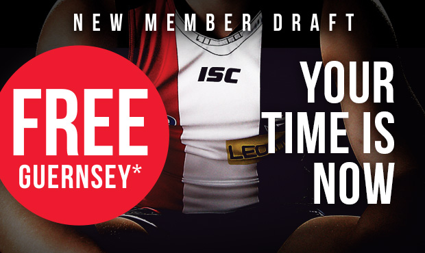
White on the collar in this new Saints jumper ad
I want to believe.
That's the same collar as before m8
White on the collar in this new Saints jumper ad
I want to believe.
Crap, everything looks 5 stars.Those shorts are terrible, Adidas has managed to screw up everything this year for the Hawks
And white? Now it seems as though neutral colours are becoming trendy, and you can see how the Hawks could prefer a grey/navy to brown, but when navy blue and a dark maroon are your two big colours, why would you choose a totally redundant neutral colour?
Bizarre. And probably the worst polo I have ever seen in the AFL.
Preseason shirts are often an alternate colourway. Brisbane have played around with white and grey in the past, as have most clubs. This summer you'll see the likes of West Coast in white, Adelaide in grey and Port in both. These have also acted as polos for water carriers in-season for some clubs wanting to differentiate from the players (the pink vests void this now).
Using maroon and gold exclusively with the white is a bit of a Bears throwback, which is nice. Shame about the actual template, but that's stock standard mediocre-brand fodder.
Considering 2014's royal number, expect the actual Brisbane media polo to be maroon or navy.
- Thread starter
- Moderator
- #2,172
Preseason shirts are often an alternate colourway. Brisbane have played around with white and grey in the past, as have most clubs. This summer you'll see the likes of West Coast in white, Adelaide in grey and Port in both. These have also acted as polos for water carriers in-season for some clubs wanting to differentiate from the players (the pink vests void this now).
Using maroon and gold exclusively with the white is a bit of a Bears throwback, which is nice. Shame about the actual template, but that's stock standard mediocre-brand fodder.
Considering 2014's royal number, expect the actual Brisbane media polo to be maroon or navy.
Was just about to say this. For the last few seasons at least, Collingwood have had a white polo for the pre-season but a traditional black for the regular season. I think this Brisbane polo is 'temporary' at best.
- Aug 21, 2007
- 31,670
- 99,023
- AFL Club
- Port Adelaide
- Other Teams
- Aston Villa, San Antonio Spurs
The Brisbane polo is better than the Melbourne polo
TheLoungeLizard
The world's most handsome man
My favourite was Hummel
Jack Stevens
#2 Ticket Holder
Last week someone said that ISC (and in particular St Kida) were changing their shorts to a pair with wider stripes. I wonder if they'll be the same template as in the IRS (without the gradients though, I hope)


- Status
- Not open for further replies.
Similar threads
- Replies
- 175
- Views
- 14K


