

Hmmm. Not feeling it.
Navigation
Install the app
How to install the app on iOS
Follow along with the video below to see how to install our site as a web app on your home screen.
Note: This feature may not be available in some browsers.
More options
-


LIVE: Richmond v Melbourne - 7:25PM Wed
Squiggle tips Demons at 77% chance -- What's your tip? -- Team line-ups »
You are using an out of date browser. It may not display this or other websites correctly.
You should upgrade or use an alternative browser.
You should upgrade or use an alternative browser.
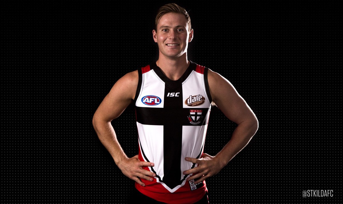
News New Jumpers for 2016
- Thread starter Gibbsy
- Start date
- Tagged users None
- Status
- Not open for further replies.
Javelin
All Australian
- Jun 6, 2013
- 849
- 1,116
- AFL Club
- West Coast
And the Giants finally get some blue on their jumper...View attachment 214438
http://www.gwsgiants.com.au/news/2016-02-11/toyo-joins-the-giants
Replaces SpotJobs. No mention of the length of the deal.
This reminds me of a game I like to play with my Dad, where we identify the future winner of any given game by identifying all the traits of their uniform that are common to both teams (i.e. Eagles vs Hawks would be "the team in yellow", Pies vs Kangas is "the team in stripes", etc.)I still don't know how people can't differentiate those two, at the game it was very easy to tell the difference.
Naturally, this game was a case of "the dark team with red on the jumper, with white numbers on the back".
Although, this still only comes in second to the Saints vs Bombers (away) - "The team in black, red and white".

TheLoungeLizard
The world's most handsome man
Not totally sold on the Essendon... "heritage"
And Silent Alarm I think you're being a bit harsh on the Saints pre-season kit, if they went a full throw back they'd be ripped into for going backwards ect by 16 year olds.
And Silent Alarm I think you're being a bit harsh on the Saints pre-season kit, if they went a full throw back they'd be ripped into for going backwards ect by 16 year olds.
- Jul 15, 2014
- 21,823
- 41,999
- AFL Club
- Richmond
- Other Teams
- Chelsea, LA Lakers, Western United
I don't understand why Essendon did not just go with a black sash instead of retaining the red sash. I think that a black sash on a red background would look better than the red sash surrounded by black stripes on a red background as shown here.
Yeah, Richmond have a similar clash guernsey as that, but still. It would look good.
I guess it looks alright though as it is
Yeah, Richmond have a similar clash guernsey as that, but still. It would look good.
I guess it looks alright though as it is
- Jul 9, 2010
- 24,163
- 26,536
- AFL Club
- Fremantle
I'm just not 100% sold on this at all. I think I might even prefer the silver version.
Three times to tend to come into my head when it comes to clashes: does it look like the club? Is it a cool jumper on its own? Does it solve the clash.
I think the first question is a definitive yes but the final two are a bit flimsy. The design is very empty looking and although clashes are more practical than anything else, it seems hard to even say its practical when this is not a smart clash. This with white or black shorts will clash with the Saints almost as much as the home strip.
I just think there's a unique, new, innovative design in here somewhere but nobody is picking it.
I think there's a great idea with the sashes. You're playing with a unique element in the AFL and when it's red and black, it will never be confused for any other club. You can play around with triangles and long, diagonal lines, surely? And you can fit a classic, simple look into that and absolutely fit a red sash into it as well. I dunno. This just seems like a bit of a miss to me.
And the red does look fairly dark and the clash is already redundant on the teams it's needed for most, so why didn't they just use a maroon or a darker shade of red on the outside? That would have highlighted the sash more. It would have been a fuller jumper.
I dunno.
- Aug 4, 2013
- 1,004
- 2,066
- AFL Club
- West Coast
- Other Teams
- Perth Scorchers, Gladbach, Kyoto Sanga
I reckon on your last point, the writing outside the sash may well highlight the sash somewhat, but I guess we'll see on gamedayI'm just not 100% sold on this at all. I think I might even prefer the silver version.
Three times to tend to come into my head when it comes to clashes: does it look like the club? Is it a cool jumper on its own? Does it solve the clash.
I think the first question is a definitive yes but the final two are a bit flimsy. The design is very empty looking and although clashes are more practical than anything else, it seems hard to even say its practical when this is not a smart clash. This with white or black shorts will clash with the Saints almost as much as the home strip.
I just think there's a unique, new, innovative design in here somewhere but nobody is picking it.
I think there's a great idea with the sashes. You're playing with a unique element in the AFL and when it's red and black, it will never be confused for any other club. You can play around with triangles and long, diagonal lines, surely? And you can fit a classic, simple look into that and absolutely fit a red sash into it as well. I dunno. This just seems like a bit of a miss to me.
And the red does look fairly dark and the clash is already redundant on the teams it's needed for most, so why didn't they just use a maroon or a darker shade of red on the outside? That would have highlighted the sash more. It would have been a fuller jumper.
I dunno.
Agreed, but I'm sure the extra hoops had to be removed to suit the amount of alternate color required criteria.If there's one thing I'd criticise of the yellow Adelaide clash is that the yellow hoop just appears as a big gap. I'd love to see it as a yellow version of the home.
As for Essendon's new clash Guernsey, it reminds me of these pearlers (note sarcasm)


Mero
Norm Smith Medallist
I am so tempted to buy this now.

Mero
Norm Smith Medallist

Is this a different shade of red to the St Kilda one Mero, or just the effect of the text?
Essendon's red is a darker red to St. Kilda's, but the text plays a small part.Is this a different shade of red to the St Kilda one Mero, or just the effect of the text?
wmat4
Team Captain
As a Bombers fans, I like the new “heritage” jumper. TBH I’m not really phased over the heritage aspect, if the club wants to take that angle then fine.
As footy jumper enthusiast like the rest of us here, when a new jumper (clash or not) is released I always ask myself a couple of questions: Is the club still identifiable easily? Does it solve a clash (if it’s a clash jumper) and are they any aspects of the jumper that could be changed to improve the design?
1 – Yes the club is easily identifiable.
2 – I think it will solve the clashes more so than the grey jumper. But still not sold on the white shorts with it against the Saints. Will wait and see
3 – Only thing I would have changed (as many have mentioned) is change the base of the jumper to a slightly darker red, similar to last year’s training jumpers, to make the sash a little more prominent.
I like it.
- Aug 21, 2007
- 31,666
- 99,002
- AFL Club
- Port Adelaide
- Other Teams
- Aston Villa, San Antonio Spurs
As a Bombers fans, I like the new “heritage” jumper. TBH I’m not really phased over the heritage aspect, if the club wants to take that angle then fine.
As footy jumper enthusiast like the rest of us here, when a new jumper (clash or not) is released I always ask myself a couple of questions: Is the club still identifiable easily? Does it solve a clash (if it’s a clash jumper) and are they any aspects of the jumper that could be changed to improve the design?
1 – Yes the club is easily identifiable.
2 – I think it will solve the clashes more so than the grey jumper. But still not sold on the white shorts with it against the Saints. Will wait and see
3 – Only thing I would have changed (as many have mentioned) is change the base of the jumper to a slightly darker red, similar to last year’s training jumpers, to make the sash a little more prominent.
I like it.
As a non-Essendon supporter, I totally agree.
It allows Essendon to maintain it's red sash on black. It doesn't introduce a new colour. It serves it's purpose perfectly as a clash kit.
Perfect.
When will they just admit its a clash jumper?
Fizzler
BBTB
- Dec 26, 2013
- 12,765
- 16,356
- AFL Club
- Port Adelaide
- Other Teams
- OKC, Coburg, Werribee, Storm, QPR
Everyone: I want this jumper
*Essendon releases it*
Everyone: I hate this jumper.
*Essendon releases it*
Everyone: I hate this jumper.
E92_
Premium Platinum
Some people: I want this jumper
*Essendon releases it*
Some people: I hate this jumper.
EFA
TheLoungeLizard
The world's most handsome man
I actually thought the grey was good but needee to be a darker shade.
The bottom white parts in your version look a bit disproportionate (smaller) to the photo of Armo. The cross doesn't look to be perfectly centred as you have it (might be more of a template thing though).
It was perfect for a clash Guernsey, as this new red 'heritage' one creates a clash with Melbourne & St. Kilda again IMO.I actually thought the grey was good but needed to be a darker shade.
It's still frustrating why the AFL enforces some teams to have a White clash Guernsey but not for others.
- Jan 29, 2007
- 912
- 1,175
- AFL Club
- Melbourne
Essendon are in more denial by calling it a "heritage" jumper than they were during their supplements regime.
hitthepost
Norm Smith Medallist
Adelaide will need a white jumper against Hawthorn at a minimumI think
Adelaide
Brisbane &
West Coast
Will be playing their last year with white in their jumper, think serious questions will be asked if they are blocked yet again.
Groupie_
time to return the traditional Richmond yellow
saints new nob cup jumper >>>> essendon "heritage"
lionbear
Geelong Member from 2016
- Feb 25, 2007
- 12,420
- 8,872
- AFL Club
- Geelong
- Other Teams
- 49ers, Indians, Storm
That's the one clash I have never understood.Adelaide will need a white jumper against Hawthorn at a minimum
Adelaide in navy with Navy shorts is plenty enough a difference.
If that is a clash, why aren't Richmond required to wear white against the Hawks?
hitthepost
Norm Smith Medallist
...you mean it needed to be closer to black?I actually thought the grey was good but needee to be a darker shade.
- Status
- Not open for further replies.
Similar threads
- Replies
- 175
- Views
- 14K
