New Kangaroo Logo??

Remove this Banner Ad

BowWow1978

All Australian
Feb 6, 2012
802
738
Melbourne
AFL Club
North Melbourne
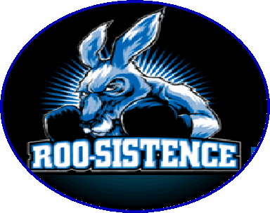
I was at the Brisbane match where the new logo was unveiled with much fanfare and manufactured excitement. To the clubs credit it actually looks pretty good. It looks tough.
Now, I'm no marketing expert, but when you launch a new logo/branding shouldn't you then follow it up? Wouldn't you expect to see it plastered all over the website or on merchandise, jackets/hats/scarves or the free flags that were being handed out at the game? Instead, it's nowhere to be seen. Good work marketing department........
 

Log in to remove this ad.

I don't think it's necessarily a new logo. More of a match day mascot kind of thing.

Personally, I think it'd be a bit stupid to totally re-brand the club again seeing as the current logo only really came in 5-6 years ago.
 
Wasn't it just the old roo-sistence logo?
Yes

420845.gif
 
I don't think it's necessarily a new logo. More of a match day mascot kind of thing.

Personally, I think it'd be a bit stupid to totally re-brand the club again seeing as the current logo only really came in 5-6 years ago.

'07 it came in. My one and only talk with Graham Duff. He wasn't happy with my smart-arse comment about it.
 
Look we need a new logo. The current one is hopeless:

- it's not iconic
- it's not memorable
- it's not timeless (in fact it already feels dated in my opinion!)
- For a logo that's supposed to be 'bold' with the kangaroo jumping at you, there's no aggression, it feels if anything weak
 

(Log in to remove this ad.)

Sarcastic conclusion to op a bit embarrassing considering the whole post is based on the incorrect notion that the banner image is our new logo.

So what's the point of it then? A group of 4 of us (all members) stood around discussing the lack of follow up before the game last week. It was launched Why have a "banner logo" and a "club logo" Is the idea to dilute the brand? Is the point to confuse supporters/members? If so - mission accomplished!

So I hope you'll excuse me for going off half cocked (I'm sure that's the only time it's ever happened on this forum.......) but if it's not a new logo, I can't see the point.

I like the balloon (great for Mazda)
I like the banner
I like the logo/image/picture/non-specific kangaroo themed cartoon

I just don't see why we would have two images?
 
Last edited:
The things you've mentioned, including the new boxing kangaroo mascot that runs around before the game, will only appear at home games. That makes me think they're only using this as part of the match day experience and not so much as part of the whole club branding.

I understand where you're coming from though, it could have been misleading if you didn't know what the clubs aims were. Maybe they should have come out directly after the game and clarified the aim of the new banner, logo, etc. and not just written it off as 'enhancing the match day experience'?
 
Look we need a new logo. The current one is hopeless:

- it's not iconic
- it's not memorable
- it's not timeless (in fact it already feels dated in my opinion!)
- For a logo that's supposed to be 'bold' with the kangaroo jumping at you, there's no aggression, it feels if anything weak
I agree the current logo sucks. Not only is it crap look wise, it has North Melbourne in such a small print, that it is basically unreadable.
 

Remove this Banner Ad

Back
Top