

____
.
- Sep 1, 2009
- 7,496
- 8,950
- AFL Club
- Brisbane Lions
- Other Teams
- Everton, Brisbane Bullets, Thai Port FC
Nice work, please design a new logo for us


Follow along with the video below to see how to install our site as a web app on your home screen.
Note: This feature may not be available in some browsers.
Nice work, please design a new logo for us
Well they ceased operations after the VFA kicked them out for trying to join the VFL.
So they started a merger with Essendon, and the best players went over to Essendon with plans for them to play at Arden St.
But then the Essendon Council said they would kick Essendon Town (VFA) off Windy Hill so Essendon VFL stopped merger talks and moved there.
North and Essendon Town merged with a new board, new colours, and were still thought of as the old North Melbourne. Or maybe the Shinboner spirit was something that belonged to someone else. (the North that died)
my take - primary and secondary logo.

Look at http://www.footyjumpers.com/ for it mateMy apologies.
Does anyone have the full timeline of Western Bulldogs logo's?
I can't find two good Melbourne logos.Just on a sidenote. I've never realised how many bad logos we've had in the AFL over the years compared to other sports imo. To me there's only really one good logo for every club over the course of history with the exception of the Dees who have had two imo.
I can't find two good Melbourne logos.
Surely you don't mean the current one.
It looks like it was designed by a committee and everyone got what they wanted.
I would say the one where the M was a flame wasn't bad, but apart from that it's a pretty ordinary bunch.
Is that what it was? I just thought it was a shoddy piece of design.Never understood the hate fit the original Bears logo grrrr I'm a koala. Also the logo on their guernseys was awesome shaped like the state.
Sorry for the delayed response but that top logo is great. However it would be better with less grey (on the bulldog you could switch the grey and white) and I don't feel like the fonts suit the logo and the Bulldogs brand. The script font feels out of place and the "Bulldogs" font should be bolder. The outline is also a bit over powering so I'd make it thinner. The logo has a lot of potential though and I'm pretty confident that it's going to be better than what they'll actually use.my take - primary and secondary logo.
Is that what it was? I just thought it was a shoddy piece of design.

Never understood the hate fit the original Bears logo grrrr I'm a koala.
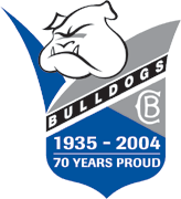
Source?In some late breaking news, This Logo will be used starting next year
People at the club and Merch Distribution Company People.Source?
