Workshop Non-Footy Designs - A No-Guernsey Area

Remove this Banner Ad

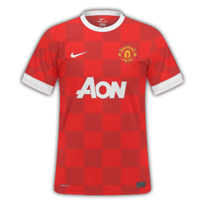
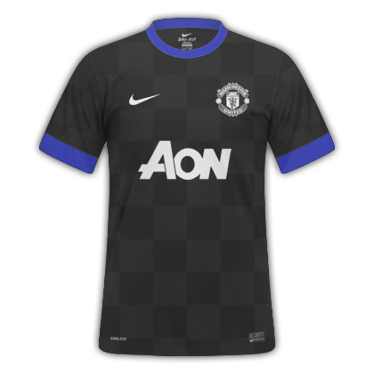
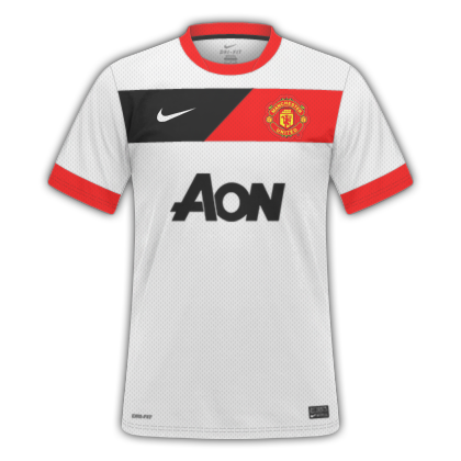
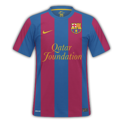
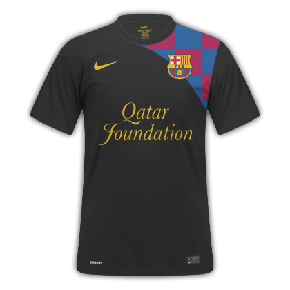
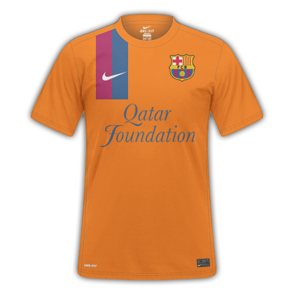
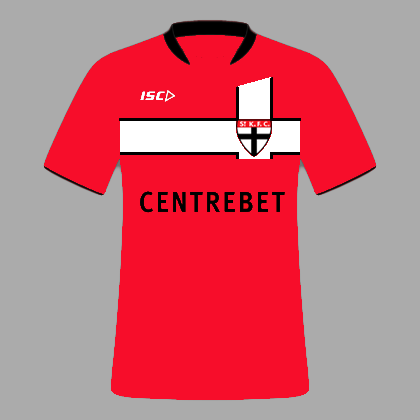
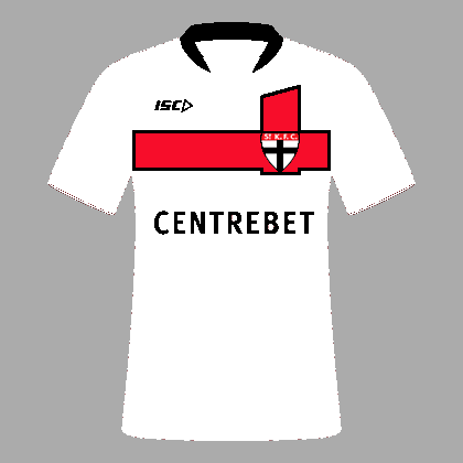
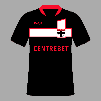
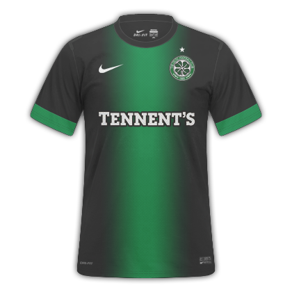
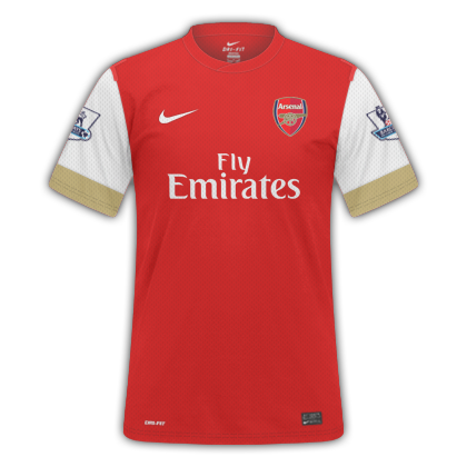
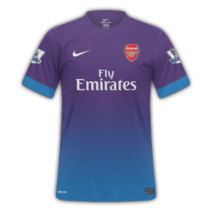
Within the realm of sports, I'm sure many us have passions in areas outside of footy. So if you have made any jerseys, kits, shirts, etc. - that have nothing to do with "aussie rules" - showcase them here (show us your kits!).

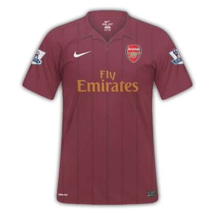
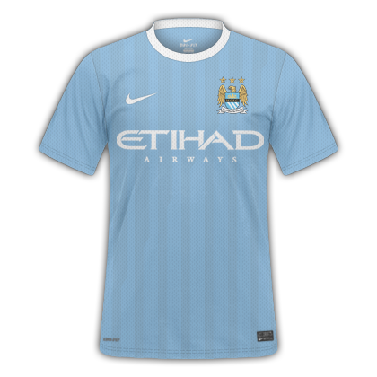
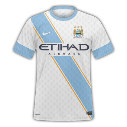
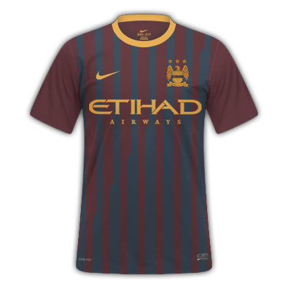
I'll kick this off with some Man City shirts:


RNkhC.png
X5quD.png
Z0K56.png
 
I would buy those first two in an instant! Wow! Third one, not so much. I never really liked the design when Barca had it. Good try though.

It's time for me to upgrade my City kit too, grown out of the black one from a few years ago.
 

Log in to remove this ad.

No-footy zone, eh? Alright, here goes a bit of junior hockey
Victoriaville Tigres from Quebec Major Junior Hockey League
victigres.png

This is a few years old, but is still a personal favorite. For you futbol fans out there, you can hazard a guess as to what inspired the third jersey.

Boston Red Sox
redsox01lonealt1.png

This one is part of what I can only call a quasi-alt history series, where I generally design an alternate jersey tied to some point in history. This one is based on Boston's first Red Sox uniform (they'd worn navy socks before switching to red socks in 1908)

Charles Woodson-Michigan and Packers
c2pcharleswoodson-1.png

A little ongoing project I have going at Creamer's is what I call College to Pro (something I've been considering adapting to footy), and it is basically what you see above: taking an individual player and swapping his college and NFL teams' uniform styles, though normally I prefer to go with jerseys said player actually wore. In this case, though, I felt the "bumblebee" uniform Michigan wore against Michigan State were simply too awesome to wait for Denard Robinson's draft. Michigan design is based on a 2003 Packers throwback (C-Wood was still a Raider at the time), Packers design based on Michigan "bumblebee" one-off.

Streetsville Derbys, Toronto area, defunct Junior A hockey
streetsvillederbys.png

A dog wearing a derby hat and a bowtie. I felt it was cool in its own way, so I put out what will likely be the only Streetsville Derbys concept ever. The script is my own work, and I figured this was just about the only time a bowtie alt logo would ever make sense.

San Antonio Spurs
spursfiesta3_2.png

One day the idea occurred to me that the "Fiesta colors" the Spurs used pretty much everywhere but the uniform in the 90s could've been worked in as trim, if nothing else. Combine that with my love for their 70s black on black, and that I happened to be putzing around with a script at the time, and here ya go. Geometric patterns are strongly associated with the southwest US, and no disrespect to the Heat, but the Spurs are the only team that can make black on black work. The script was actually my second stab at it, there was rather mixed opinion on the first version, which was either messier or more organic depending on who you asked.
 
Love the Spurs one, mate. :thumbsu: I could see something like that working for the Heat too. They could trim their "back in black" jersey with their colourful ABA unis.

I would buy those first two in an instant! Wow! Third one, not so much. I never really liked the design when Barca had it. Good try though.

Cheers. :) Now if I can get some more kudos like that, Nike might start taking my kit requests seriously.
I'm going to continue with Manchester area kits:

mAwVz.png
qnZVQ.png
aG5Ys.png
 
I've always had that third kit design in my head but I've never gotten around to actually designing it. Looks good :thumbsu:
 
a couple that are actually new...
Pacers: basically a mix of their two iconic uniforms-the early 90s "Flojo" set and the late 90s/2000s pinstripes...the funny looking I is the Indiana state map
pacersconcept.png


Pistons: loosely based on a throwback uniform they wore during their 50th anniversary season, and combined with stripnig from an old Juventus clash shirt mainly so it's not simply the same color as the road uni (I've been sitting on the design itself for at least a year and a half, just now released it)
pistonsconcept.png


back to my older crap: Packers overhaul...Green Bay almost pulled the trigger on a uniform change for the 94 season before getting cold feet, and following Le Divorce, there were rumors that the Pack was considering an overhaul as a symbolic break from the Favre era. Didn't happen, obviously, but there are a number of us in Packer nation who would've welcomed a change. The whole concept is one I've considered revisiting.
packersheismanmain3.png

packersheismanalt3.png

packersheismanvintage.png
 
Packers overhaul...Green Bay almost pulled the trigger on a uniform change for the 94 season before getting cold feet, and following Le Divorce, there were rumors that the Pack was considering an overhaul as a symbolic break from the Favre era. Didn't happen, obviously, but there are a number of us in Packer nation who would've welcomed a change. The whole concept is one I've considered revisiting.

Really, 'cause all I hear is "if you touch the designs in any major way, bad things will happen to you" (or along those lines) from Packers fans (including myself).
 
Really, 'cause all I hear is "if you touch the designs in any major way, bad things will happen to you" (or along those lines) from Packers fans (including myself).
Yeah, that number's a vast minority, but still there. At least a few folks I know of wouldn't miss the G, and a few others wouldn't mind navy blue making a more permanent comeback, if only to remind folks there is in fact Packers history before Lombardi. In any event, nothing ever came of it beyond rumor.
 
Anyone heard of an online game called batracer? There is the opportunity to design car liveries, not sure if it's worth contributing these to the thread though.

You might as well. ;)
 
Those kits are class! The away template is awesome too.

Discrim - on those Pacers kits, I really do adore them but if there's one thing I dislike about the current Pacers identity is the font of their wordmark. Their old 90's font was actually better. The one they have now (since about 05) looks like Agency FB - so cringey! Maybe have a go at a different font?
 

(Log in to remove this ad.)

I have no real problem with the font the Pacers are using at the moment, and I didn't really have any plans to redo the concept. Anyways, may as well reinvigorate this thread a bit...yeh, more of my old stuff, but a lot of my old stuff is interesting at worst. First, the Drummondville Voltigeurs from Quebec's junior league
voltigeurs.png

The light sweater is silver, not the usual white, as while ordinarily I have no problem with white jerseys, I sometimes get bored of their prevalence in North American sports. This was made during one of those times...and at the same time as the V-fest that was the Tigres, and as I think I used every V in my city's limits for that one, I decided to stray from them here, instead going for a simple yet distinct striping pattern for the home and away. I'd been told that I played it too safe with the third, however...the near-exact words being it looked like every other hockey jersey ever (usually the exact opposite of my ethos regarding thirds, but I liked the design).

Rimouski Oceanic, same league, Sid Crosby's old team
oceanic.png

I was partially inspired by the Islanders' "fishsticks" jerseys, though a tad tamer but still wavy. The third looks the way it does because I couldn't decide which of the lighter blues to use. I think it still would've been checkered had I gone with only one blue.

Asheville Tourists, minor league baseball
touristsmain2.png

touristsalts2.png

The Tourists have overhauled their uniform since I'd made this one (and no, it looks nothing like this), and I won't lie, this was one of my more experimental ideas. The whole thing is based off of the stereotypical American tourist (someone had even suggested I make the pants khaki instead of the customary white and gray), and the white and gray jerseys have the same Hawaiian shirt design as the much louder alternates, just far more subtle like shadow stripes in soccer (gotta give em something they'd wear everyday, ya know). And seeing as one minor league team, the Lake Elsinore Storm, has gotten a shitload of mileage out of their "eyes" cap, one with a pair of sunglasses wouldn't be too much of a stretch.
 
This is really sharp! Especially the road blue, and I love the alt logo. You should submit this to the Pacers, imho.
No offence, but do you really think that a NBA club will take any notice of a design posted on BigFooty? I do like the design though.
 
Yeah I'm using gimp so I should be able to add textures if I play around some more :) thanks for the feedback as always gibbsy
 
Asheville Tourists, minor league baseball
touristsalts2.png

The Tourists have overhauled their uniform since I'd made this one (and no, it looks nothing like this), and I won't lie, this was one of my more experimental ideas. The whole thing is based off of the stereotypical American tourist (someone had even suggested I make the pants khaki instead of the customary white and gray), and the white and gray jerseys have the same Hawaiian shirt design as the much louder alternates, just far more subtle like shadow stripes in soccer (gotta give em something they'd wear everyday, ya know). And seeing as one minor league team, the Lake Elsinore Storm, has gotten a shitload of mileage out of their "eyes" cap, one with a pair of sunglasses wouldn't be too much of a stretch.


Those are awesome!


. . . A quick Celtic third kit:

huIUl.png
 
Honestly, hadn't thought about it. I've had too many other ideas to really consider revisiting it just yet. In any event, the branching out I've long wanted to do with the College to Pro idea, I finally got around to doing it, here's the first of hopefully many.
c2progerclemens.png

Univ. of Texas is based on the Yankees' longtime home uniform, complete with burnt orange pinstripes, with the longhorn replacing the NY...Yankees is based on the uniforms Clemens wore in college, and while white caps aren't all that popular at the big league level, the Horns had one in the 80s and still wear one, as well as a gray cap.

c2pcamnewton2.png

Another style swap, this time on the gridiron...anyways, sometimes players transfer for various reasons, usually because they figure they'll get playing time somewhere else or they did something stupid and got kicked off the team. In any event, before Cam Newton's controversial time at Auburn, he had an equally tumultuous time backing up Tebus Christ at Florida. I'll be honest though, the Pantherized Florida set looks less awkward than when I'd posted the Auburn version...
c2pcamnewton.png


c2pjoemontana.png

Heh, Montana wore mismatched golds most of his career, his college pants were Packer yellow while his Niners pants were damn near khaki, figured I'd keep that inconsistency consistent. Anyways, anybody wondering where the Niners' SF is, I'd decided on a pure helmet switch....with a school famous for its blank, 23K gold painted helmets.
 
love the redcurrant Arse shirt
redskinsalt_zps3c058533.png

A pdf full of officially proposed Redskins designs was made public several years ago, and every now and then I take a look through it for laughs (every single full set in it includes a black alt, and the helmets, burgundys and whites all include at least some black...and I gotta tell ya, almost all of em are rather horrid designs). A rather nice spear was the only real bright spot in the whole thing, and I'd wanted to use it somewhere for a good while. The feathered R, I can't recall off the top of my head who came up with it TBH. And I've long thought the Skins could make a gold jersey work.
 

Remove this Banner Ad

Back
Top