- Sep 23, 2012
- 1,979
- 1,396
- AFL Club
- GWS
Warner's pose looks so seductive. Great work.
Goes with the seedy 80's style mo he's got.
Follow along with the video below to see how to install our site as a web app on your home screen.
Note: This feature may not be available in some browsers.
Warner's pose looks so seductive. Great work.
Warner's pose looks so seductive. Great work.


It's Rugby

Argh, Slenderman is back. But, that's a really goob job.

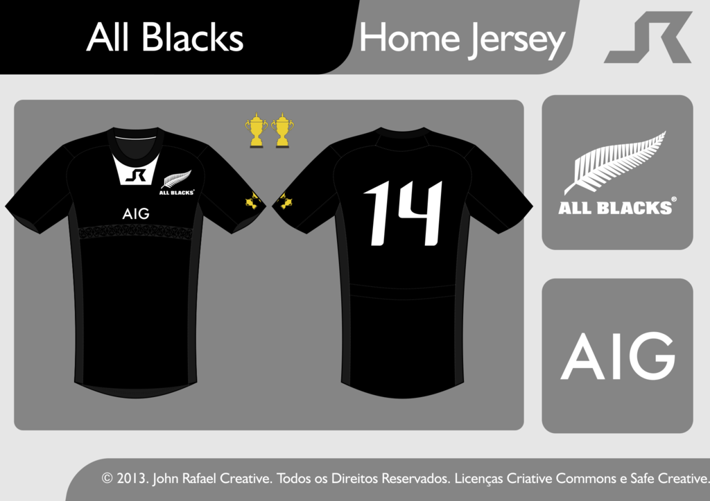
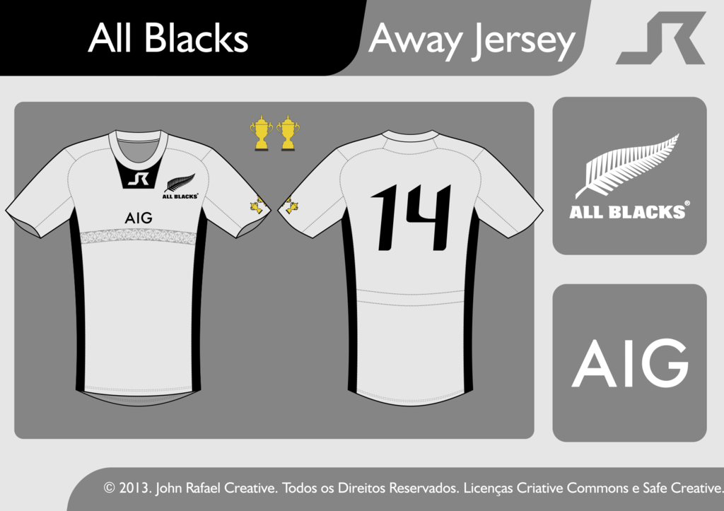
Meanwhile it, I've a new rugby Concept.
All Blacks:
I like that grey, what's the design across the chest?