Navigation
Install the app
How to install the app on iOS
Follow along with the video below to see how to install our site as a web app on your home screen.
Note: This feature may not be available in some browsers.
More options


You are using an out of date browser. It may not display this or other websites correctly.
You should upgrade or use an alternative browser.
You should upgrade or use an alternative browser.
Portfolio NRL Crossover
- Thread starter Klim
- Start date
- Tagged users None
It's more reminiscent of the circa-'95 design, rather than the one from the 1960's-1980's. I don't mind it at all TBHJust tried that, it looks kinda squashed.

Damo Crows Fan
Club Legend
Brisbane Broncos
Home
The home is a nod to the original Broncos jumper. The back is inspired by the Bears old jumper.
View attachment 101010
]
This is a lot closer to what i was HOPING the 2015 kit would look like
- Aug 21, 2007
- 31,669
- 99,019
- AFL Club
- Port Adelaide
- Other Teams
- Aston Villa, San Antonio Spurs
Brisbane Broncos
Home
The home is a nod to the original Broncos jumper. The back is inspired by the Bears old jumper.
View attachment 101010
This converted back to a league jersey would be just about as good as the Broncos have ever looked
This converted back to a league jersey would be just about as good as the Broncos have ever looked
Contain your organisms...
")
Damo Crows Fan
Club Legend
LOVE that jersey!!!!
Aww s**t, my spider crab just ran away. Thanks for nothing.Contain your organisms...
was hoping someone would get it (Y)Aww s**t, my spider crab just ran away. Thanks for nothing.
Mero
Norm Smith Medallist
Can I suggest using the templates used by the manufacturers as well as using the designs?
For instance, I like the 80s and 90s inspired Broncos Nike jumpers, I really do.
But if they were made by Nike in 2015 they would be on the same template as Carlton use.
adidas use that collar, but then they have a different cut, where the back is wider than the front and they meet at the front of the hips.
BLK use that template, where the seams meet at the side, as do CCC. But they both have different collars.
Nike have side panels made of a different material than the front and back. And they have a different collar.
I realise that this is a new template that you want to play with and the designs so far look great.
But if you stretch yourself and learn how to create the different templates in Photoshop I guarantee it will be rewarding.
Try something different other than recolours.. If you don't this will be very repetitive.
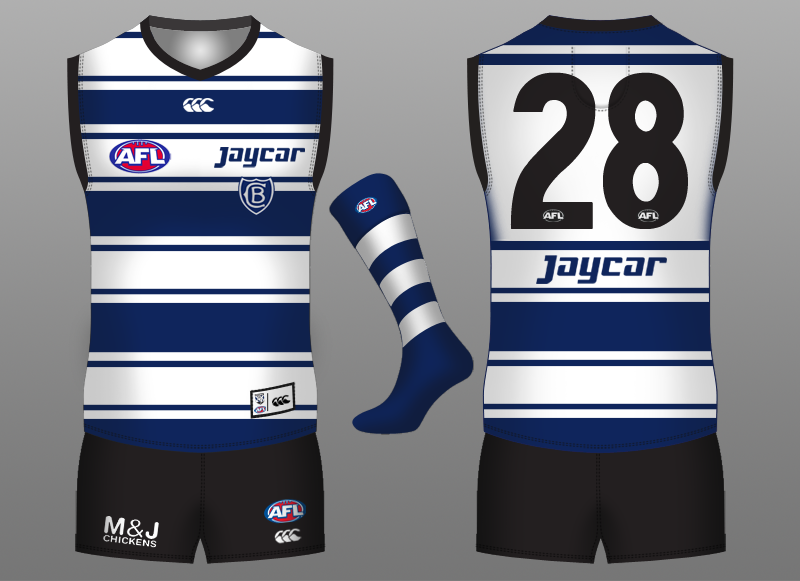
One thing Klim, the thinner white stripe and the thin blue stripe (between the thick white stripe and the thin white stripe) should be the exact same thickness if it's a butcher stripes designCanterbury-Bankstown Bulldogs
Heritage
The irregular ("butcher stripes") stripes design which was used from 1935 until at least 1962.
TGDesigns
Senior List
Looking good, Klim/Volta! Broncos' and Canterbury's designs are spot on. Cronulla's design would have a larger white hoop surrounded by smaller black hoops at the edges (sorry if I'm being picky). But the Sharks designs are still nice. Newcastle's and North Queensland's designs are beautifully done! Interesting how the Storm will be designed like. And keep up the good work, Volta/Klim!
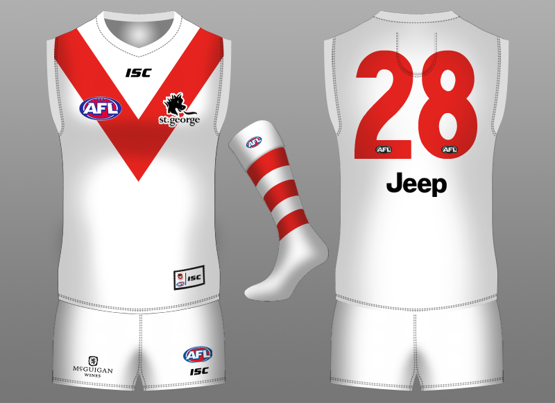
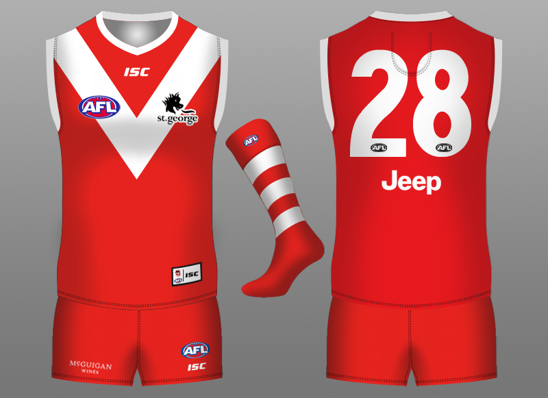
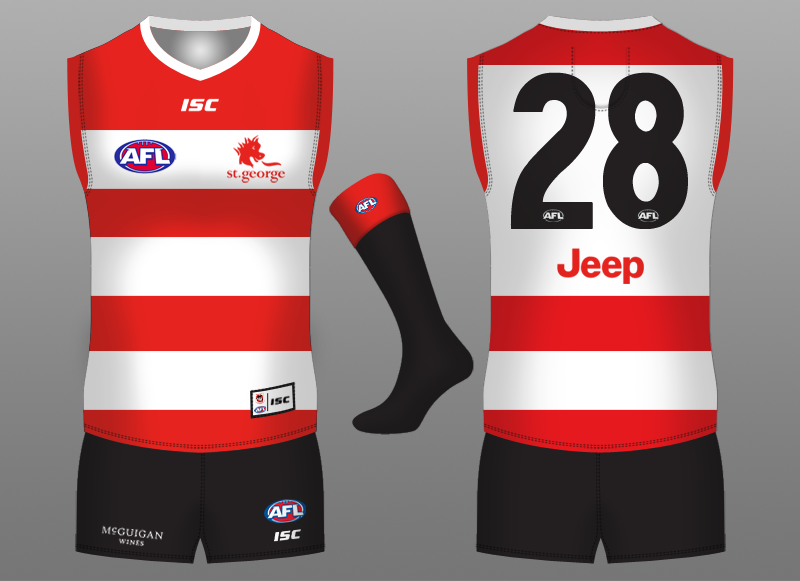
I must say I like the Heritage, we both had the same inspiration obviously but there's something particularly striking about yoursSt.George Illawarra Dragons
Home
The hooped socks are back.
Away
An inverted version of the home. Its a Dragons design but with a nod to Illawarra.
Heritage
The heritage kit is based on the club’s original uniform.
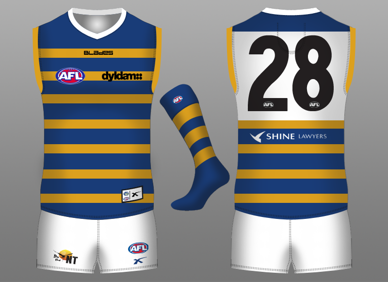
why'd you use the blades wordmark rather than the normal logo?Parramatta Eels
Heritage
Based from the 2011 heritage kit.
Klim
Brownlow Medallist
- Sep 17, 2013
- 12,532
- 10,363
- AFL Club
- Sydney
- Thread starter
- #48
Canberra has been added. Not sure if you guys really don't like my portfolio but I think people lurk around. Please if you want to share something about the designs good or bad I don't mind. I just want to see people looking and enjoying at the designs I've done and giving their opinions and likes.
Jack Stevens
#2 Ticket Holder
I know that it looks neater at the end, and it's helpful from an archive point of view, but I think that part of the reason why you're not getting more feedback is that you're just updating the "reserved" posts. As lazy as it may seem, I've been opening this thread when I see new posts, read that you've added a team, and then move to the next thread. You're going to get more eyes on your designs if you just post them throughout the thread, IMO.Canberra has been added. Not sure if you guys really don't like my portfolio but I think people lurk around. Please if you want to share something about the designs good or bad I don't mind. I just want to see people looking and enjoying at the designs I've done and giving their opinions and likes.
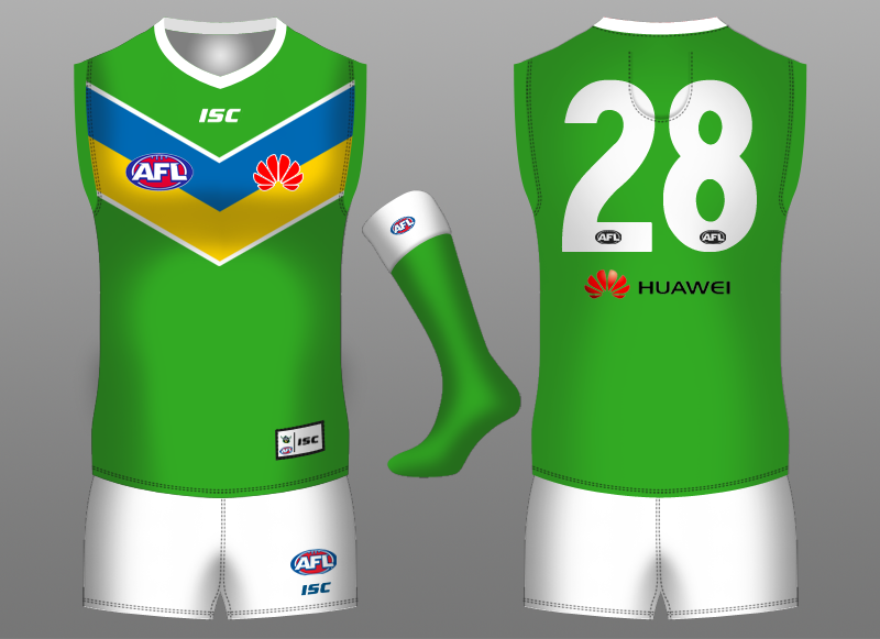
Perfect. I reckon this is one of the best so far. Clean, simple and works for their team in the AFL setting. I like how you've been adding the team logos to the hip tag tooCanberra Raiders
Home
Based on the 2012 home jersey. I've made them full block chevrons because the white separates the chevrons making the white more dominant. Also changed the sleeves to green to tie in with the 'Green Machine'.
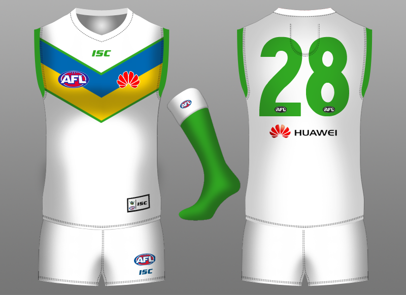
Away
Same for the away kit.