Navigation
Install the app
How to install the app on iOS
Follow along with the video below to see how to install our site as a web app on your home screen.
Note: This feature may not be available in some browsers.
More options


You are using an out of date browser. It may not display this or other websites correctly.
You should upgrade or use an alternative browser.
You should upgrade or use an alternative browser.
Our Icon
- Thread starter Augustine
- Start date
- Tagged users None
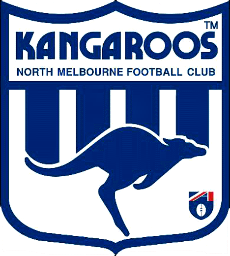
Maybe the club is getting rid of that Kangaroo logo that I loath.
- Aug 28, 2013
- 3,250
- 8,834
- AFL Club
- North Melbourne
- Other Teams
- Arsenal
- Thread starter
- #3
Mid-season?Maybe the club is getting rid of that Kangaroo logo that I loath.
Roos Addick
Club Legend
- Apr 2, 2014
- 1,175
- 1,478
- AFL Club
- North Melbourne
- Other Teams
- Charlton Athletic
Is that what a kangaroo footprint looks like?!?
Sent from beneath the blue and white using Tapatalk
Sent from beneath the blue and white using Tapatalk
Maybe the club is getting rid of that Kangaroo logo that I loath.
Was hoping the same thing Gaso. Was in the Roos shop the other day commenting on how good the back of the NAB Guernsey looked only for it to be spoiled by the logo on the front. That kangaroo paw in the video has a bit of a Toronto Raptors feel.
- Aug 19, 2012
- 4,780
- 5,971
- AFL Club
- North Melbourne
- Other Teams
- Jazz, West Indies
thinking they are changing the kangaroo logo to look more aggressive.
- Jan 17, 2014
- 7,591
- 16,217
- AFL Club
- North Melbourne
- Other Teams
- Philadelphia Eagles Baby
You loathe the Kangaroo??Maybe the club is getting rid of that Kangaroo logo that I loath.
I am all for innovative marketing and broadening our appeal, but...... Ummmmm..... We are the North Melbourne KANGAROOS!!!
Uncle_Leo
Premium Gold
With bones.. Shinboners/Kangaroos type logo?
- Jan 17, 2014
- 7,591
- 16,217
- AFL Club
- North Melbourne
- Other Teams
- Philadelphia Eagles Baby
Brilliant, a "like" wasn't enough, had to extend the appreciation.
- Sep 13, 2013
- 23,950
- 62,598
- AFL Club
- North Melbourne
Maybe the club is getting rid of that Kangaroo logo that I loath.
This was perfection. Can anyone explain to me why we found the need to change it?

This was perfection. Can anyone explain to me why we found the need to change it?
Hear, hear!
Roos Addick
Club Legend
- Apr 2, 2014
- 1,175
- 1,478
- AFL Club
- North Melbourne
- Other Teams
- Charlton Athletic
+1
This was perfection. Can anyone explain to me why we found the need to change it?
Sent from beneath the blue and white using Tapatalk
Higgins2Waite
ZZZZZZZZZZZZZZZZZZZZZZZZZZZZZZ
- Aug 13, 2012
- 13,511
- 23,104
- AFL Club
- Hawthorn
- Other Teams
- NORTH! 2016,2017,2018.
- Banned
- #19
Looked more like a new Jurassic park is coming out.
muttley45
Premium Platinum
What's this about??
 Why does *dustin fletchers rotten head appear in the centre of 9 images after i view this clip
 You loathe the Kangaroo??
I am all for innovative marketing and broadening our appeal, but...... Ummmmm..... We are the North Melbourne KANGAROOS!!!
Not the Roo.
Just the current Roo....this one...timid...

Always liked this one from the mid 90's though this is not a good pic...

This is even not too bad from someone on BF...
Saintly31
Cancelled
- Apr 2, 2012
- 8,136
- 5,445
- AFL Club
- North Melbourne
I wonder if we didn't win premierships with the old logo whether it would be so fondly remembered.
The current logo looks good to me, but unfortunately it has no success attached to it.
If the club wants to go a different way again i'd be fine with that also.
The current logo looks good to me, but unfortunately it has no success attached to it.
If the club wants to go a different way again i'd be fine with that also.
DarkPhoenix
Cont-Roo-Versial
- May 26, 2009
- 40,574
- 56,707
- AFL Club
- North Melbourne
- Other Teams
- ManCity, Cardinals, Avalanche
Long as we don't get a paddlepop kanga.

Pykie
Cancelled
I absolutely hate the logo too, it's a paddle pop kangaroo imo, but I reckon we might be missing something.
It costs a shitload of money to rebrand an organisation, and it definitely wouldn't be done mid season when all the merchandise etc has been produced..............
It costs a shitload of money to rebrand an organisation, and it definitely wouldn't be done mid season when all the merchandise etc has been produced..............
Similar threads
- Replies
- 45
- Views
- 3K
