Media Race for the Qooty premiership, in squiggly lines

Remove this Banner Ad

upload_2015-8-5_21-9-10.png

Would be great if we had a SFA squiggle.

Wouldn't it just?

Now we do.

This squiggle maintains the same process as its inferior predecessor. All teams started their Sweet FA journey with a rating of 50 for offence and defence. All teams will gain predicted scores for each game, centred on a base score of 95 points per game. All teams will rise or fall in their offensive or defensive ratings based on whether they score above or below expectation and defend above or below expectation. There is no home ground advantage factored in - there's no home ground advantage in the Sweet FA as a whole, just the novelty of cool names like the Snow Dome and...I don't know any other good ones.

This means an average team will be rated, generally, 50 in each category. The nature of the squiggle means it's possible to grow offensive scores more than defensive scores as you can't score below 0, but the impact is minimal and balances out.

Due to the randomisation of the sim and a seemingly frequent ability for teams to play catch-up in last quarters, the Sweet FA is actually a very even competition and as such this squiggle will become a little messy. If you think the AFL's congested, just wait until you see the round 16 squiggle (though this is something I'll try to work around). However, such little genuine disparity between teams means they rise and plummet in no time at all, which is pretty entertaining...if you're not doing the plummeting.

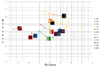
So, without further ado, the round one squiggle:

upload_2015-8-9_21-48-58.png

Further explanation on the graph. Each team's logo is where that team is currently positioned. The lines and dots behind mark where that team has placed previously. So, after round one, it means the Warriors have moved down (and are now ranked worse offensively), the Dragons have moved right (and are now ranked better defensively), the Wolves have moved down and left (and are now ranked worse offensively and defensively) and so on.

The premiership cups denote where each premiership team has ranked upon winning the premiership, thus creating a general territory in which you'd rather your team sit. As you can see above the Dragons have moved from their premiership cup to a new position, further right.

tl;dr the further up and right your team is, the better.

Some notes:
  • The Wonders are in the top five? They certainly are. Despite a horror season 19 they came in to season 20 ranked above average defensively thanks to a 59-point win over the Demons (yeah, yeah. Arseholes). Holding the Demons to just 8.7 (55), a long way below their expected score of 116, meant the Wonders quickly jumped back into more familiar territory. I promise they were much worse than everyone else.
  • Do the Bandits just not like everyone else? Probably not. Some of them are okay. The Bandits were a below-average side last season but, in a similar case to the Wonders, were belted in round 14 by the Dragons. Conceding 27.14 (176) almost put them off the map and put the Dragons into premiership contention. As you can see, they gained points defensively against the Demons despite conceding 16.14 (110). All evens out. (You see why I hesitated doing this?!)
  • Are, like, seven teams almost in premiership territory? Yes. I told you, it's very even. Enjoy having something to bang on about, half the competition.
I'll release some more cool things as we go.
 

Attachments

  • upload_2015-8-5_21-33-42.png
    upload_2015-8-5_21-33-42.png
    17.7 KB · Views: 20
Last edited:
945.gif
 

Log in to remove this ad.

Is anyone else not getting this?
I should explain further...

Basically - this measures team's offence and defence against everyone else. If you're a good offensive team, you'll have a good offensive rating (above 50, which is average). If you're a poor offensive team, you'll have a poor offensive rating (below 50). Same applies to defence. So a team like, say, the Bandits - they're rated about 52 for offence, so they're a good offensive team. But their defence is rated around 36.

These ratings change week to week based on how every team fares. Take your Dragons as an example (top right, LCynic. There should be green there). Last week they kept the Warriors to 9.16 (70). This was rated a really strong defensive performance, so their defensive rating increased (the graph shows they moved a reasonable distance to the right). The Dragons' 17.8 (110) was considered a little below average so their offensive rating decreased minimally.

tl;dr - you want your team to be rated as high as possible offensively and defensively, and as close to the top right of the graph as possible.
 
If you don't, it's the same premise as the "Race for the flag, in squiggly lines" thread on the main AFL board.
I should explain further...

Basically - this measures team's offence and defence against everyone else. If you're a good offensive team, you'll have a good offensive rating (above 50, which is average). If you're a poor offensive team, you'll have a poor offensive rating (below 50). Same applies to defence. So a team like, say, the Bandits - they're rated about 52 for offence, so they're a good offensive team. But their defence is rated around 36.

These ratings change week to week based on how every team fares. Take your Dragons as an example (top right, LCynic. There should be green there). Last week they kept the Warriors to 9.16 (70). This was rated a really strong defensive performance, so their defensive rating increased (the graph shows they moved a reasonable distance to the right). The Dragons' 17.8 (110) was considered a little below average so their offensive rating decreased minimally.

tl;dr - you want your team to be rated as high as possible offensively and defensively, and as close to the top right of the graph as possible.
Thanks guys. Nice work Eth.
How do I know whose premierships are the ones indicated?

Should start seeing some nice squiggles very soon...
Cheers. I understand the concept, just needed to know where to look. I don't do well with recognising the coloured lines.
It's also not our guernsey anymore!
 
If you don't, it's the same premise as the "Race for the flag, in squiggly lines" thread on the main AFL board.
I didn't understand that one either. But I do like the pretty colours so I'm interested.
 
I should explain further...

Basically - this measures team's offence and defence against everyone else. If you're a good offensive team, you'll have a good offensive rating (above 50, which is average). If you're a poor offensive team, you'll have a poor offensive rating (below 50). Same applies to defence. So a team like, say, the Bandits - they're rated about 52 for offence, so they're a good offensive team. But their defence is rated around 36.

These ratings change week to week based on how every team fares. Take your Dragons as an example (top right, LCynic. There should be green there). Last week they kept the Warriors to 9.16 (70). This was rated a really strong defensive performance, so their defensive rating increased (the graph shows they moved a reasonable distance to the right). The Dragons' 17.8 (110) was considered a little below average so their offensive rating decreased minimally.

tl;dr - you want your team to be rated as high as possible offensively and defensively, and as close to the top right of the graph as possible.
What do all the premiership cups represent? And why are they placed there? And which one are we aiming for?
 
What do all the premiership cups represent? And why are they placed there? And which one are we aiming for?
I'm guessing they were the combined offence/defence marks that the premiership teams achieved when they won.

Case in point: Dragons are basically right over their cup icon. (I'm guessing the 'circle' point is where I'm supposed to look)
 

(Log in to remove this ad.)

I'm guessing they were the combined offence/defence marks that the premiership teams achieved when they won.

Case in point: Dragons are basically right over their cup icon. (I'm guessing the 'circle' point is where I'm supposed to look)
So the Dragons are on the exact place they won the flag last season? Or would it be that they're favourites for this seasons flag therefore that's where they are at?
 
So the Dragons are on the exact place they won the flag last season? Or would it be that they're favourites for this seasons flag therefore that's where they are at?
I want to believe the former, also because of what Eth said about our offence and defence 'scores' after round 1.

Or I could be reading it wrong, in that our 'cup' was the one to the left and not the one where the circle is.
 
I want to believe the former, also because of what Eth said about our offence and defence 'scores' after round 1.

Or I could be reading it wrong, in that our 'cup' was the one to the left and not the one where the circle is.
Think you're right. I counted 19 cups.
 
Thanks guys. Nice work Eth.
How do I know whose premierships are the ones indicated?
I haven't labelled them to limit clutter, it's mostly for perspective. The Dragons one from last season is where that dot is (hasn't moved). The highest offensive one (furthest up) was the Demons in S18, the highest defensive one (furthest right) was the Roys in S04 (next best the Wonders in S13).

By that measure the two worst premiership sides in history are the Hurricanes in S02 and the Wonders in S15 (they're clumped in the same spot, just above the Bears).
 
I want to believe the former, also because of what Eth said about our offence and defence 'scores' after round 1.

Or I could be reading it wrong, in that our 'cup' was the one to the left and not the one where the circle is.
Yeah, the team's logo (designed by... Marlowe? I think. Shoutout nonetheless) is where your team is currently positioned. The line behind is the trail each team has left.

The logo's the head, the trail is the tail. Think of it like...

homer-sperm-dance-o.gif


...never mind.
 
Last edited:
Yeah, the team's logo (designed by...@Marlowe? I think. Shoutout nonetheless) is where your team is currently positioned. The line behind is the trail each team has left.

The logo's the head, the trail is the tail. Think of it like...

homer-sperm-dance-o.gif


...never mind.
Ohhh. Was trying to make sense of our 'rise in defence' and our position in relation to that. Now I do.

I also see the drop in offence, too.

This is now officially fun.
 
I haven't labelled them to limit clutter, it's mostly for perspective. The Dragons one from last season is where that dot is (hasn't moved). The highest offensive one (furthest up) was the Demons in S18, the highest defensive one (furthest right) was the Roys in S04 (next best the Wonders in S13).

By that measure the two worst premiership sides in history are the Hurricanes in S02 and the Wonders in S15 (they're clumped in the same spot, just above the Bears).
I was really enjoying this thread until I saw "worst" and "Bears" in the same sentence.
 

Remove this Banner Ad

Back
Top